Hexbin chart with the hexbin package


This post explains how to build a hexbin chart with R using the hexbin package. Hexbin chart is a 2d density chart, allowing to visualize the relationship between 2 numeric variables.

2d density section Data to Viz

Scatterplots can get very hard to interpret when displaying large datasets, as points inevitably overplot and can???t be individually discerned.

Binning can be though of as a two-dimensional histogram, where shades of the bins take the place of the heights of the bars. This technique is computed in the hexbin package.

This example has been published by Myles Harrison on R-bloggers.
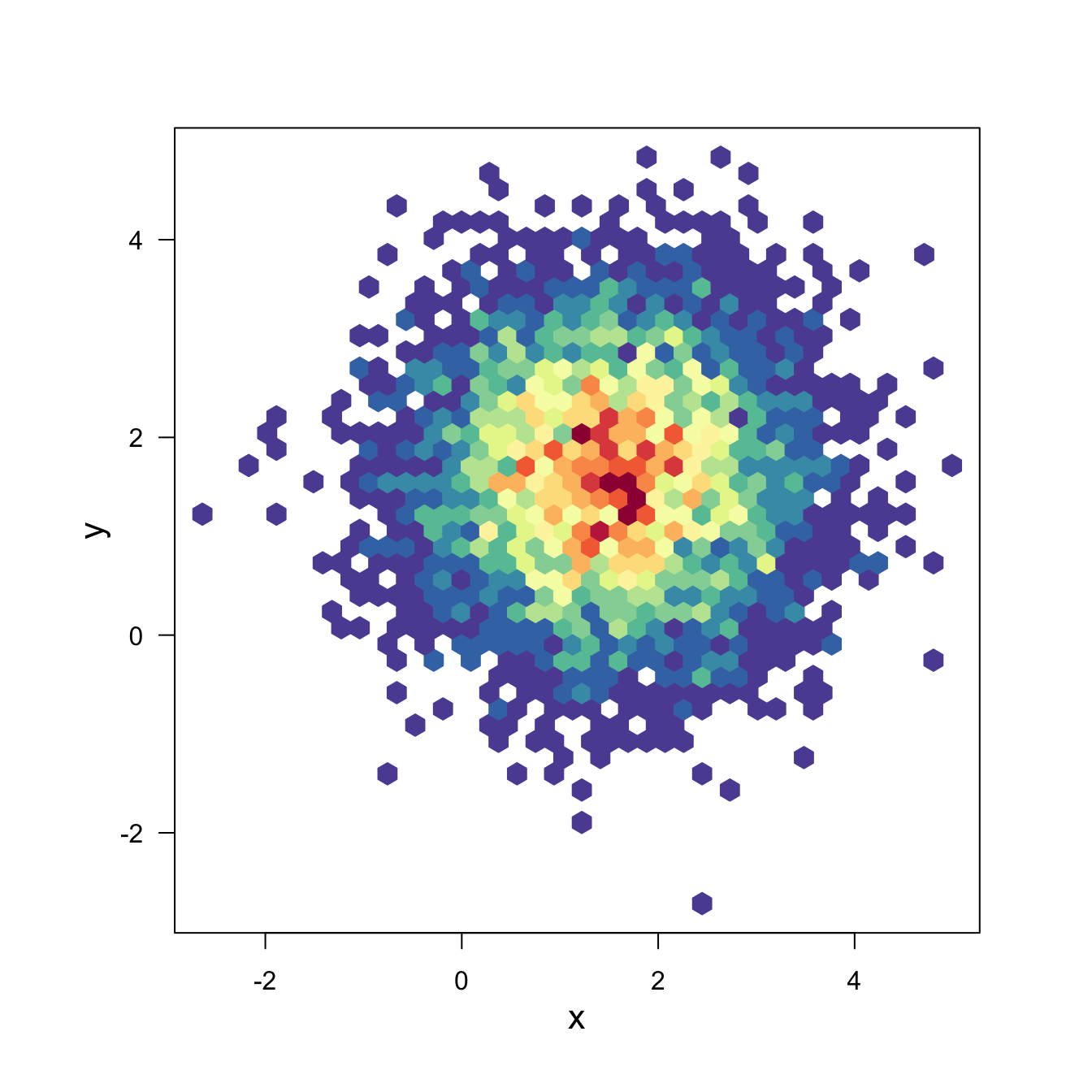
# Packages
library(hexbin)
library(RColorBrewer)
 
# Create data
x <- rnorm(mean=1.5, 5000)
y <- rnorm(mean=1.6, 5000)
 
# Make the plot
bin<-hexbin(x, y, xbins=40)
my_colors=colorRampPalette(rev(brewer.pal(11,'Spectral')))
plot(bin, main="" , colramp=my_colors , legend=F ) 

Related chart types


Scatter
Heatmap
Correlogram
Bubble
Connected scatter
Density 2d


Contact

This document is a work by Yan Holtz. Any feedback is highly encouraged. You can fill an issue on Github, drop me a message on Twitter, or send an email pasting yan.holtz.data with gmail.com.

Github Twitter