Change line chart color according to Y value


This post explains how to build a line chart in base R, where the line color is set according to the Y axis value. Reproducible code is provided.

Line chart Section About line chart

The plotrix library allows to change the line color according to the value of the Y axis thanks to the clplot function.

Here, the RColorBrewer package is used to set a palette of 8 colors.

Note:: Thanks to Carl Witthoft for sending this chart.
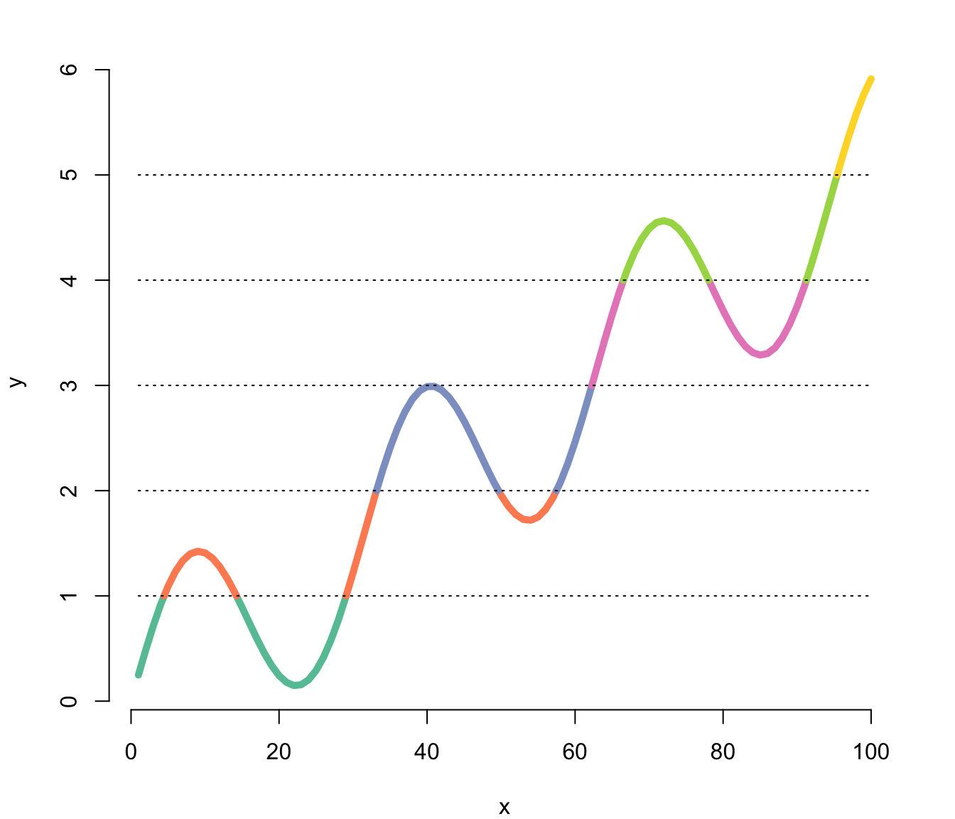
# library
library(plotrix)
 
#create color palette
library(RColorBrewer)
my_colors = brewer.pal(8, "Set2") 
 
# Create data
x<-seq(1,100)
y<-sin(x/5)+x/20
 
# Plot x and y
par(mar=c(4,4,2,2))
clplot(x, y, main="", lwd=5, levels=c(1,2,3,4,5), col=my_colors, showcuts=T , bty="n")

Related chart types


Line plot
Area
Stacked area
Streamchart
Time Series


Contact

This document is a work by Yan Holtz. Any feedback is highly encouraged. You can fill an issue on Github, drop me a message on Twitter, or send an email pasting yan.holtz.data with gmail.com.

Github Twitter