In R, circular plots are made using the circlize package.
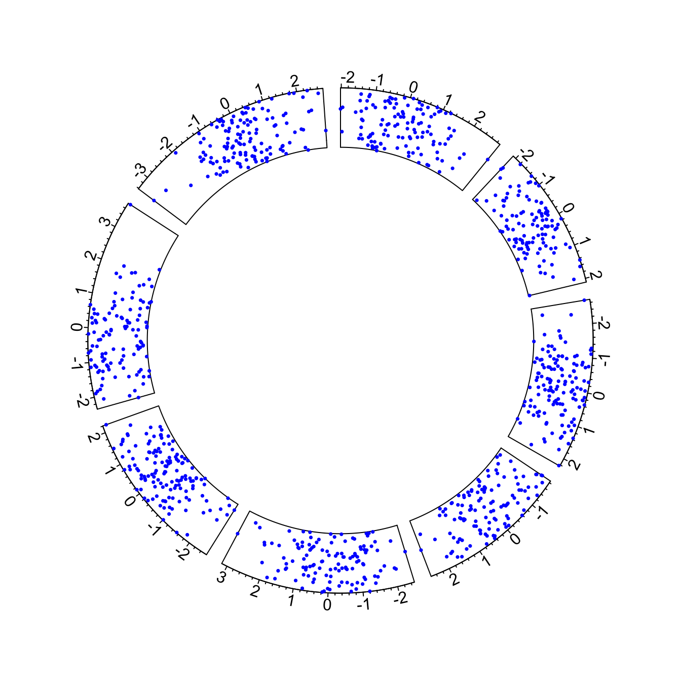
Circular plots are composed by several regions (8 here), each
representing a level of a factor. Three steps are required to build a
circular plot:
-
Step 1: Initialize the chart with
circos.initialize(). Provide the factor vector, and the numeric values to use for the X axis. The circle will be split in as many zone as the number of levels present in your factor. Each region will be as long as the coresponding x axis. -
Step2: Build the regions with
circos.trackPlotRegion(). You have to specify the factors once again, and tell what to use for the Y axis if needed. -
Step3: Add a chart in each region. Here
circos.trackPoints()is used to build a scatterplot. See chart #226 for other chart types.
# Upload library
library(circlize)

# Create data
data = data.frame(
    factor = sample(letters[1:8], 1000, replace = TRUE),
    x = rnorm(1000),
    y = runif(1000)
    )

# Step1: Initialise the chart giving factor and x-axis.
circos.initialize( factors=data$factor, x=data$x )

# Step 2: Build the regions.
circos.trackPlotRegion(factors = data$factor, y = data$y, panel.fun = function(x, y) {
    circos.axis()
    })

# Step 3: Add points
circos.trackPoints(data$factor, data$x, data$y, col = "blue", pch = 16, cex = 0.5) 