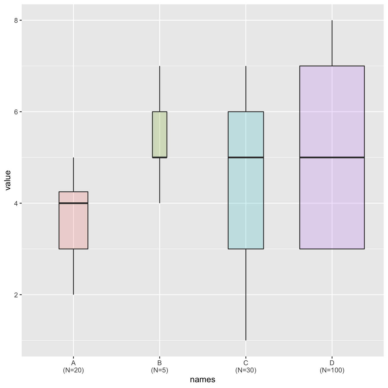
Grouped boxplot
Boxplot are often critized for hiding the underlying distribution of each category. Since individual data points are hidden, it is also impossible to know what sample size is available for each category.
In this example, box widths are proportional to sample size thanks
to the varwidth option. On top of that, the exact
sample size is added to the X axis labels for more accuracy.

# library
library(ggplot2)

# create data
names <- c(rep("A", 20) , rep("B", 5) , rep("C", 30), rep("D", 100))
value <- c( sample(2:5, 20 , replace=T) , sample(4:10, 5 , replace=T), sample(1:7, 30 , replace=T), sample(3:8, 100 , replace=T) )
data <- data.frame(names,value)

# prepare a special xlab with the number of obs for each group
my_xlab <- paste(levels(data$names),"\n(N=",table(data$names),")",sep="")

# plot
ggplot(data, aes(x=names, y=value, fill=names)) +
    geom_boxplot(varwidth = TRUE, alpha=0.2) +
    theme(legend.position="none") +
    scale_x_discrete(labels=my_xlab)


