A graph by Matt Asher showing probability function in a data art fashion.
This graph comes from the probability and statistics blog of Matt Asher Thanks for this contribution !
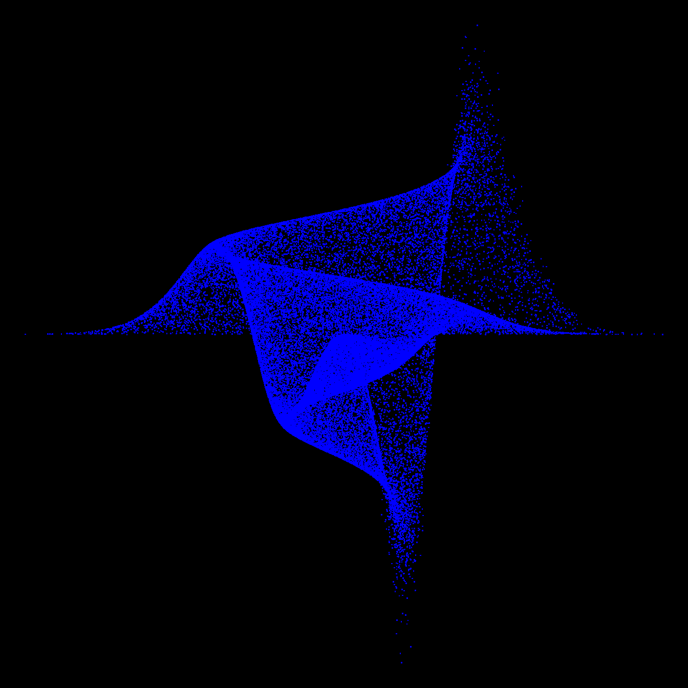
moxbuller = function(n) { u = runif(n) v = runif(n) x = cos(2*pi*u)*sqrt(-2*log(v)) y = sin(2*pi*v)*sqrt(-2*log(u)) r = list(x=x, y=y) return(r) } r = moxbuller(50000) par(bg="black") par(mar=c(0,0,0,0)) plot(r$x,r$y, pch=".", col="blue", cex=1.2)
Related chart types
This document is a work by Yan Holtz. Any feedback is highly encouraged. You can fill an issue on Github, drop me a message on Twitter, or send an email pasting yan.holtz.data with gmail.com.