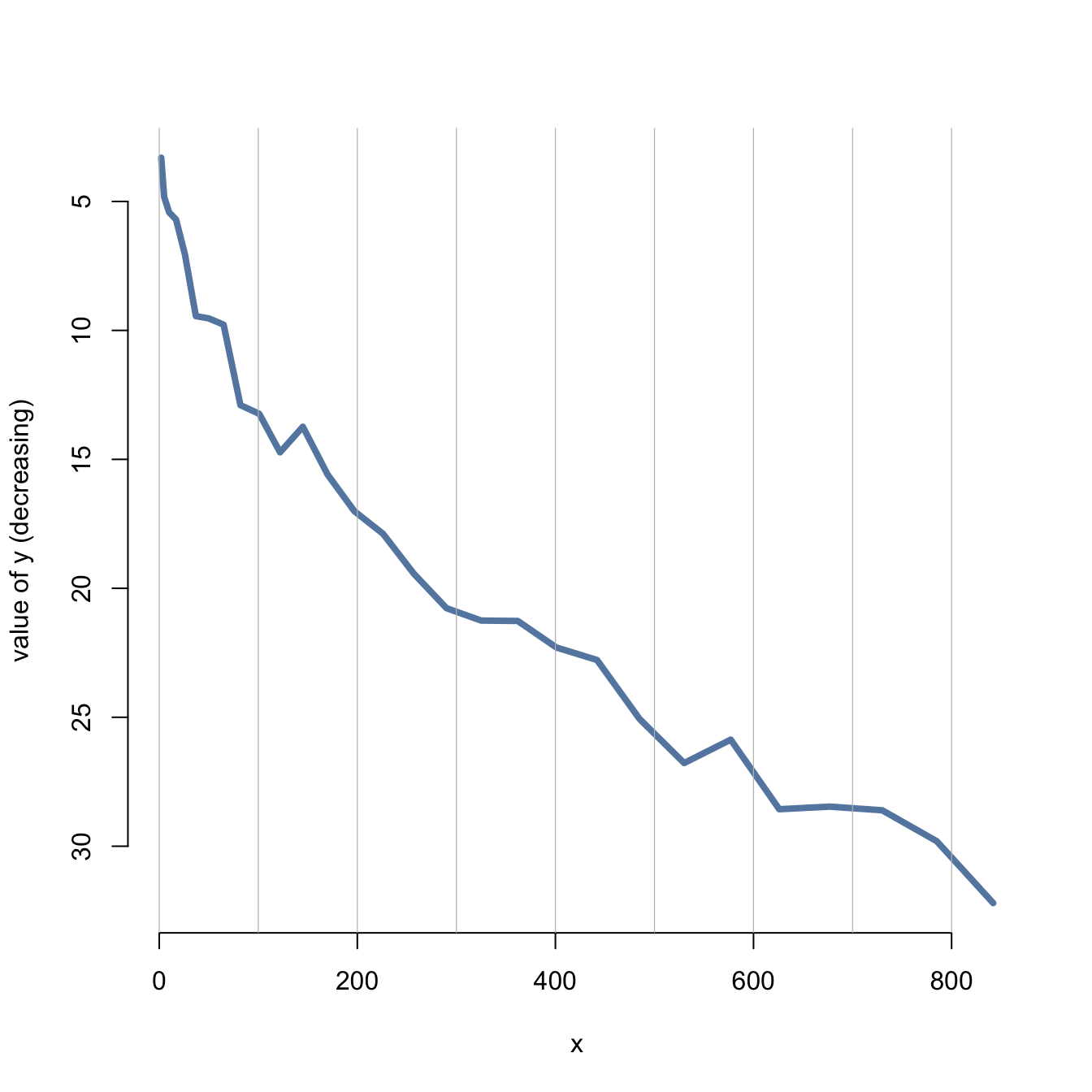
It is a common need in dataviz to flip the Y axis upside down. In
base R this is pretty easy to do: you just have to reverse the
values of the ylim argument.
This can be done using this statement: rev(range(y))
Note: be carefull, do not build a counter-iintuitive chart

# Create data
x <- seq(1,29)^2+runif(29,0.98)
y <- abs(seq(1,29)+4*runif(29,0.4))

# Make the plotwith ylim in reverse
plot(y~x , ylim = rev(range(y)) ,
     lwd=4 , type="l" , bty="n" , ylab="value of y (decreasing)" , col=rgb(0.2,0.4,0.6,0.8) )

#Add the grey lines
abline(v=seq(0,900,100) , col="grey" , lwd=0.6)


