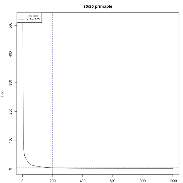
There are far more ordinary people (say, 80 percent) than extraordinary people (say, 20 percent); this is often characterized by the 80/20 principle, based on the observation made by the Italian economist Vilfredo Pareto in 1906 that 80% of land in Italy was owned by 20% of the population. A histogram of the data values for these phenomena would reveal a right-skewed or heavy-tailed distribution. How to map the data with the heavy-tailed distribution?
Abstract
This vignette discusses the implementation of the “Head/tail breaks” style (Jiang (2013)) on the classIntervals function of the classInt package. A step-by-step example is presented in order to clarify the method. A case study using spData::afcon is also included, making use of other additional packages as sf.
Introduction
The Head/tail breaks, sometimes referred as ht-index (Jiang and Yin (2013)), is a classification scheme introduced by Jiang (2013) in order to find groupings or hierarchy for data with a heavy-tailed distribution.
Heavy-tailed distributions are heavily right skewed, with a minority of large values in the head and a majority of small values in the tail. This imbalance between the head and tail, or between many small values and a few large values, can be expressed as “far more small things than large things”.
Heavy tailed distributions are commonly characterized by a power law, a lognormal or an exponential function. Nature, society, finance (Vasicek (2002)) and our daily lives are full of rare and extreme events, which are termed “black swan events” (Taleb (2008)). This line of thinking provides a good reason to reverse our thinking by focusing on low-frequency events.
library(classInt)
# 1. Characterization of heavy-tail distributions----
set.seed(1234)
# Pareto distribution a=1 b=1.161 n=1000
sample_par <- 1 / (1 - runif(1000))^(1 / 1.161)
opar <- par(no.readonly = TRUE)
par(mar = c(2, 4, 3, 1), cex = 0.8)
plot(
sort(sample_par, decreasing = TRUE),
type = "l",
ylab = "F(x)",
xlab = "",
main = "80/20 principle"
)
abline(
h = quantile(sample_par, .8),
lty = 2,
col = "red3"
)
abline(
v = 0.2 * length(sample_par),
lty = 2,
col = "darkblue"
)
legend(
"topleft",
legend = c("F(x): p80", "x: Top 20%"),
col = c("red3", "darkblue"),
lty = 2,
cex = 0.8
)
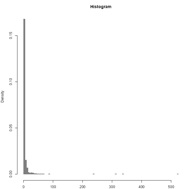
hist(
sample_par,
n = 100,
xlab = "",
main = "Histogram",
col = "grey50",
border = NA,
probability = TRUE
)
par(opar)
Breaking method
The method itself consists on a four-step process performed recursively until a stopping condition is satisfied. Given a vector of values \(v = (a_1, a_2, ..., a_n)\) the process can be described as follows:
- On each iteration, compute \(\mu = \sum_{i=1}^{n} a_i \:\:\: \forall \: a_i \in v\).
- Break \(v\) into the \(tail\) and the \(head\): \(tail = \{ a_x \in v | a_x \lt \mu \}\) \(head = \{ a_x \in v | a_x \gt \mu \}\).
- Assess if the proportion of \(head\) over \(v\) is lower or equal than a given threshold: \(\frac{|head|}{|v|} \le thresold\)
- If 3 is
TRUE, repeat 1 to 3 until the condition isFALSEor no more partitions are possible (i.e. \(head\) has less than two elements).
It is important to note that, at the beginning of a new iteration, \(v\) is replaced by \(head\). The underlying hypothesis is to create partitions until the head and the tail are balanced in terms of distribution.So the stopping criteria is satisfied when the last head and the last tail are evenly balanced.
In terms of threshold, Jiang, Liu, and Jia (2013) set 40% as a good approximation, meaning that if the \(head\) contains more than 40% of the observations the distribution is not considered heavy-tailed.
The final breaks are the vector of consecutive \(\mu\):
\[breaks = (\mu_1, \mu_2, \mu_3, ..., \mu_n )\]Step by step example
We reproduce here the pseudo-code1 as per Jiang (2019):
Recursive function Head/tail Breaks:
 Rank the input data from the largest to the smallest
 Break the data into the head and the tail around the mean;
 // the head for those above the mean
 // the tail for those below the mean
 While (head <= 40%):
 Head/tail Breaks (head);
End Function
A step-by-step example in R (for illustrative purposes) has been developed:
opar <- par(no.readonly = TRUE)
par(mar = c(2, 2, 3, 1), cex = 0.8)
var <- sample_par
thr <- .4
brks <- c(min(var), max(var)) # Initialise with min and max

sum_table <- data.frame(
  iter = 0,
  mu = NA,
  prop = NA,
  n_var = NA,
  n_head = NA
)
# Pars for chart
limchart <- brks
# Iteration
for (i in 1:10) {
  mu <- mean(var)
  brks <- sort(c(brks, mu))
  head <- var[var > mu]
  prop <- length(head) / length(var)
  stopit <- prop < thr & length(head) > 1
  sum_table <- rbind(
    sum_table,
    c(i, mu, prop, length(var), length(head))
  )
  hist(
    var,
    main = paste0("Iter ", i),
    breaks = 50,
    col = "grey50",
    border = NA,
    xlab = "",
    xlim = limchart
  )
  abline(v = mu, col = "red3", lty = 2)
  ylabel <- max(hist(var, breaks = 50, plot = FALSE)$counts)
  labelplot <- paste0("PropHead: ", round(prop * 100, 2), "%")
  text(
    x = mu,
    y = ylabel,
    labels = labelplot,
    cex = 0.8,
    pos = 4
  )
  legend(
    "right",
    legend = paste0("mu", i),
    col = c("red3"),
    lty = 2,
    cex = 0.8
  )
  if (isFALSE(stopit)) {
    break
  }
  var <- head
}
par(opar)
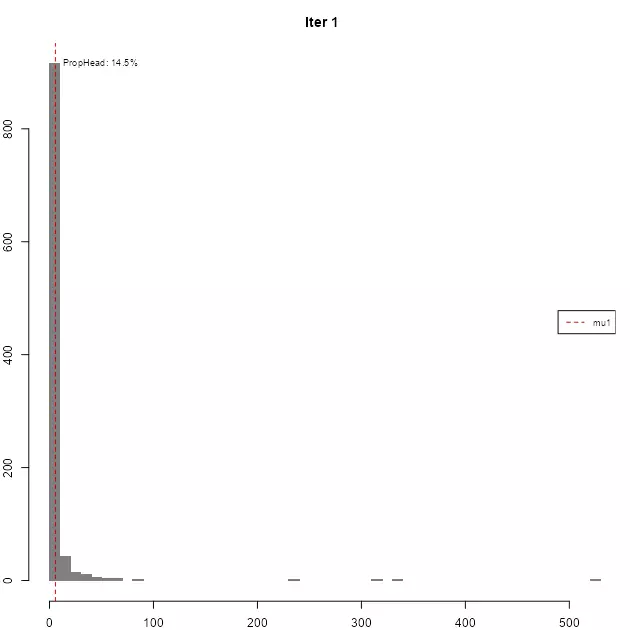
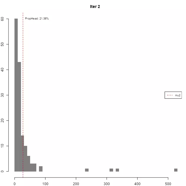
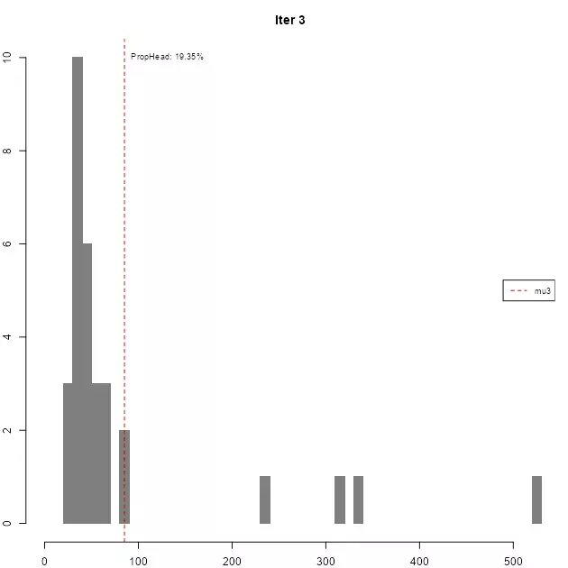
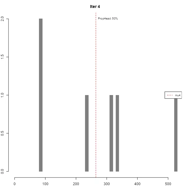
As it can be seen, in each iteration the resulting head gradually loses the high-tail property, until the stopping condition is met.
| iter | mu | prop | n_var | n_head |
|---|---|---|---|---|
| 1 | 5.6755 | 14.5% | 1000 | 145 |
| 2 | 27.2369 | 21.38% | 145 | 31 |
| 3 | 85.1766 | 19.35% | 31 | 6 |
| 4 | 264.7126 | 50% | 6 | 3 |
The resulting breaks are then defined as breaks = c(min(var), mu1, mu2, ..., mu_n, max(var)).
Implementation on classInt package
The implementation in the classIntervals function should replicate the results:
ht_sample_par <- classIntervals(sample_par, style = "headtails")
brks == ht_sample_par$brks
## [1] TRUE TRUE TRUE TRUE TRUE TRUE
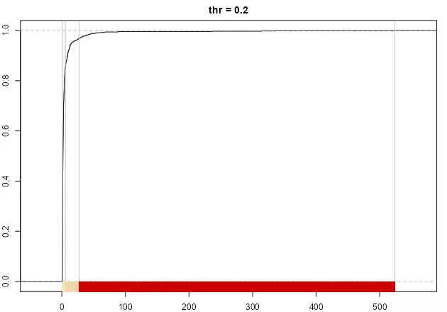
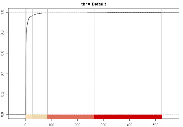
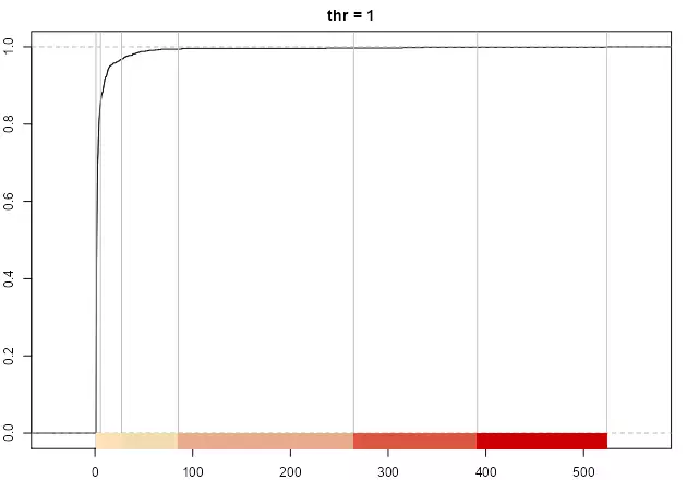
As stated in Jiang (2013), the number of breaks is naturally determined, however the thr parameter could help to adjust the final number. A lower value on thr would provide less breaks while a larger thr would increase the number, if the underlying distribution follows the “far more small things than large things” principle.
opar <- par(no.readonly = TRUE)
par(mar = c(2, 2, 2, 1), cex = 0.8)

pal1 <- c("wheat1", "wheat2", "red3")
# Minimum: single break
print(paste("number of breaks", length(classIntervals(sample_par, style = "headtails", thr = 0)$brks - 1)))
plot(
  classIntervals(sample_par, style = "headtails", thr = 0),
  pal = pal1,
  main = "thr = 0"
)

# Two breaks
print(paste("number of breaks", length(classIntervals(sample_par, style = "headtails", thr = 0.2)$brks - 1)))
plot(
  classIntervals(sample_par, style = "headtails", thr = 0.2),
  pal = pal1,
  main = "thr = 0.2"
)

# Default breaks: 0.4
print(paste("number of breaks", length(classIntervals(sample_par, style = "headtails")$brks - 1)))
plot(classIntervals(sample_par, style = "headtails"),
  pal = pal1,
  main = "thr = Default"
)

# Maximum breaks
print(paste("number of breaks", length(classIntervals(sample_par, style = "headtails", thr = 1)$brks - 1)))
plot(
  classIntervals(sample_par, style = "headtails", thr = 1),
  pal = pal1,
  main = "thr = 1"
)
par(opar)
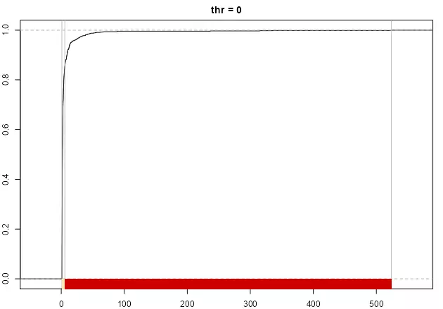
The method always returns at least one break, corresponding to mean(var).
Case study
Jiang (2013) states that "the new classification scheme is more natural than the natural breaks in finding the groupings or hierarchy for data with a heavy-tailed distribution." (p. 482), referring to Jenks’ natural breaks method. In this case study we would compare headtails vs. fisher, that is the alias for the Fisher-Jenks algorithm and it is always preferred to the jenks style (see ?classIntervals). For this example we will use the afcon dataset from spData package, plus some additional spatial information in order to create the data visualization.
library(spData)
data(afcon, package = "spData")
Let’s have a look to the Top 10 values and the distribution of the variable totcon (index of total conflict 1966-78):
# Top10
knitr::kable(head(afcon[order(afcon$totcon, decreasing = TRUE), c("name", "totcon")], 10))

opar <- par(no.readonly = TRUE)
par(mar = c(4, 4, 3, 1), cex = 0.8)
hist(afcon$totcon,
  n = 20,
  main = "Histogram",
  xlab = "totcon",
  col = "grey50",
  border = NA,
)
plot(
  density(afcon$totcon),
  main = "Distribution",
  xlab = "totcon",
)
par(opar)
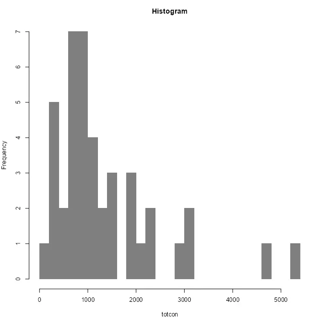
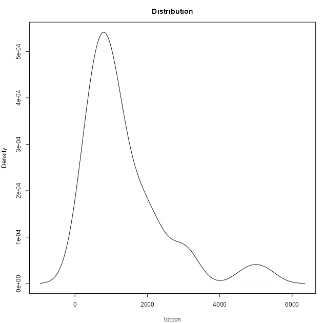
The data shows that EG and SU data present a clear hierarchy over the rest of values. As per the histogram, we can confirm a heavy-tailed distribution and therefore the “far more small things than large things” principle.
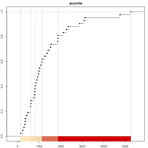
As a testing proof, on top of headtails and fisher we would use also quantile to have a broader view on the different breaking styles. As quantile is a position-based metric, it doesn’t account for the magnitude of F(x) (hierarchy), so the breaks are solely defined by the position of x on the distribution.
Applying the three aforementioned methods to break the data:
brks_ht <- classIntervals(afcon$totcon, style = "headtails")
print(brks_ht)
# Same number of classes for "fisher"
nclass <- length(brks_ht$brks) - 1
brks_fisher <- classIntervals(afcon$totcon,
  style = "fisher",
  n = nclass
)
print(brks_fisher)

brks_quantile <- classIntervals(afcon$totcon,
  style = "quantile",
  n = nclass
)
print(brks_quantile)

pal1 <- c("wheat1", "wheat2", "red3")
opar <- par(no.readonly = TRUE)
par(mar = c(2, 2, 2, 1), cex = 0.8)
plot(brks_ht, pal = pal1, main = "headtails")
plot(brks_fisher, pal = pal1, main = "fisher")
plot(brks_quantile, pal = pal1, main = "quantile")
par(opar)
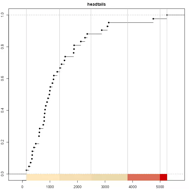
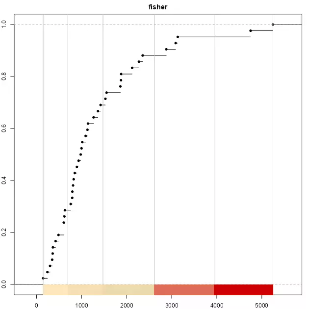
It is observed that the top three classes of headtails enclose 5 observations, whereas fisher includes 13 observations. In terms of classification, headtails breaks focuses more on extreme values.
The next plot compares a continuous distribution of totcon re-escalated to a range of [1,nclass] versus the distribution across breaks for each style. The continuous distribution has been offset by -0.5 in order to align the continuous and the discrete distributions.
# Helper function to reescale values
help_reescale <- function(x, min = 1, max = 10) {
  r <- (x - min(x)) / (max(x) - min(x))
  r <- r * (max - min) + min
  return(r)
}
afcon$ecdf_class <- help_reescale(afcon$totcon,
  min = 1 - 0.5,
  max = nclass - 0.5
)
afcon$ht_breaks <- cut(afcon$totcon,
  brks_ht$brks,
  labels = FALSE,
  include.lowest = TRUE
)

afcon$fisher_breaks <- cut(afcon$totcon,
  brks_fisher$brks,
  labels = FALSE,
  include.lowest = TRUE
)

afcon$quantile_break <- cut(afcon$totcon,
  brks_quantile$brks,
  labels = FALSE,
  include.lowest = TRUE
)

opar <- par(no.readonly = TRUE)
par(mar = c(4, 4, 1, 1), cex = 0.8)
plot(
  density(afcon$ecdf_class),
  ylim = c(0, 0.8),
  lwd = 2,
  main = "",
  xlab = "class"
)
lines(density(afcon$ht_breaks), col = "darkblue", lty = 2)
lines(density(afcon$fisher_breaks), col = "limegreen", lty = 2)
lines(density(afcon$quantile_break),
  col = "red3",
  lty = 2
)
legend("topright",
  legend = c(
    "Continuous", "headtails",
    "fisher", "quantile"
  ),
  col = c("black", "darkblue", "limegreen", "red3"),
  lwd = c(2, 1, 1, 1),
  lty = c(1, 2, 2, 2),
  cex = 0.8
)
par(opar)
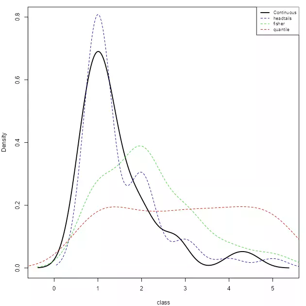
It can be observed that the distribution of headtails breaks is also heavy-tailed, and closer to the original distribution. On the other extreme, “quantile” provides a quasi-uniform distribution, ignoring the totcon hierarchy
In terms of data visualization, we compare here the final map using the techniques mentioned above. On this plotting exercise, a choropleth map would be created.
Additionally, a high-granularity choropleth map is created with a greater number of classes, in order to compare and contrast the actual grouping options against a more granular approach.
library(sf)
library(giscoR)
library(cartography)

opar <- par(no.readonly = TRUE)

par(
  mfrow = c(2, 2),
  mar = c(1, 1, 1, 1),
  bg = "white"
)
africa <- gisco_get_countries(resolution = 60, region = "Africa", epsg = 3857)

afcon.sf <- st_as_sf(afcon, crs = 4326, coords = c("x", "y"))
afcon.sf <- st_transform(afcon.sf, st_crs(africa))
# afcon.sf <- st_join(africa[, "admin"], afcon.sf)
afcon.sf <- afcon.sf[order(afcon.sf$totcon), ]


# High granularity map
plot(st_geometry(africa), col = "grey80", border = NA)
propSymbolsLayer(
  afcon.sf,
  var = "totcon",
  inches = 0.2,
  col = adjustcolor("grey10", alpha.f = 0.5),
  border = NA
)
title(main = "High granularity map")

# Quantile

pal <- hcl.colors(5, palette = "inferno", alpha = 0.6)
plot(st_geometry(africa), col = "grey80", border = NA)
propSymbolsTypoLayer(
  afcon.sf,
  var = "totcon",
  inches = 0.2,
  col = pal,
  border = NA,
  legend.var.pos = "n",
  legend.var2.pos = "bottomleft",
  var2 = "quantile_break"
)
title(main = "Quantile")


# Fisher
plot(st_geometry(africa), col = "grey80", border = NA)
propSymbolsTypoLayer(
  afcon.sf,
  var = "totcon",
  inches = 0.2,
  col = pal,
  border = NA,
  legend.var.pos = "n",
  legend.var2.pos = "bottomleft",
  var2 = "fisher_breaks"
)
title(main = "Fisher")

# Head Tails
plot(st_geometry(africa), col = "grey80", border = NA)
propSymbolsTypoLayer(
  afcon.sf,
  var = "totcon",
  inches = 0.2,
  col = pal,
  border = NA,
  legend.var.pos = "n",
  legend.var2.pos = "bottomleft",
  var2 = "ht_breaks"
)
title(main = "Head Tails")
par(opar)
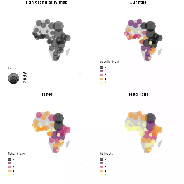
As per the results, headtails seems to provide a better understanding of the most extreme values when the result is compared against the high-granularity plot. The quantile style, as expected, just provides a clustering without taking into account the real hierarchy. The fisher plot is in-between of these two interpretations.
It is also important to note that headtails and fisher reveal different information that can be useful depending of the context. While headtails highlights the outliers, it fails on providing a good clustering on the tail, while fisher seems to reflect better these patterns. This can be observed on the values of Western Africa and the Niger River Basin, where headtails doesn’t highlight any special cluster of conflicts, fisher suggests a potential cluster, aligned with the high-granularity plot. This can be confirmed on the histogram generated previously, where a concentration of totcon around 1,000 is visible.
References
Jiang, Bin. 2013. "Head/Tail Breaks: A New Classification Scheme for Data with a Heavy-Tailed Distribution." The Professional Geographer 65 (3): 482–94. DOI.
———. 2019. "A Recursive Definition of Goodness of Space for Bridging the Concepts of Space and Place for Sustainability." Sustainability 11 (15): 4091. DOI.
Jiang, Bin, Xintao Liu, and Tao Jia. 2013. "Scaling of Geographic Space as a Universal Rule for Map Generalization." Annals of the Association of American Geographers 103 (4): 844–55. DOI.
Jiang, Bin, and Junjun Yin. 2013. "Ht-Index for Quantifying the Fractal or Scaling Structure of Geographic Features." Annals of the Association of American Geographers 104 (3): 530–40. DOI.
Taleb, Nassim Nicholas. 2008. The Black Swan: The Impact of the Highly Improbable. 1st ed. London: Random House.
Vasicek, Oldrich. 2002. "Loan Portfolio Value." Risk, December, 160–62.
-
The method implemented on
classIntcorresponds to head/tails 1.0 as named on this article. ↑