This post is dedicated to Dominic Royé, AKA \@dr_xeo
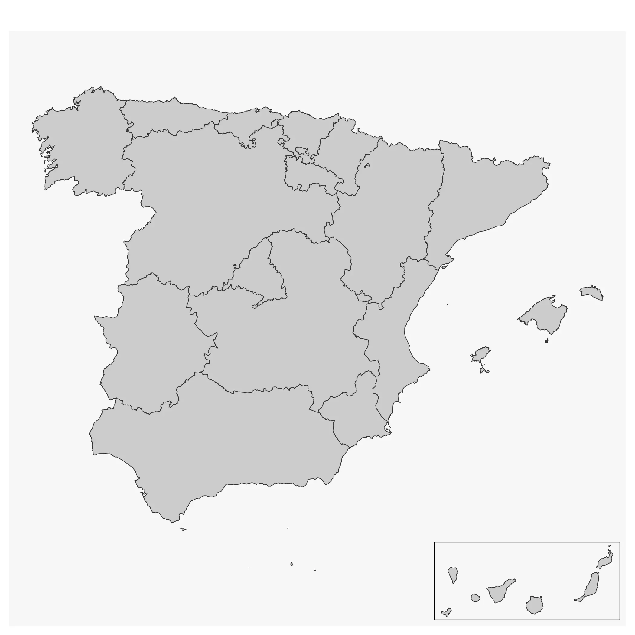
A common challenge when creating maps is how to include an inset map in your visualization. An inset map is nothing more than a smaller map usually included in a corner that may provide additional context to the overall map. It is also useful for representing spatial units that may form part of a country but whose geographical location would result in an imperfect visualization, or for including small units that would otherwise not be shown on the map.
I have already covered this
using the base plot() function,
but this time I show how to produce these insets using the ggplot2 and
tmap packages. In short: use the cowplot package.
Test case: Canary Islands as an inset
In this example, I create a map of Spain using mapSpain and an inset for the Canary Islands.
The “true” map of Spain is:
library(mapSpain)
library(sf)
library(ggplot2)
library(dplyr)

regions <- esp_get_ccaa(moveCAN = FALSE)

ggplot(regions) +
  geom_sf()
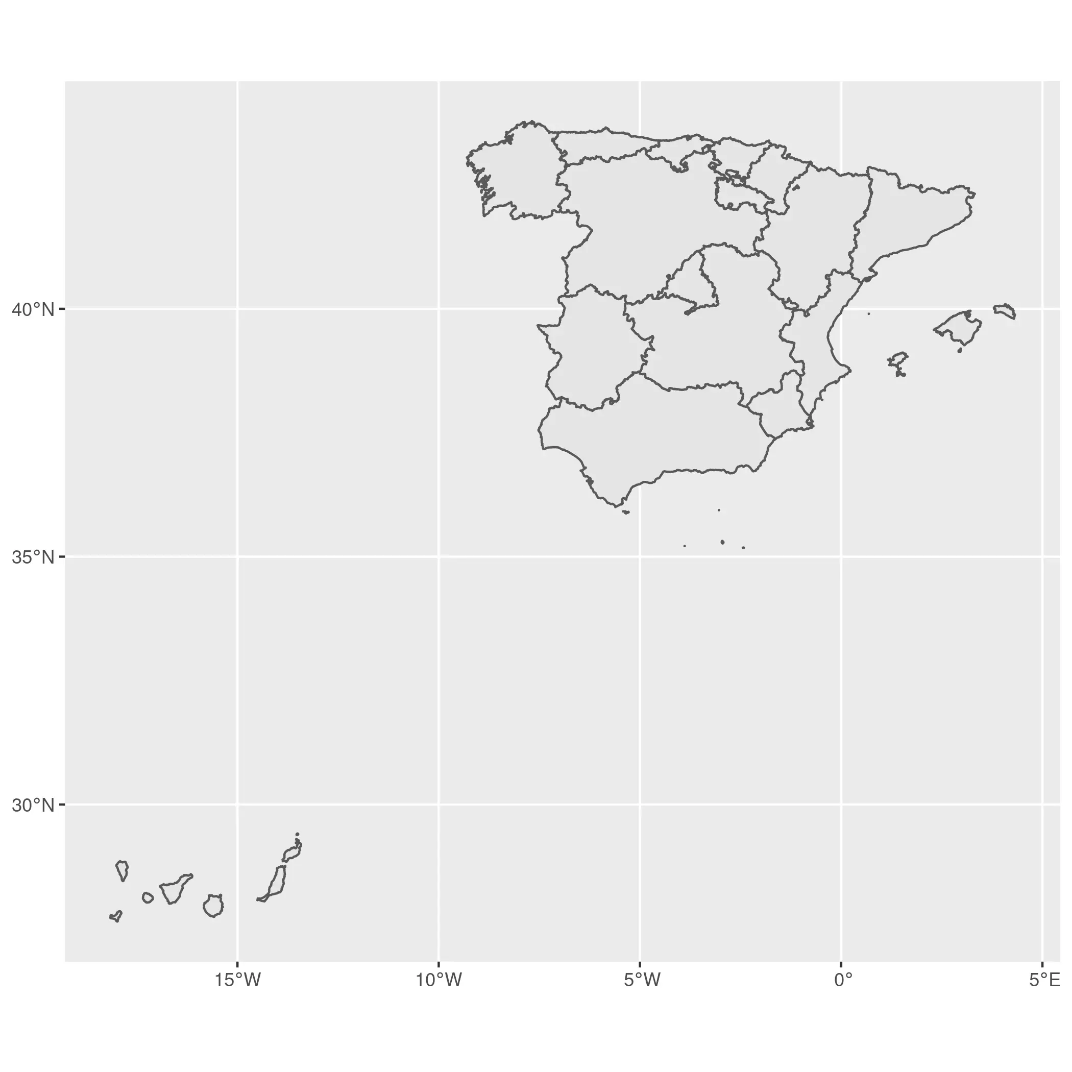
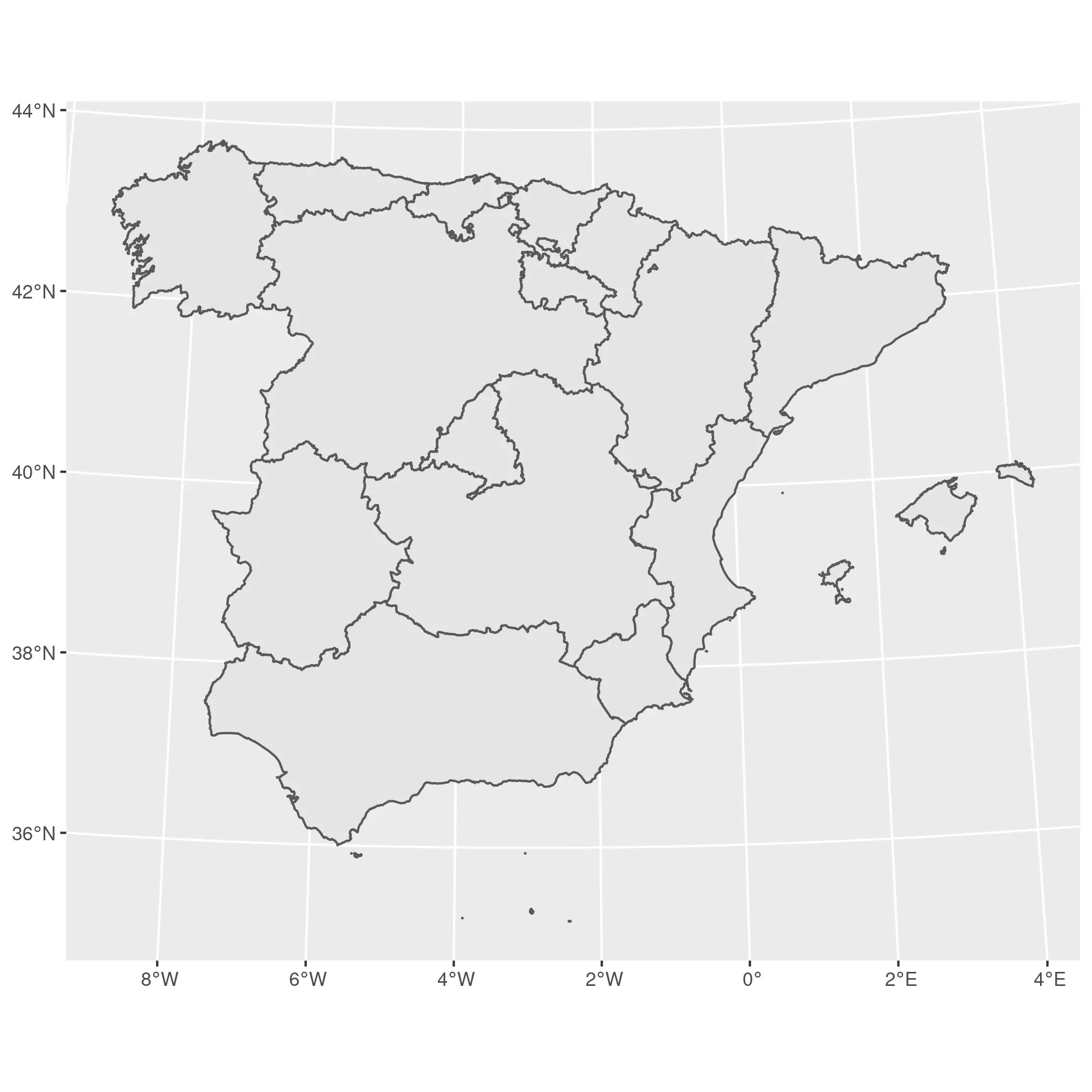
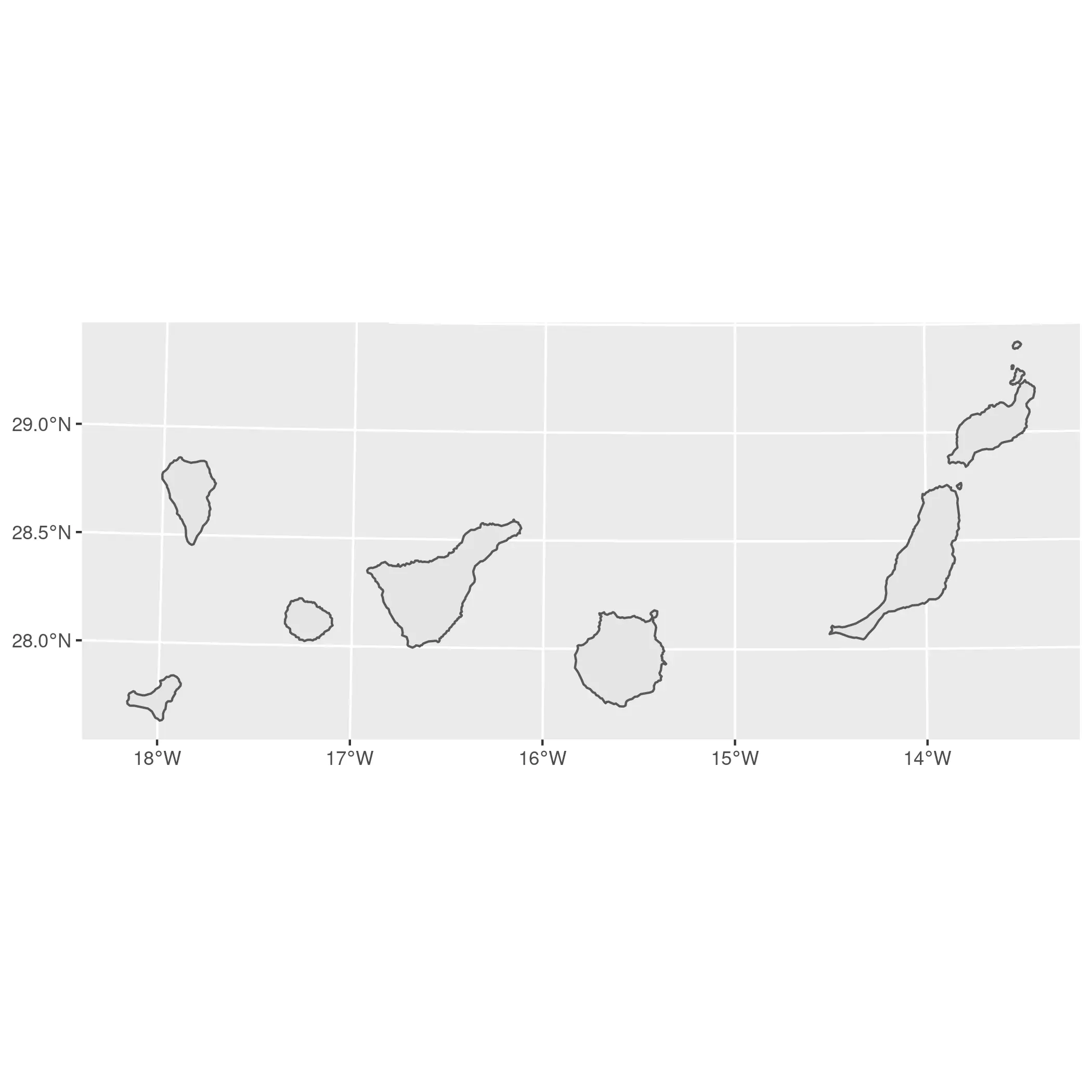
I use a different CRS for each part of Spain. In the case of mainland Spain, I use ETRS89 / UTM 30N (EPSG:25830) and for the Canary Islands I use REGCAN95 / UTM 28N (EPSG:4083).
main <- regions %>%
  filter(ccaa.shortname.es != "Canarias") %>%
  st_transform(25830)

ggplot(main) +
  geom_sf()
island <- regions %>%
  filter(ccaa.shortname.es == "Canarias") %>%
  st_transform(4083)

ggplot(island) +
  geom_sf()
So that was easy! Just a couple of maps using ggplot2. Let’s start mixing and matching!
On ggplot2
We have already created two quick maps with ggplot2. Now, to produce our map with insets we will:
-
Produce two plots: the main plot and the subplot, providing a minimal style. We will store them as
ggplotobjects. -
Combine both objects with cowplot.
# Main plot
main_gg <- ggplot(main) +
  geom_sf() +
  theme_void() +
  theme(
    plot.background = element_rect(fill = "grey85", colour = NA),
    # Add a bit of margin on the bottom left
    # We will place the inset there
    plot.margin = margin(l = 80, b = 80)
  )

# Sub plot
sub_gg <- ggplot(island) +
  geom_sf() +
  theme_void() +
  # Add a border to the inset
  theme(
    panel.border = element_rect(fill = NA, colour = "black"),
    plot.background = element_rect(fill = "grey95")
  )
We have our objects in place, and now is when the magic happens! With cowplot,
we can combine both maps into a single one. You may need to play a bit with the
parameters x, y, hjust and vjust of the subplot to improve the
placement:
library(cowplot)

ggdraw() +
  draw_plot(main_gg) +
  draw_plot(sub_gg,
    height = 0.2,
    x = -0.25,
    y = 0.08
  )
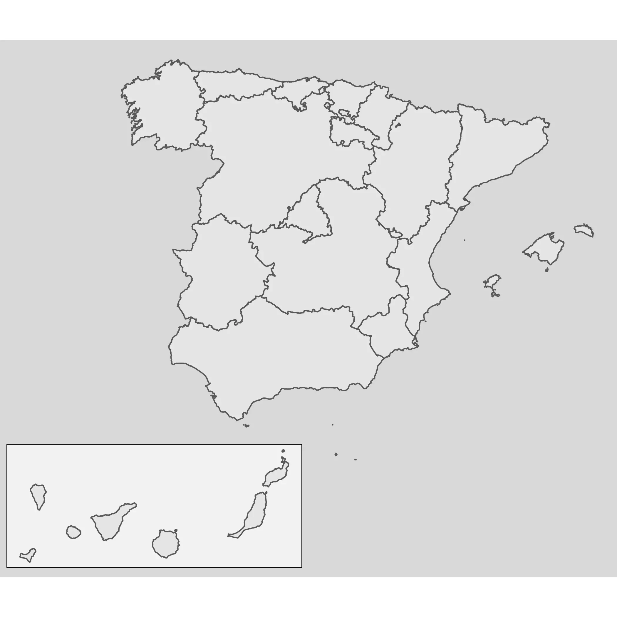
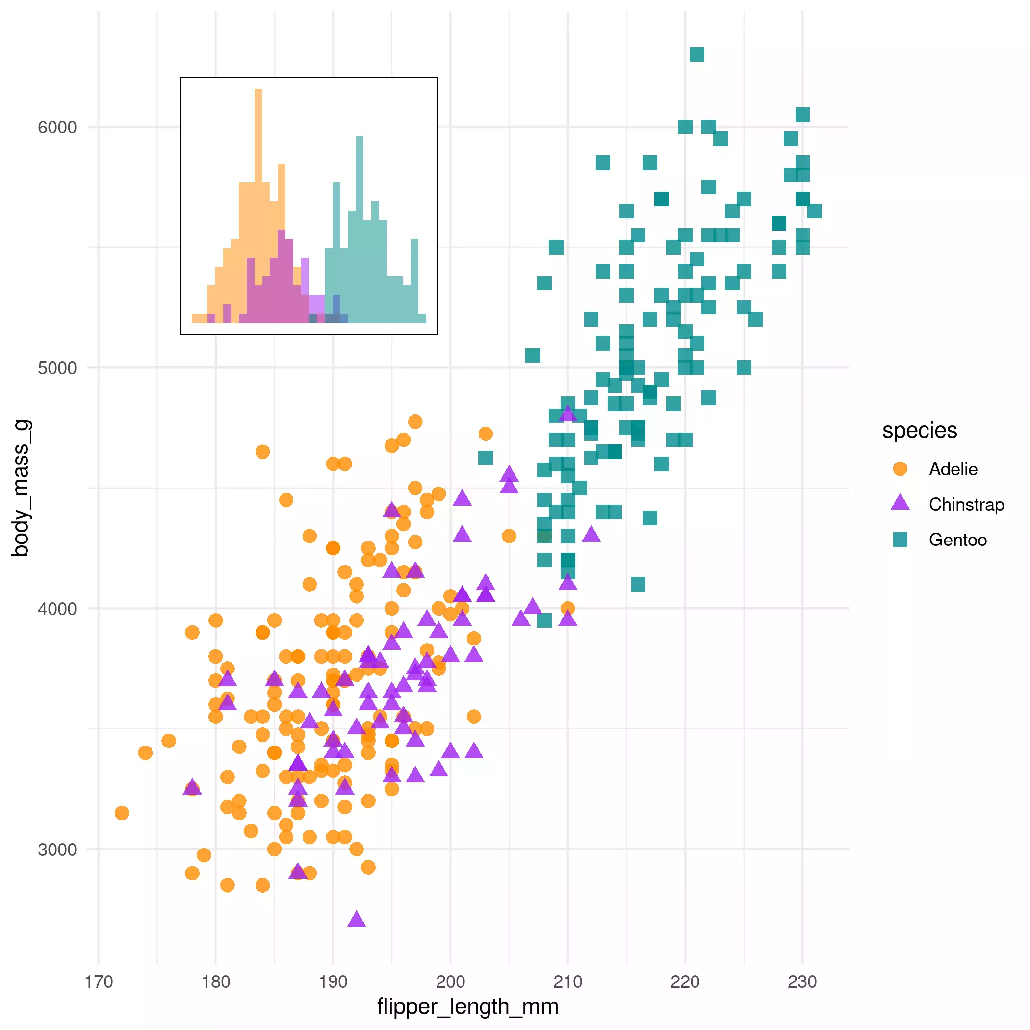
Note also that this approach is valid not only for maps, but for all types of plots produced by ggplot2, since this package is not specific to map objects:
# Combining non-spatial plots
library(palmerpenguins)

mass_flipper <- ggplot(
  data = penguins,
  aes(
    x = flipper_length_mm,
    y = body_mass_g
  )
) +
  geom_point(aes(
    color = species,
    shape = species
  ),
  size = 3,
  alpha = 0.8
  ) +
  theme_minimal() +
  scale_color_manual(values = c("darkorange", "purple", "cyan4"))

flipper_hist <- ggplot(data = penguins, aes(x = flipper_length_mm)) +
  geom_histogram(aes(fill = species),
    alpha = 0.5,
    position = "identity",
    show.legend = FALSE
  ) +
  scale_fill_manual(values = c("darkorange", "purple", "cyan4")) +
  theme_void() +
  theme(plot.background = element_rect(fill = "white"))


# Nonsense plot!
ggdraw() +
  draw_plot(mass_flipper) +
  draw_plot(flipper_hist,
    scale = 0.25,
    y = 0.3,
    x = -0.2
  )
On tmap
We can follow a similar approach with tmap. In version 3.x.x (there is a
new revamped version under development),
we can use tmap_grob() to
convert the tmap objects to the objects that cowplot can handle.
library(tmap)

main_tmap <- tm_shape(main) +
  tm_polygons() +
  tm_layout(
    inner.margins = c(.3, .3, 0, 0),
    frame = FALSE
  )


main_tmap <- tmap_grob(main_tmap)

sub_tmap <- tm_shape(island) +
  tm_polygons()

sub_tmap <- tmap_grob(sub_tmap)
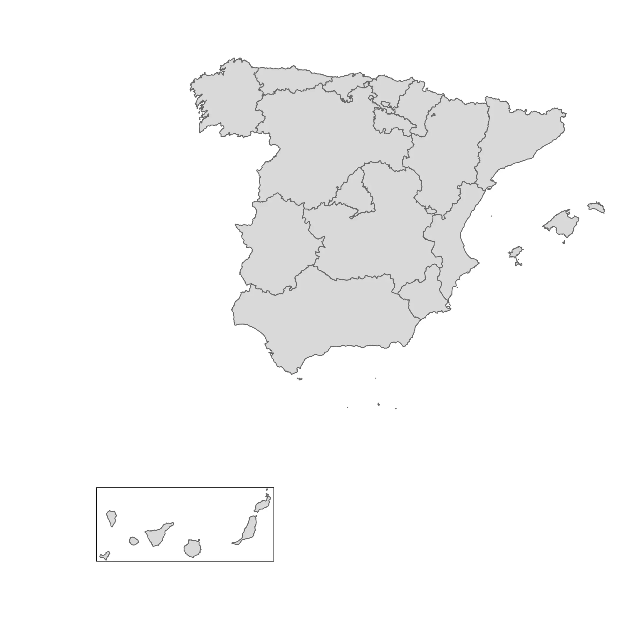
Once we have these new “grobs”, we can use the same approach as the one we applied to ggplot2 objects.
ggdraw() +
  draw_plot(main_tmap) +
  draw_plot(sub_tmap,
    height = 0.3,
    x = -0.2
  )
Update: On mapsf
Timotheé Giraud (AKA \@rgeomatic), the developer of mapsf, also shared how to create inset maps using that package:
library(mapsf)

mf_map(main)
mf_inset_on(island, pos = "bottomright", cex = .3)
mf_map(island)
box(lwd = .5)
mf_inset_off()