This is the second post of the series “Hillshade, colors and marginal plots with tidyterra”. In this post I would explore an approach for annotating marginal plots to a ggplot2 map of a SpatRaster, including information of the values by longitude and latitude. See the first post of the series here.
If you love watching classic movies, specially from the Hollywood’s Golden Age, you may recognize the following lyrics:
The rain in Spain stays mainly in the plain!
By George, she’s got it! By George, she’s got it!
Now, once again where does it rain? On the plain! On the plain!
And where’s that soggy plain? In Spain! In Spain!
The rain in Spain stays mainly in the plain!
The rain in Spain stays mainly in the plain!
This hard statement is made on My Fair Lady (1964) by Audrey Hepburn, Rex Harrison and Stanley Holloway. But as a Spaniard I can tell it is completely false.
The rain in Spain stays mainly in the north, most notably in Galicia. And I can prove it!
On this post I would overlay a SpatRaster showing average precipitation data with an extra set of plots on the margin to identify where the rain in Spain stays (mainly).
Libraries
On this post we would use the following libraries:
## Libraries

# Data manipulation
library(terra)
library(tidyterra)
library(dplyr)

# Get the data
library(geodata)
library(mapSpain)

# Plotting
library(ggplot2)
library(scales)
library(cowplot)
library(colorspace)
The plain in Spain
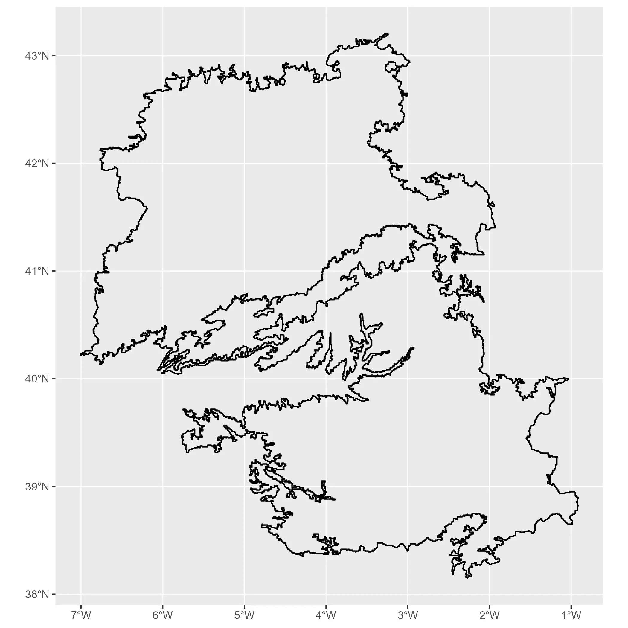
Well, the plain (or as we name it La Meseta Central) covers a large area of the inner land of Spain, with an average altitude of 650 meters over the sea level.
I didn’t find any accurate spatial data file with the bounds of the plain, so for this case I would approximate it using a mixture of political borders (historically the Meseta is associated to Castile and Madrid) and elevation data to get a rough shape.
# Using mapSpain
the_plain <- esp_get_prov(
  c(
    "Madrid", "Castilla-La Mancha",
    "Extremadura", "Castilla y Leon",
    "Teruel"
  ),
  epsg = 4326, resolution = 1
) %>%
  mutate(the_plain = TRUE) %>%
  group_by(the_plain) %>%
  # Combine
  summarise() %>%
  # To terra, until this step was sf
  vect()

# Get altitude

# I use here a local directory to cache downloaded files on my PC.
# Modify this to your likes, e.g. using
# mydir <- tempdir()

mydir <- "~/R/mapslib/misc"


r_init <- elevation_30s("ESP", path = mydir)

# For better handling we set here the names
names(r_init) <- "alt"

# We don't want values lower than 0 on the raster
r <- r_init %>%
  mutate(alt = pmax(0, alt))


# Now intersect the raster and the vector and filter by range

exploded <- r %>%
  crop(the_plain, mask = TRUE) %>%
  # Let's define here a range of elevations
  filter(alt > 600 & alt < 1100) %>%
  drop_na() %>%
  as.polygons(dissolve = TRUE, na.rm = TRUE) %>%
  # Aggregate first
  aggregate() %>%
  # Explode vectors
  disagg() %>%
  # And fill holes
  fillHoles()


# Select biggest polygons (area bigger than 50 kms 2)
r_plain <- exploded %>%
  # Add area
  mutate(area = expanse(exploded)) %>%
  filter(area > 50000**2) %>%
  # And convert to lines
  as.lines()

autoplot(r_plain)
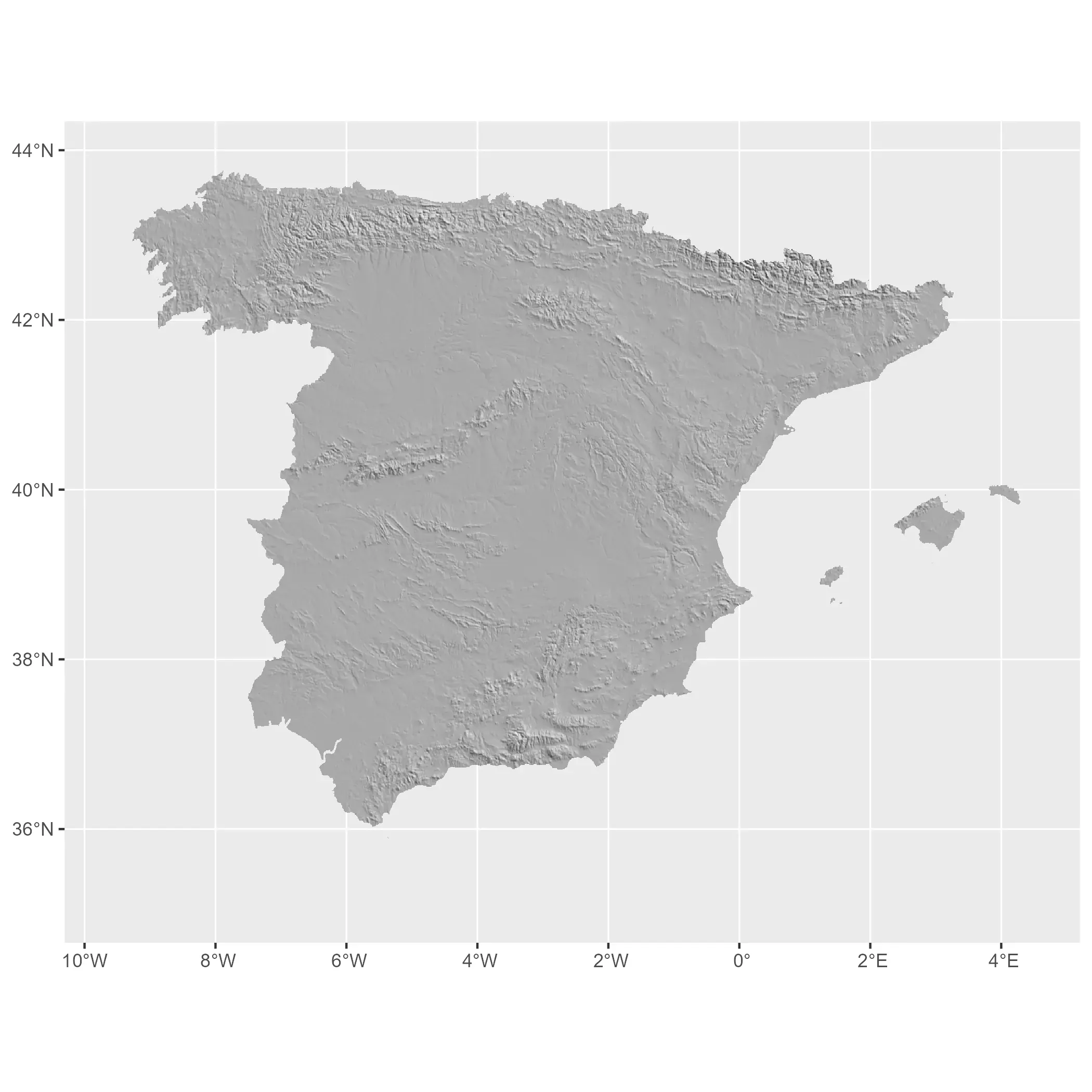
We can create a now plot similar to the one produced in the previous post to identify the plain. In first place I create a base layer with a representation of the hillshade, that we would reuse later:
# Creating hillshade

slope <- terrain(r, "slope", unit = "radians")
aspect <- terrain(r, "aspect", unit = "radians")
hill <- shade(slope, aspect, 30, 45)

# normalize names
names(hill) <- "shades"

# Hillshading palette
pal_greys <- hcl.colors(1000, "Grays")

# Index of color by cell
index <- hill %>%
  mutate(index_col = rescale(shades, to = c(1, length(pal_greys)))) %>%
  mutate(index_col = round(index_col)) %>%
  pull(index_col)


# Get cols
vector_cols <- pal_greys[index]

# Need to avoid resampling
# and dont use aes

# Base hill plot
hill_plot <- ggplot() +
  geom_spatraster(
    data = hill, fill = vector_cols, maxcell = Inf,
    alpha = 1
  )

hill_plot
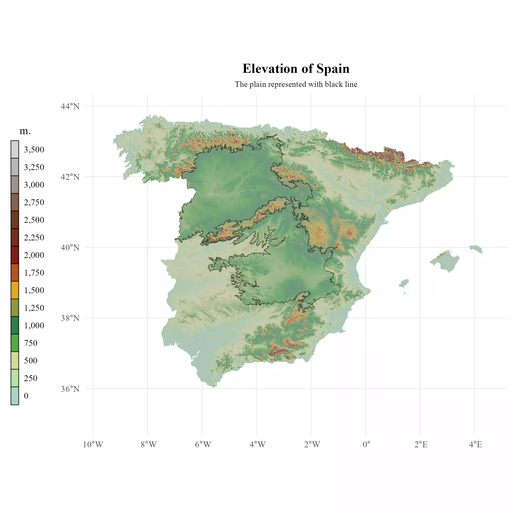
And finally we overlay the altitude and the outline of the plain in Spain.
# Overlaying and theming

# Aware of limits of the raster

alt_limits <- minmax(r) %>% as.vector()
# Round to lower and higher 500 integer with a min of 0
alt_limits <- pmax(
  c(floor(alt_limits[1] / 500), ceiling(alt_limits[2] / 500)) * 500,
  0
)

alt_limits
#> [1]    0 3500


base_text_size <- 9


plot_esp <- hill_plot +
  geom_spatraster(data = r, maxcell = Inf) +
  # Overlay the_plain
  geom_spatvector(
    data = r_plain,
    color = alpha("black", 0.7),
    linewidth = 0.15
  ) +
  scale_fill_hypso_tint_c(
    palette = "wiki-schwarzwald-cont",
    limits = alt_limits,
    alpha = 0.4,
    breaks = seq(0, 3500, 250),
    labels = label_comma()
  ) +
  guides(fill = guide_legend(
    title = "   m.",
    title.position = "top",
    keywidth = .5,
    reverse = TRUE,
    override.aes = list(alpha = 0.8)
  )) +
  labs(
    title = "Elevation of Spain",
    subtitle = "The plain represented with black line"
  ) +
  theme_minimal(base_family = "serif") +
  theme(
    plot.background = element_rect(fill = "white", color = "white"),
    plot.title = element_text(
      face = "bold", size = base_text_size * 1.5,
      hjust = 0.5
    ),
    plot.subtitle = element_text(
      size = base_text_size * 0.9,
      hjust = 0.5
    ),
    plot.caption = element_text(
      margin = margin(t = base_text_size * 3),
      face = "italic"
    ),
    legend.key = element_rect("grey50"),
    legend.text = element_text(hjust = 0),
    legend.position = "left"
  )

plot_esp
The rain in Spain
Let’s check now wheter the rain falls mainly in the plain or not. We use here
geodata::worldclim_country() to get the average precipitation by month from
WordClim:
# Precipitation of Spain

# Get precip data
precip <- geodata::worldclim_country("ESP", "prec", mydir)

precip
#> class       : SpatRaster
#> dimensions  : 1980, 2760, 12  (nrow, ncol, nlyr)
#> resolution  : 0.008333333, 0.008333333  (x, y)
#> extent      : -18.5, 4.5, 27.5, 44  (xmin, xmax, ymin, ymax)
#> coord. ref. : lon/lat WGS 84 (EPSG:4326)
#> source      : ESP_wc2.1_30s_prec.tif
#> names       : ESP_w~rec_1, ESP_w~rec_2, ESP_w~rec_3, ESP_w~rec_4, ESP_w~rec_5, ESP_w~rec_6, ...
#> min values  :           0,           1,           1,           0,           0,           0, ...
#> max values  :         296,         255,         199,         166,         181,         140, ...
We have now a SpatRaster with 12 layers representing the value of each month. So
we now just add the values by cell to get the annual average. Note that we also
need to normalize the SpatRaster to the projection, extent and resolution of our
hill object:
# Sum all layers
precip_avg <- sum(precip)
precip_avg
#> class : SpatRaster
#> dimensions : 1980, 2760, 1 (nrow, ncol, nlyr)
#> resolution : 0.008333333, 0.008333333 (x, y)
#> extent : -18.5, 4.5, 27.5, 44 (xmin, xmax, ymin, ymax)
#> coord. ref. : lon/lat WGS 84 (EPSG:4326)
#> source(s) : memory
#> name : sum
#> min value : 8
#> max value : 2055
compare_spatrasters(precip_avg, hill)
# Align raster using hill
precip_avg_mask <- precip_avg %>%
project(hill) %>%
crop(hill) %>%
mask(hill)
# Normalize
names(precip_avg_mask) <- "prec"
compare_spatrasters(precip_avg_mask, hill)
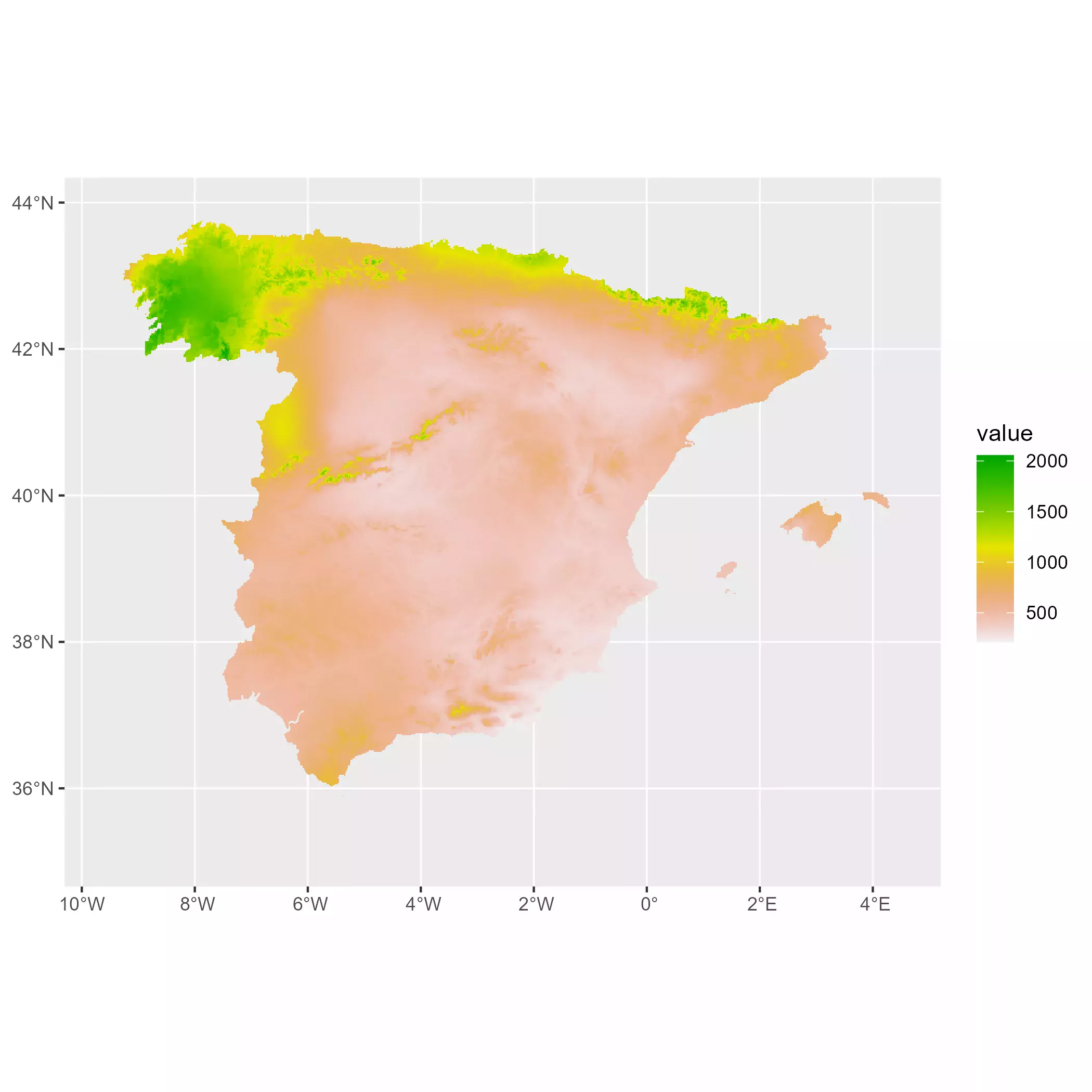
autoplot(precip_avg_mask)
Creating a modified palette
We can now start representing our precipitation map. I chose here to create a
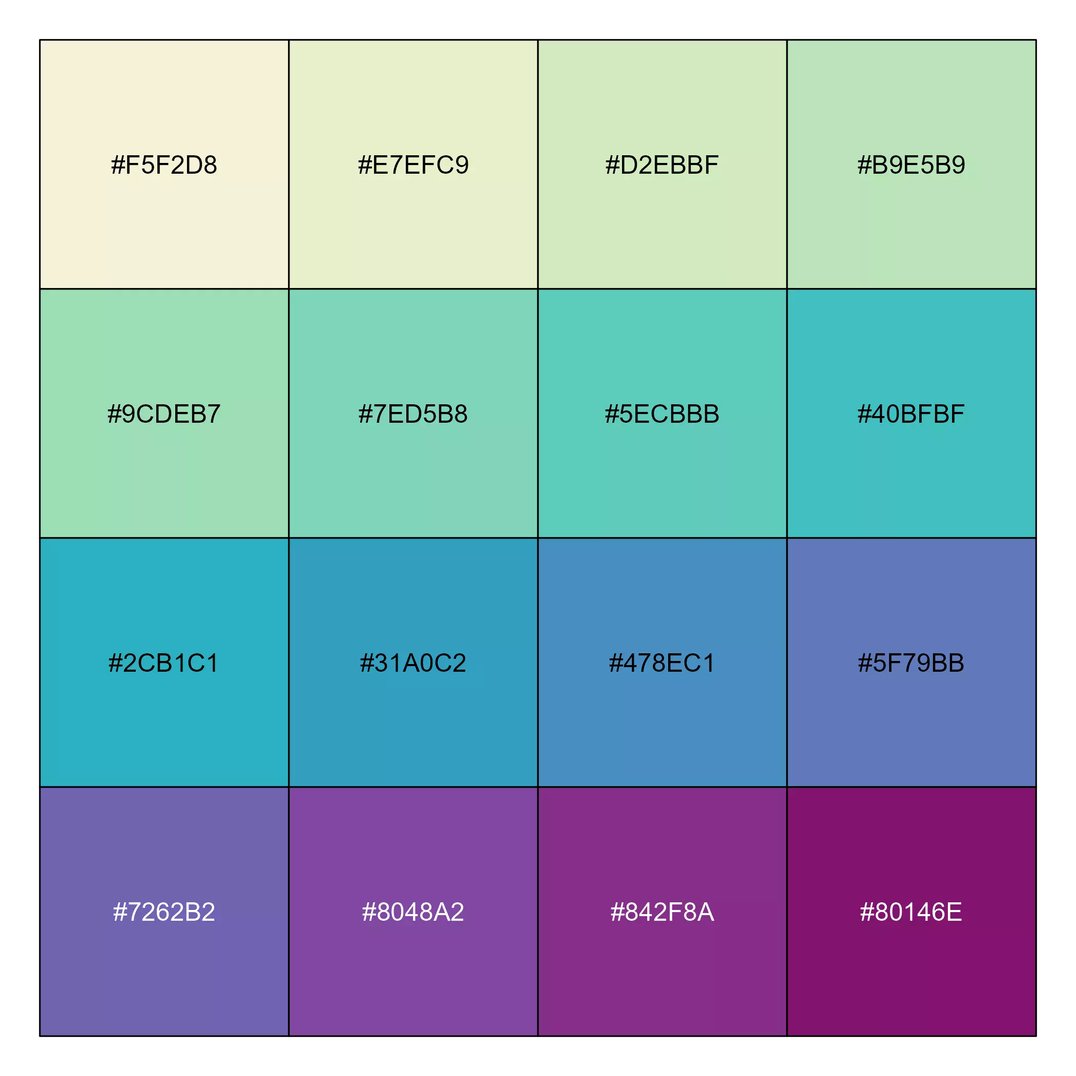
custom palette with colorspace to better highlight the differences:
mypal <- sequential_hcl(
  n = 16,
  h = c(320, 80),
  c = c(60, 65, 20),
  l = c(30, 95), power = c(0.7, 1.3),
  rev = TRUE
)

show_col(mypal)
And now we can create the final map showing if the rain in Spain stays mainly in the plain:
# Precipitation limits, rounded to 100
prec_limits <- floor(as.vector(minmax(precip_avg_mask)) / 100) * 100 + c(0, 100)


meteo_plot <- hill_plot +
  geom_spatraster(data = precip_avg_mask, maxcell = Inf) +
  # Overlay the_plain
  geom_spatvector(
    data = r_plain, color = alpha("black", 0.7),
    linewidth = .1
  ) +
  # This part is theming only
  scale_fill_gradientn(
    colours = alpha(mypal, 0.7),
    na.value = NA,
    labels = label_comma(),
    breaks = seq(0, prec_limits[2], 250)
  ) +
  guides(fill = guide_legend(
    direction = "horizontal",
    keyheight = .5,
    keywidth = 2,
    title.position = "right",
    label.position = "bottom",
    nrow = 1,
    family = "serif",
    title = " mm.",
    override.aes = list(alpha = 0.9)
  )) +
  labs(
    title = "Average yearly precipitation of Spain",
    subtitle = "The rain in Spain does not stay mainly in the plain"
  ) +
  theme_minimal(base_family = "serif") +
  theme(
    plot.background = element_rect(fill = "white", color = "white"),
    plot.title = element_text(
      face = "bold", size = base_text_size * 1.5,
      hjust = 0.5
    ),
    plot.subtitle = element_text(
      size = base_text_size,
      hjust = 0.5
    ),
    axis.text = element_text(size = base_text_size * 0.7, face = "italic"),
    legend.key = element_rect("grey50"),
    legend.position = "bottom",
    legend.title = element_text(size = base_text_size * .7),
    legend.text = element_text(size = base_text_size * .7),
    legend.spacing.x = unit(0, "pt")
  )


meteo_plot
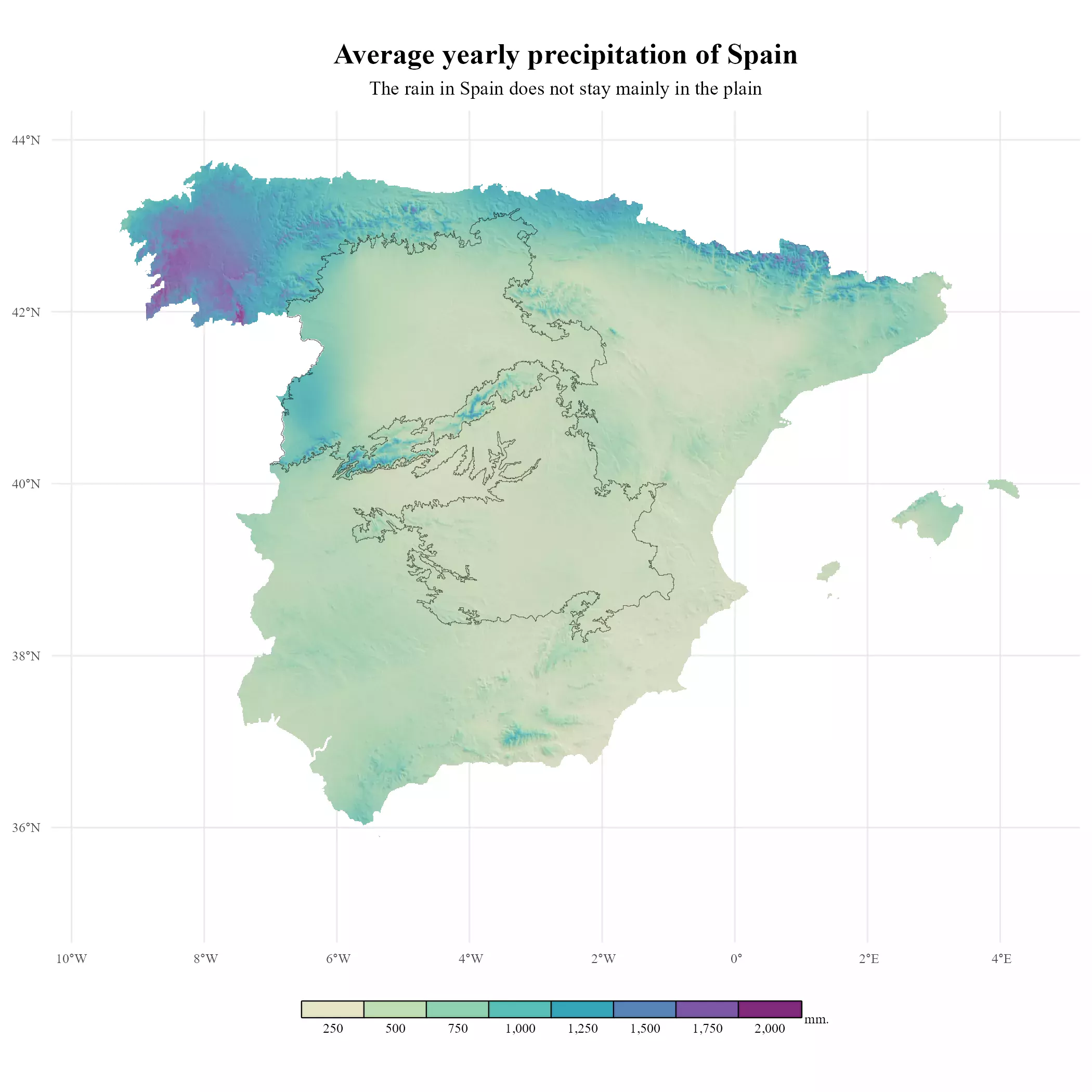
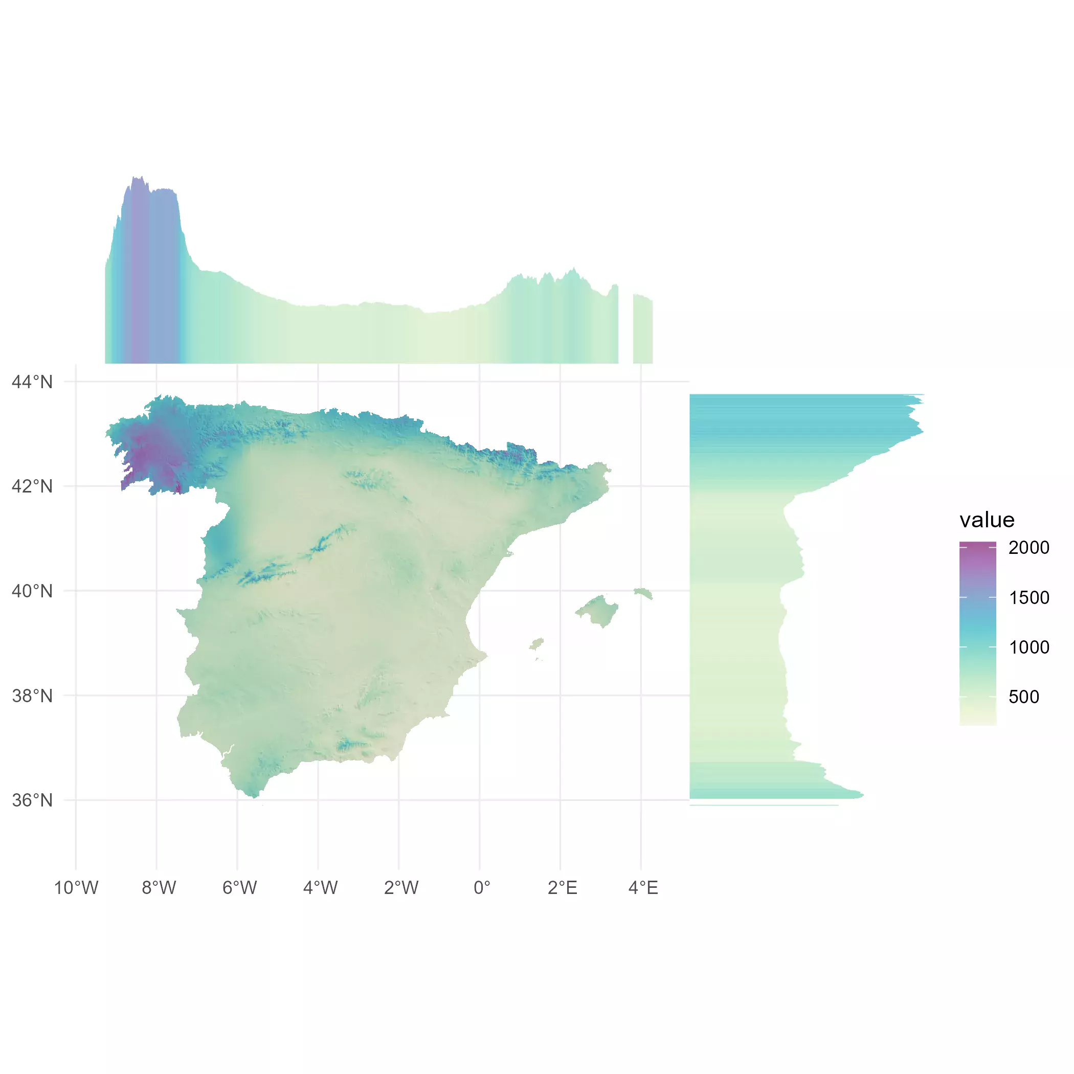
We can now check that the rain in Spain falls mainly in the Atlantic coast (North of Spain) and specifically in Galicia. That’s why in Spanish the lyrics The rain in Spain stays mainly in the plain were translated into:
La lluvia en Sevilla es una pura maravilla.
That can be translated as “The rain in Seville is a true marvel”. And it is, indeed. Seville (located in the south on the Guadalquivir Valley has circa 50 rainy days per year, featuring very hot and dry summers.
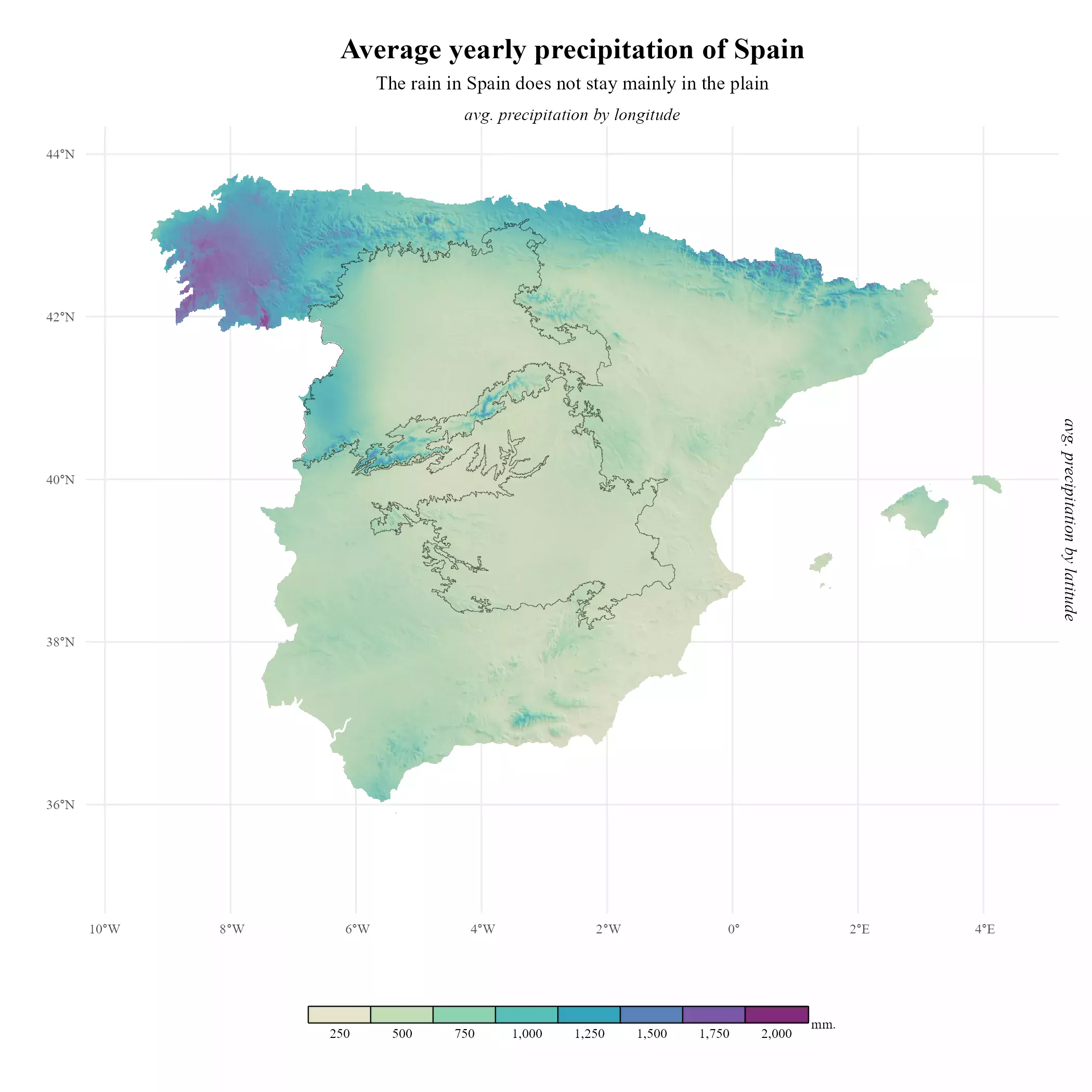
Marginal plots (finally)
We can now start profiling our final plot. The idea is to create two bar charts, representing the value to be plotted (in this case, average annual precipitation) by longitude and latitude.
But first we add some additional margins and title axes to the main plot, so we can insert those marginal plots easily on our main plot:
# Now we can add titles on the secondary axis

plot_main <- meteo_plot +
  xlab("") +
  ylab("") +
  # titles on secondary axis, for later
  scale_x_continuous(sec.axis = dup_axis(
    name = "avg. precipitation by longitude"
  )) +
  scale_y_continuous(sec.axis = dup_axis(
    name = "avg. precipitation by latitude"
  )) +
  theme(
    axis.title.x = element_text(
      margin = margin(t = base_text_size),
      size = base_text_size * 0.9, face = "italic"
    ),
    axis.title.y = element_text(
      angle = 270,
      margin = margin(
        l = base_text_size,
        t = base_text_size
      ),
      size = base_text_size * 0.9, face = "italic"
    )
  )

plot_main
Profiling marginal plots
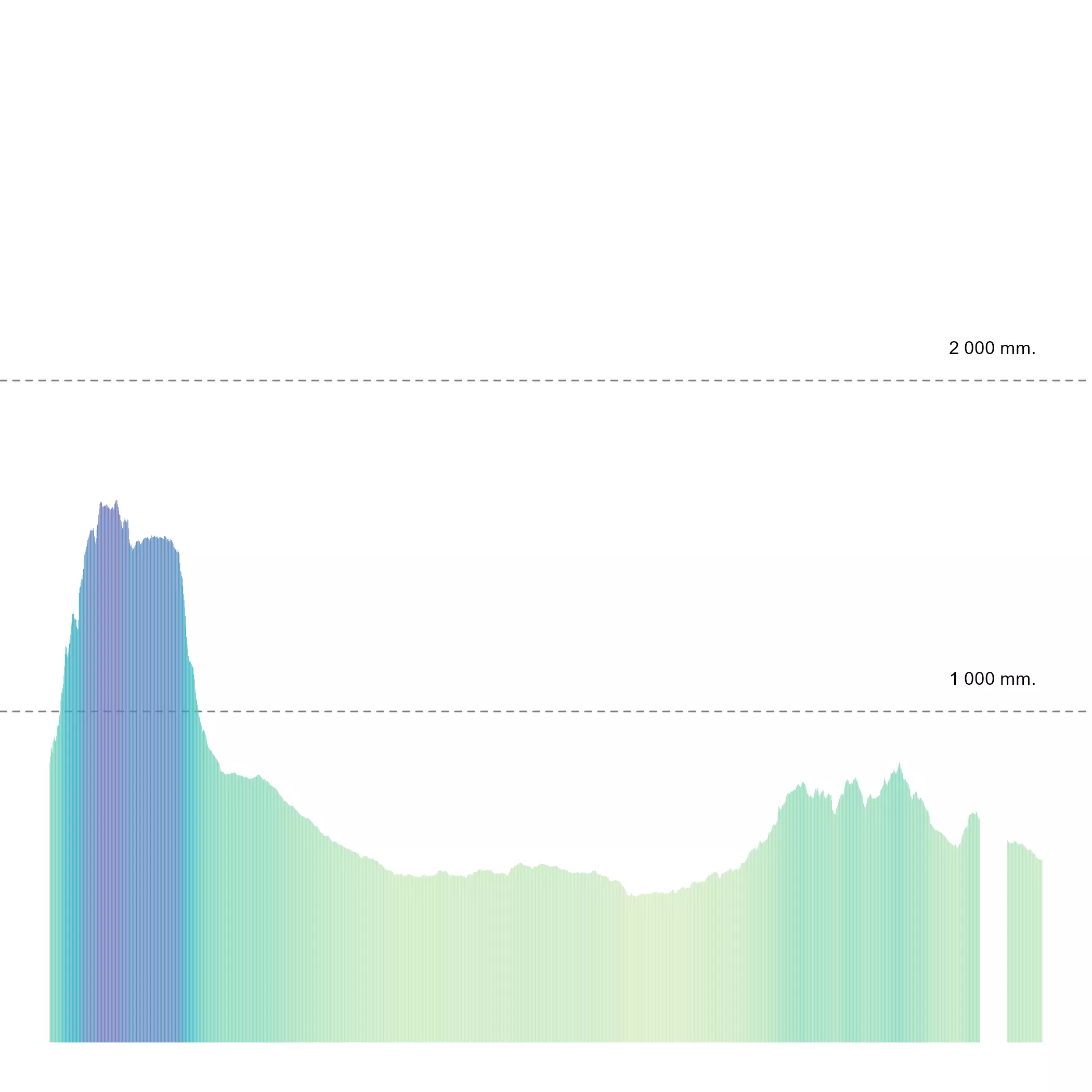
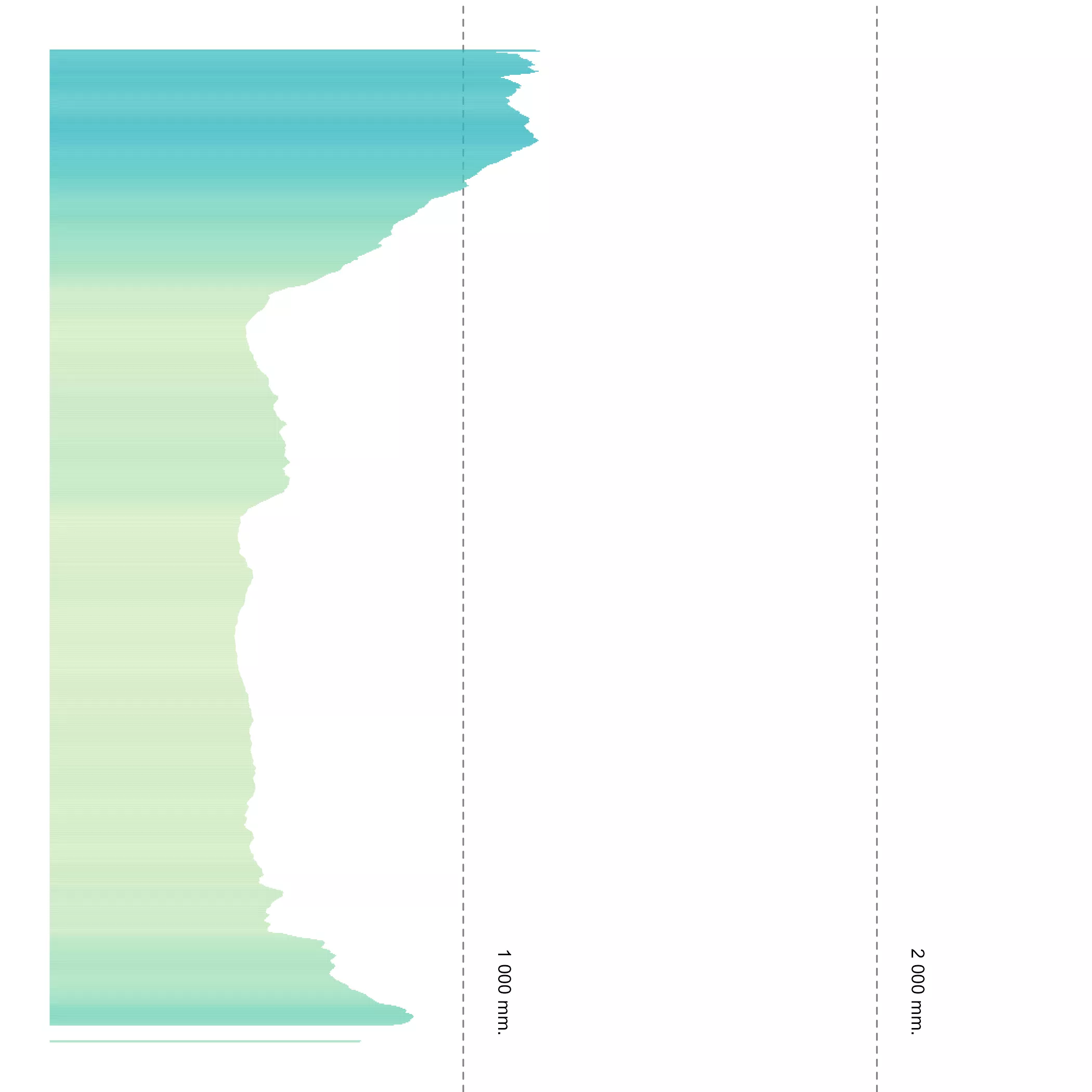
On the following code, I am just drafting how the marginal plots would look like, so we can have a preview of the final result:
# Profiling marginal plots

# Getting averages by x,y
marg_x <- precip_avg_mask %>%
  as_tibble(xy = TRUE) %>%
  drop_na() %>%
  group_by(x) %>%
  summarise(avg = mean(prec))

marg_y <- precip_avg_mask %>%
  as_tibble(xy = TRUE) %>%
  drop_na() %>%
  group_by(y) %>%
  summarise(avg = mean(prec))


# Cowplot would delete axis, we create an axis at 1000 and 2000
br_4marginal <- c(1000, 2000)

labs <- data.frame(labs = paste(
  prettyNum(br_4marginal, big.mark = " "),
  "mm."
))

labs$for_x <- max(marg_x$x) - diff(range(marg_x$x)) * 0.05
labs$for_y <- min(marg_y$y) + diff(range(marg_y$y)) * 0.05
labs$y <- br_4marginal

# Profiling
ggplot() +
  geom_col(
    data = marg_x,
    aes(x, avg, fill = avg),
    color = NA,
    show.legend = FALSE
  ) +
  geom_text(
    data = labs, aes(x = for_x, y = y, label = labs),
    nudge_y = 100,
    size = 3
  ) +
  scale_fill_gradientn(
    colours = alpha(mypal, 0.9),
    na.value = NA,
    labels = label_comma(),
    limits = prec_limits
  ) +
  scale_y_continuous(
    breaks = br_4marginal,
    limits = c(0, max(br_4marginal) * 1.5)
  ) +
  theme_void() +
  theme(panel.grid.major.y = element_line(
    colour = "grey50",
    linetype = "dashed"
  ))
ggplot() +
  geom_col(
    data = marg_y,
    aes(y, avg, fill = avg),
    color = NA,
    show.legend = FALSE
  ) +
  geom_text(
    data = labs, aes(x = for_y, y = y, label = labs),
    nudge_y = 100,
    angle = 270,
    size = 3
  ) +
  scale_fill_gradientn(
    colours = alpha(mypal, 0.9),
    na.value = NA,
    labels = label_comma(),
    limits = prec_limits
  ) +
  scale_y_continuous(
    breaks = br_4marginal,
    limits = c(0, max(br_4marginal) * 1.2)
  ) +
  coord_flip() +
  theme_void() +
  theme(panel.grid.major.x = element_line(
    colour = "grey50",
    linetype = "dashed"
  ))
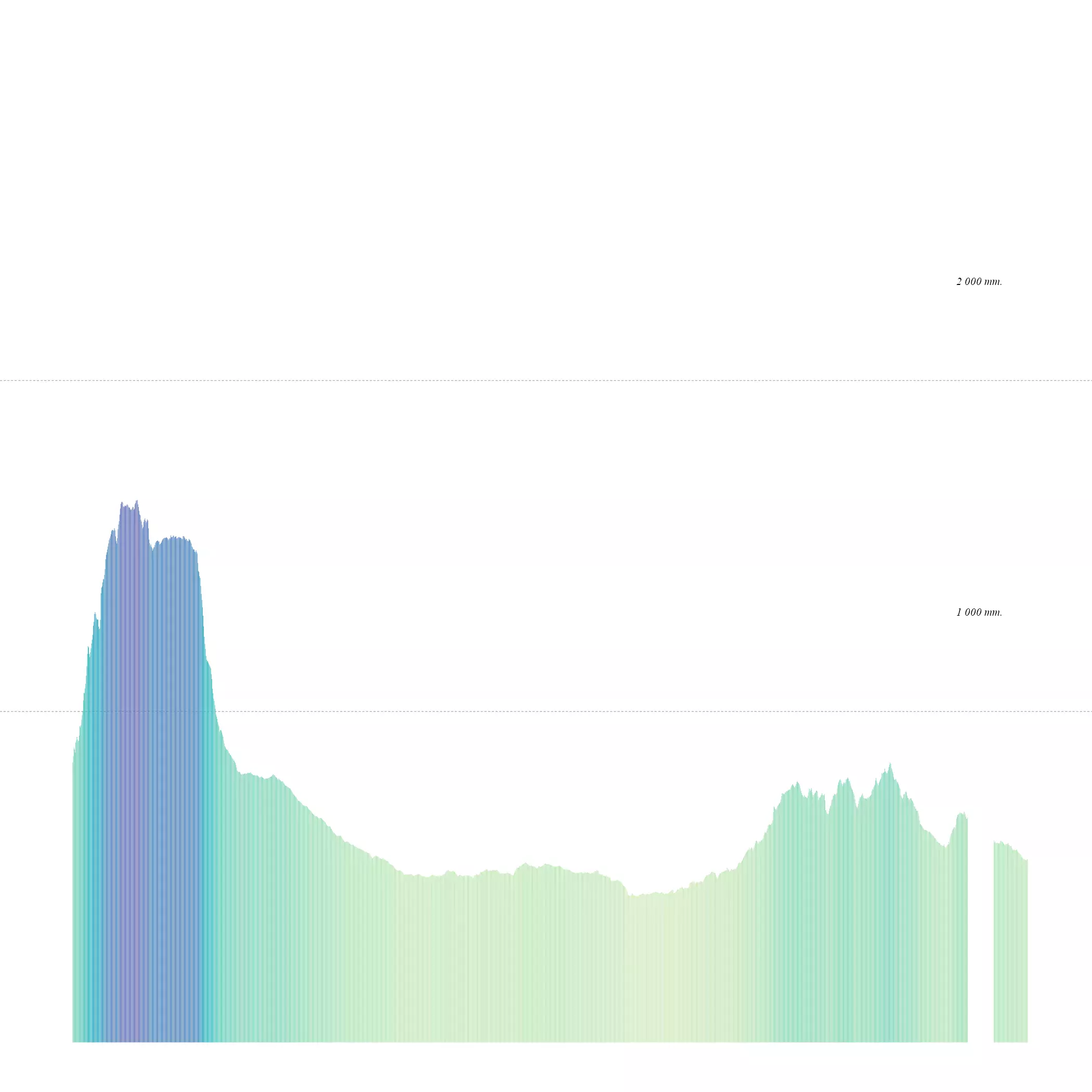
Putting all the pieces together
Finally, we would use cowplot::axis_canvas() to create the marginal plots as
we want:
# Last step: We combine plots

# Marginal plots
plot_x <- axis_canvas(plot_main, axis = "x") +
  geom_col(
    data = marg_x,
    aes(x, avg, fill = avg),
    color = NA,
    show.legend = FALSE
  ) +
  geom_text(
    data = labs, aes(x = for_x, y = y, label = labs),
    # Adjust the position of the labels
    nudge_y = 300,
    family = "serif",
    fontface = "italic",
    size = base_text_size * 0.2
  ) +
  scale_fill_gradientn(
    colours = alpha(mypal, 0.9),
    na.value = NA,
    labels = label_comma(),
    limits = prec_limits
  ) +
  scale_y_continuous(
    breaks = br_4marginal,
    limits = c(0, max(br_4marginal) * 1.5)
  ) +
  theme_void() +
  theme(panel.grid.major.y = element_line(
    colour = "grey50",
    linetype = "dashed",
    linewidth = 0.1
  ))

plot_x
plot_y <- axis_canvas(plot_main, axis = "y", coord_flip = TRUE) +
  geom_col(
    data = marg_y,
    aes(y, avg, fill = avg),
    color = NA,
    show.legend = FALSE
  ) +
  geom_text(
    data = labs, aes(x = for_y, y = y, label = labs),
    # Adjust the position of the labels
    nudge_y = 300,
    angle = 270,
    family = "serif",
    fontface = "italic",
    size = base_text_size * 0.2
  ) +
  scale_fill_gradientn(
    limits = prec_limits,
    colours = alpha(mypal, 0.9),
    na.value = NA,
    labels = label_comma()
  ) +
  scale_y_continuous(
    breaks = br_4marginal,
    limits = c(0, max(br_4marginal) * 1.5)
  ) +
  coord_flip() +
  theme_void() +
  theme(panel.grid.major.x = element_line(
    colour = "grey50",
    linetype = "dashed",
    linewidth = 0.1
  ))
plot_y

And insert everything in the main plot. See the final result:
# Combine all plots into one
sizes_axis <- grid::unit(.3, "null")

plot_final <- insert_xaxis_grob(plot_main, plot_x,
  position = "top",
  height = sizes_axis
)
plot_final <- insert_yaxis_grob(plot_final, plot_y,
  position = "right",
  width = sizes_axis * 1.25
)

gg_final <- ggdraw(plot_final)
gg_final
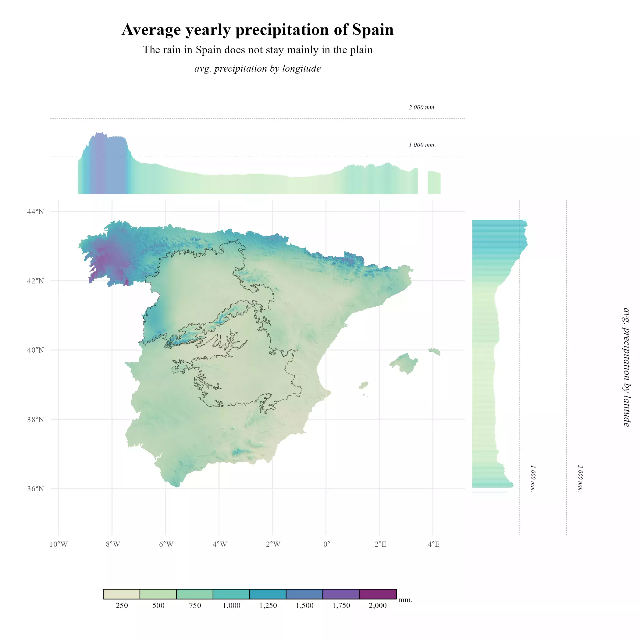
And with a bit of effort we got it.
Recap
Much of the code we have created relates with the theming and labels of the plot. Here you can find a simplified version:
Simplified version
# Libraries
# Data manipulation
library(terra)
library(tidyterra)
library(dplyr)

# Get the data
library(geodata)

# Plotting
library(ggplot2)
library(scales)
library(cowplot)
library(colorspace)

# Get the data
mydir <- "~/R/mapslib/misc"

r <- elevation_30s("ESP", path = mydir) %>%
  rename(alt = 1) %>%
  mutate(alt = pmax(0, alt))

# Creating hillshade

slope <- terrain(r, "slope", unit = "radians")
aspect <- terrain(r, "aspect", unit = "radians")
hill <- shade(slope, aspect, 30, 45)

# normalize names
names(hill) <- "shades"

# Hillshading palette
pal_greys <- hcl.colors(1000, "Grays")

# Index of color by cell
index <- hill %>%
  mutate(index_col = rescale(shades, to = c(1, length(pal_greys)))) %>%
  mutate(index_col = round(index_col)) %>%
  pull(index_col)


# Get cols
vector_cols <- pal_greys[index]


# Base hill plot
hill_plot <- ggplot() +
  geom_spatraster(
    data = hill, fill = vector_cols, maxcell = Inf,
    alpha = 1
  ) +
  theme_minimal()

# Overlay
precip <- geodata::worldclim_country("ESP", "prec", mydir)
precip_end <- sum(precip) %>%
  project(hill) %>%
  crop(hill) %>%
  mask(hill) %>%
  rename(prec = 1)

p_range <- as.vector(minmax(precip_end))

mypal <- sequential_hcl(
  n = 16,
  h = c(320, 80),
  c = c(60, 65, 20),
  l = c(30, 95), power = c(0.7, 1.3),
  rev = TRUE
)


base_plot <- hill_plot +
  geom_spatraster(data = precip_end, maxcell = Inf) +
  scale_fill_gradientn(
    colors = alpha(mypal, 0.7), na.value = NA,
    limits = p_range
  )

# Marginal plots
# Data
marg_x <- precip_end %>%
  as_tibble(xy = TRUE) %>%
  drop_na() %>%
  group_by(x) %>%
  summarise(avg = mean(prec))

marg_y <- precip_end %>%
  as_tibble(xy = TRUE) %>%
  drop_na() %>%
  group_by(y) %>%
  summarise(avg = mean(prec))

# Adding marginal plots

plot_x <- axis_canvas(base_plot, axis = "x") +
  geom_col(
    data = marg_x,
    aes(x, avg, fill = avg),
    color = NA,
    show.legend = FALSE
  ) +
  scale_fill_gradientn(
    colours = alpha(mypal, 0.9),
    na.value = NA,
    limits = p_range
  ) +
  theme_void()

plot_y <- axis_canvas(base_plot, axis = "y", coord_flip = TRUE) +
  geom_col(
    data = marg_y,
    aes(y, avg, fill = avg),
    color = NA,
    show.legend = FALSE
  ) +
  scale_fill_gradientn(
    colours = alpha(mypal, 0.9),
    na.value = NA,
    limits = p_range
  ) +
  theme_void() +
  coord_flip()

# All pieces together
sizes_axis <- grid::unit(.3, "null")

plot_final_simp <- insert_xaxis_grob(base_plot, plot_x,
  position = "top",
  height = sizes_axis
)
plot_final_simp <- insert_yaxis_grob(plot_final_simp, plot_y,
  position = "right",
  width = sizes_axis * 1.25
)

gg_final_simp <- ggdraw(plot_final_simp)
gg_final_simp