This is the first post of a series of two, showing how to overlay a SpatRaster on top of a Hillshade background. Next post would show how to add marginal plots including information of the values of the raster by longitude and latitude. See the second post here.
Using shadow effects on relief mappings is a very common technique, that allows to produce informative yet beautiful maps. If you are interested on this topic and you work with R, you would have probably seen this map:
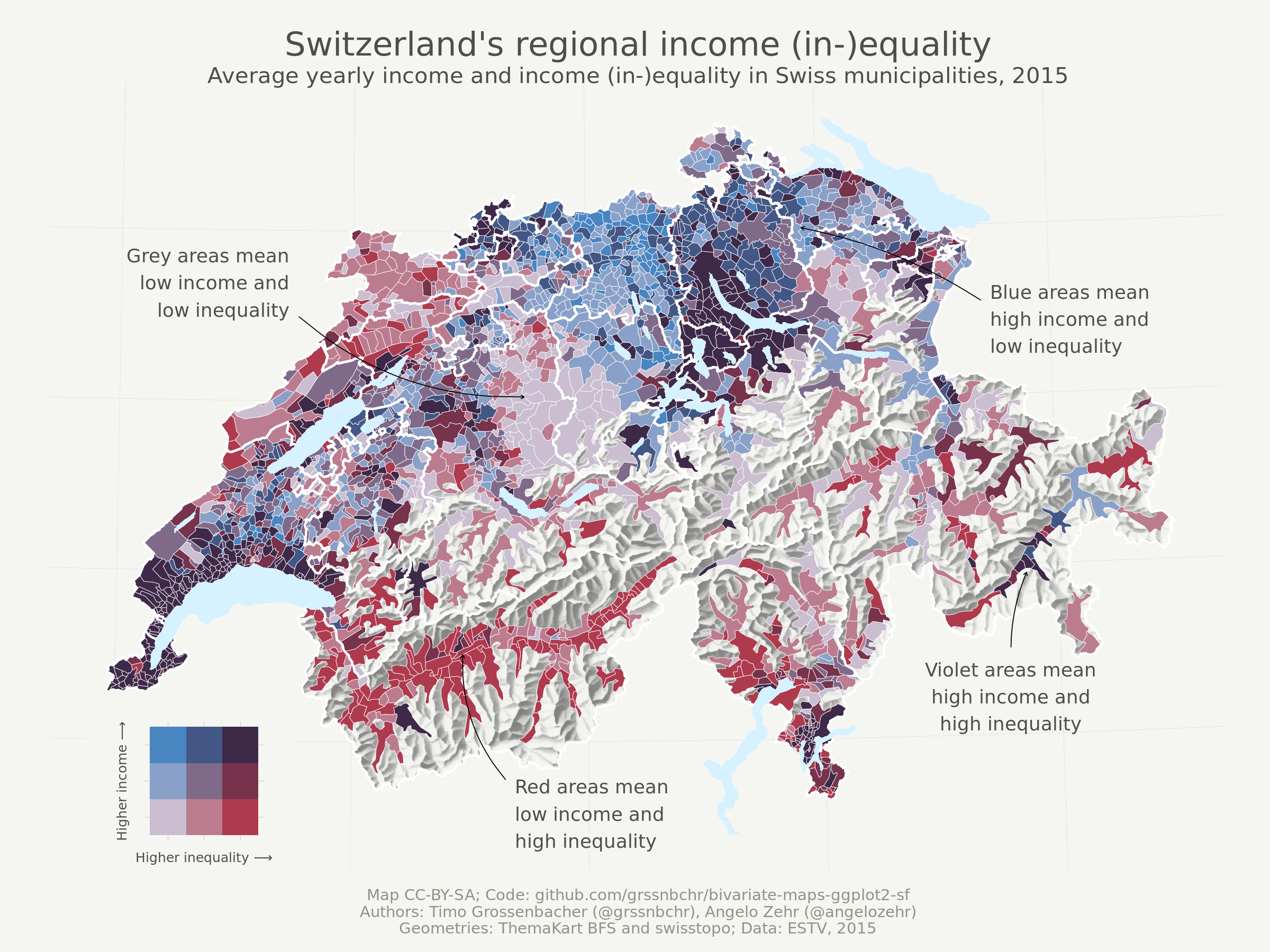
The production of this map by Timo
Grossenbacher
has been a reference for years. However, last developments on the R package
ecosystem (terra, sf and support of both classes on ggplot2, development
of ggnewscale, etc.) can make even easier the task of producing such type of
maps.
In fact, Dominic Royé recently wrote a very detailed
post on creating
shadow effects on map reliefs. On this first post of the series I would
replicate that technique with a slight variation (e.g. not making use of
ggnewscale) and I would discuss a bit on the potential choice of a color
palette for this kind of maps.
Libraries
I would use the following libraries:
## Libraries

library(terra)
library(tidyterra)
library(ggplot2)
library(dplyr)
library(scales)

# Get the data
library(geodata)
Get the data
First step is to get the altitude data. I use here the package geodata for
simplicity, but you can use as well elevatr that is much more complete.
However elevatr produces the result as RasterLayers, so you would need to
convert the object to SpatRaster with terra::rast().
# Cache map data
mydir <- "~/R/mapslib/misc"

r_init <- elevation_30s("ROU", path = mydir)

r_init
#> class       : SpatRaster
#> dimensions  : 588, 1176, 1  (nrow, ncol, nlyr)
#> resolution  : 0.008333333, 0.008333333  (x, y)
#> extent      : 20.1, 29.9, 43.5, 48.4  (xmin, xmax, ymin, ymax)
#> coord. ref. : lon/lat WGS 84 (EPSG:4326)
#> source      : ROU_elv_msk.tif
#> name        : ROU_elv_msk
#> min value   :          -4
#> max value   :        2481

# For better handling we set here the names
names(r_init) <- "alt"

# We don't want values lower than 0
r <- r_init %>%
  mutate(alt = pmax(0, alt))

r
#> class       : SpatRaster
#> dimensions  : 588, 1176, 1  (nrow, ncol, nlyr)
#> resolution  : 0.008333333, 0.008333333  (x, y)
#> extent      : 20.1, 29.9, 43.5, 48.4  (xmin, xmax, ymin, ymax)
#> coord. ref. : lon/lat WGS 84 (EPSG:4326)
#> source      : memory
#> name        :  alt
#> min value   :    0
#> max value   : 2481
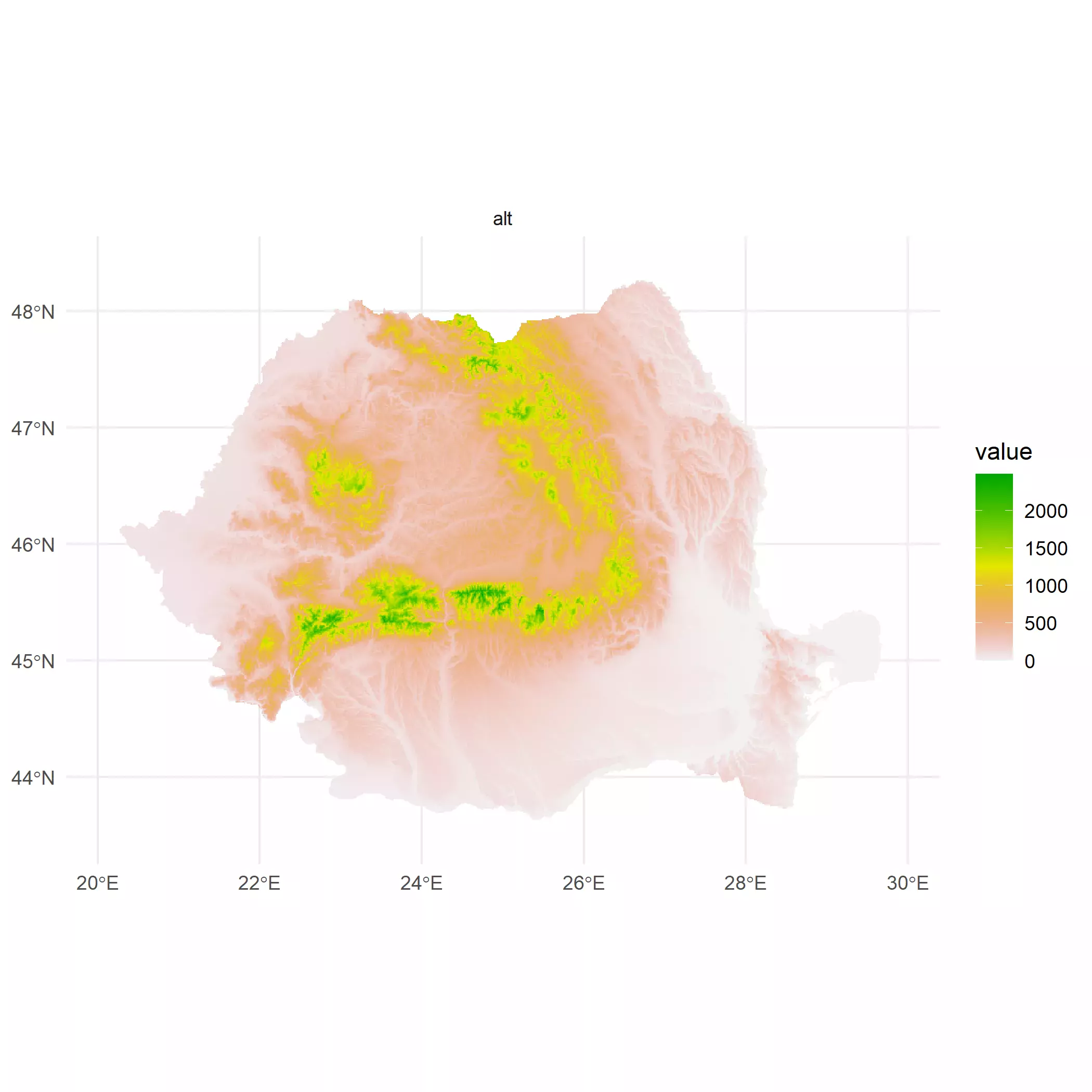
We can now have a quick look to the plot with tidyterra::autoplot():
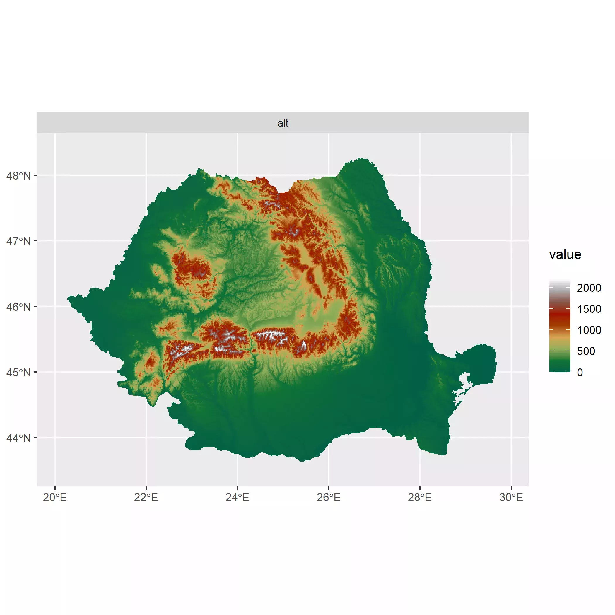
# Quick look
autoplot(r) +
  theme_minimal()
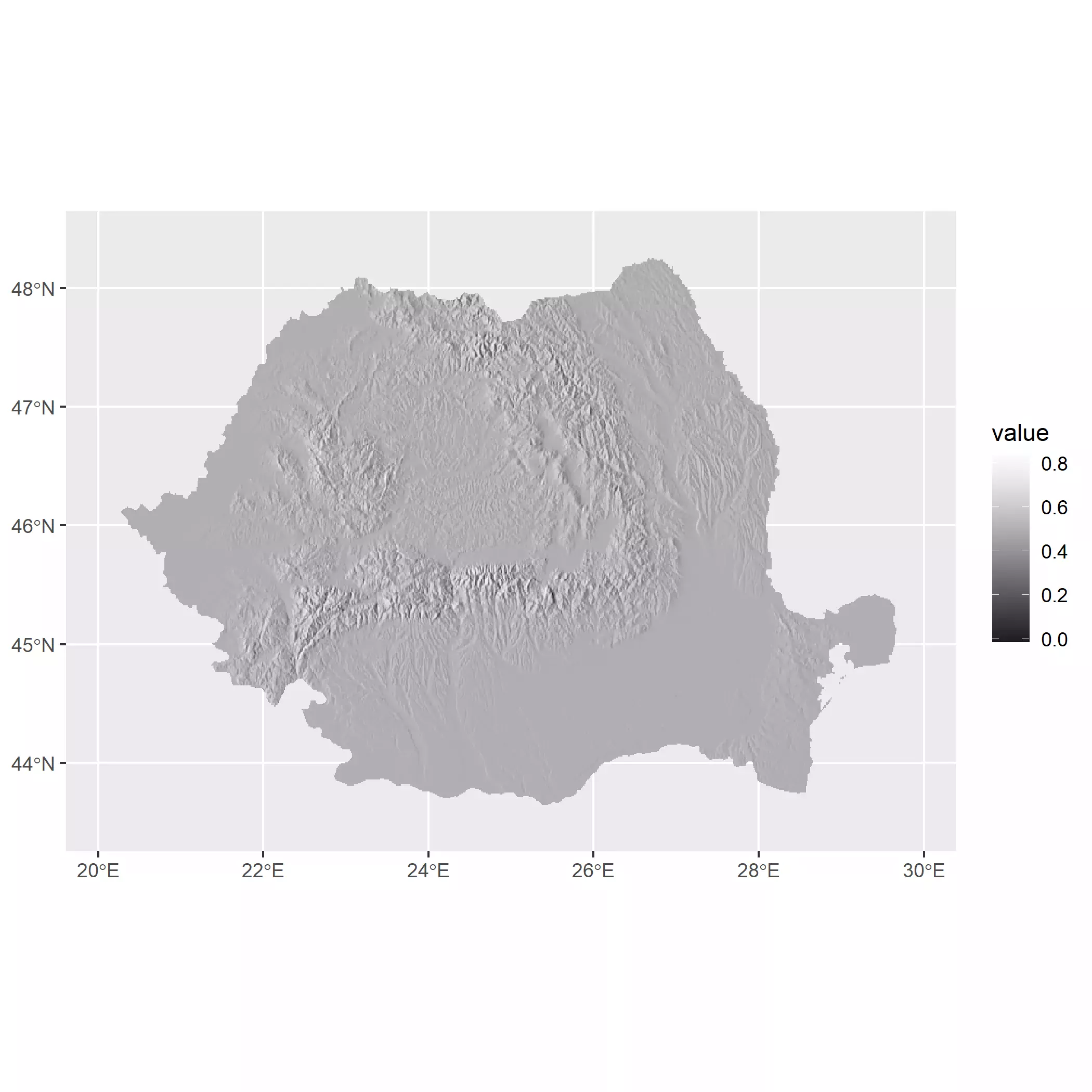
Hillshading
Next step is to calculate the hillshade. Royé has a very detailed discussion
here,
so I would not go into details. Basically what we want to create is a layer that
approximates the potential “texture” of the surface based on the elevation and
the sun position. This is straightforward with terra::terrain() and
terra::shade() functions:
## Create hillshade effect

slope <- terrain(r, "slope", unit = "radians")
aspect <- terrain(r, "aspect", unit = "radians")
hill <- shade(slope, aspect, 30, 270)

# normalize names
names(hill) <- "shades"

# Hillshading, but we need a palette
pal_greys <- hcl.colors(1000, "Grays")

ggplot() +
  geom_spatraster(data = hill) +
  scale_fill_gradientn(colors = pal_greys, na.value = NA)
#> SpatRaster resampled to ncells = 501501
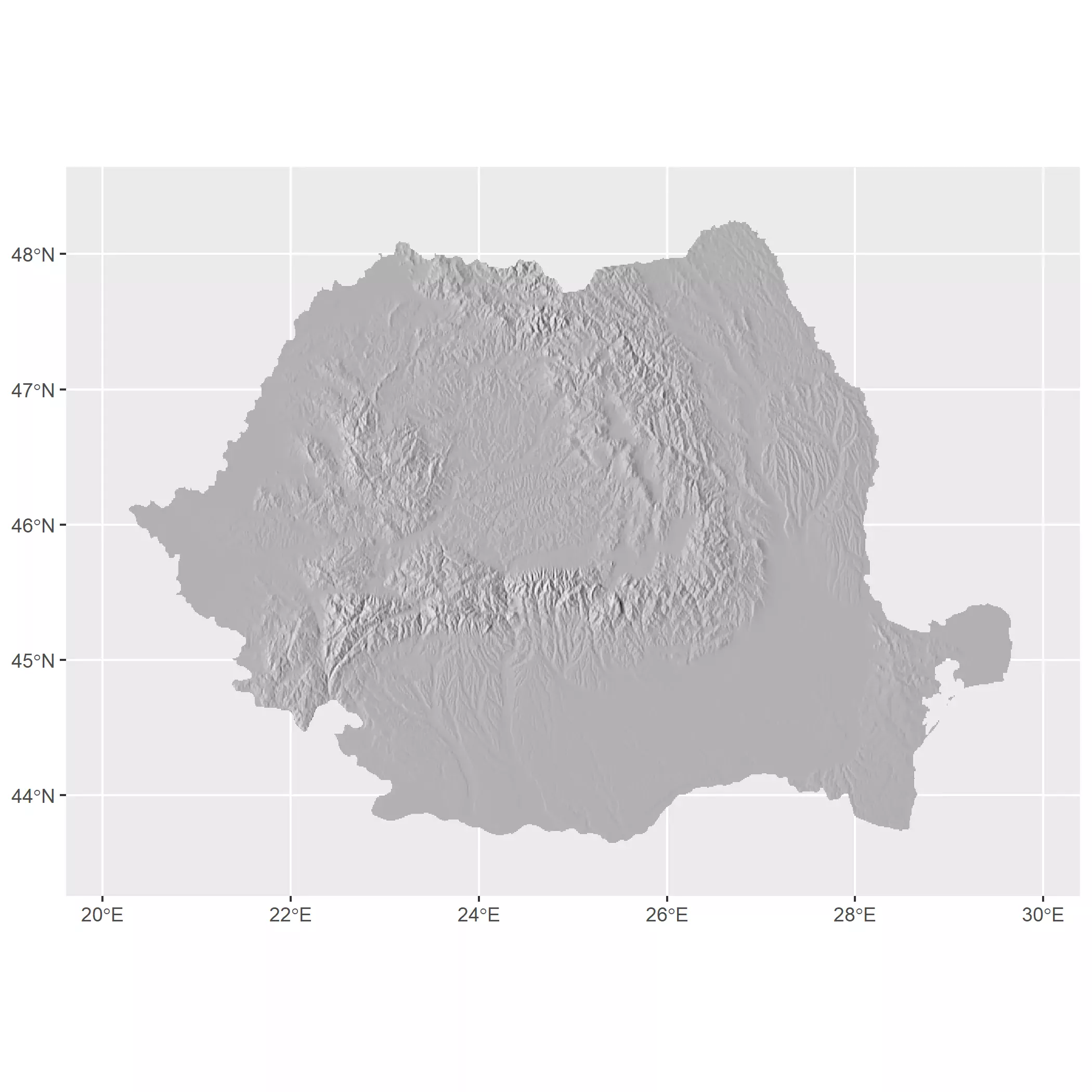
We can also do the following hack to avoid the use of a scale_fill_* (via
ggplot2 or via ggnewscale::new_scale_fill()):
- Select a vector of colors (in this post
pal_greys). - Extract the values of the raster and reescale them to the length of the
palette (
c(1, 1000)). - Round those rescaled values to the nearest integer. So we would have a index
indicating which value of
pal_greysshould be mapped to each cell. - Now use the parameter
fillon thegeom_instead of using the scale.
An additional note is that geom_spatraster() has a parameter maxcell that
would perform a spatial resampling if the raster has more cells than maxcell.
This is for optimization (note that terra::plot() has the same setup and that
the users often forgot about it), but we can force to plot all the cells by
using maxcell = Inf. On this approach for using fill the value maxcell
needs to be effectively set to Inf to ensure that the number of color values
and the number of cells is the same.
# Use a vector of colors


index <- hill %>%
  mutate(index_col = rescale(shades, to = c(1, length(pal_greys)))) %>%
  mutate(index_col = round(index_col)) %>%
  pull(index_col)


# Get cols
vector_cols <- pal_greys[index]

# Need to avoid resampling
# and dont use aes

hill_plot <- ggplot() +
  geom_spatraster(
    data = hill, fill = vector_cols, maxcell = Inf,
    alpha = 1
  )

hill_plot
Selecting colors
The selection of colors for elevation maps is a key aspect when designing this kind of visualization since colors can be confused with environmental phenomena (Patterson and Jenny, 2011). For example, by convention green colors are associated to low elevations while orange, browns and whites are associared to high elevations on some of the most common elevation palettes (aka hypsometric tints). See for example the Wikipedia Topographic maps conventions.
This is not ideal, since greens can be confused with forests, for example, so an elevation map of desertic areas would not be appropiated with a green-brown-white color scheme.
There is an additional point to take into account when designing color palettes for maps. A regular gradient would just interpolate colors assuming that the distance among colors is the same:
# Regular gradient
grad <- hypso.colors(10, "dem_poster")

autoplot(r) +
  scale_fill_gradientn(colours = grad, na.value = NA)
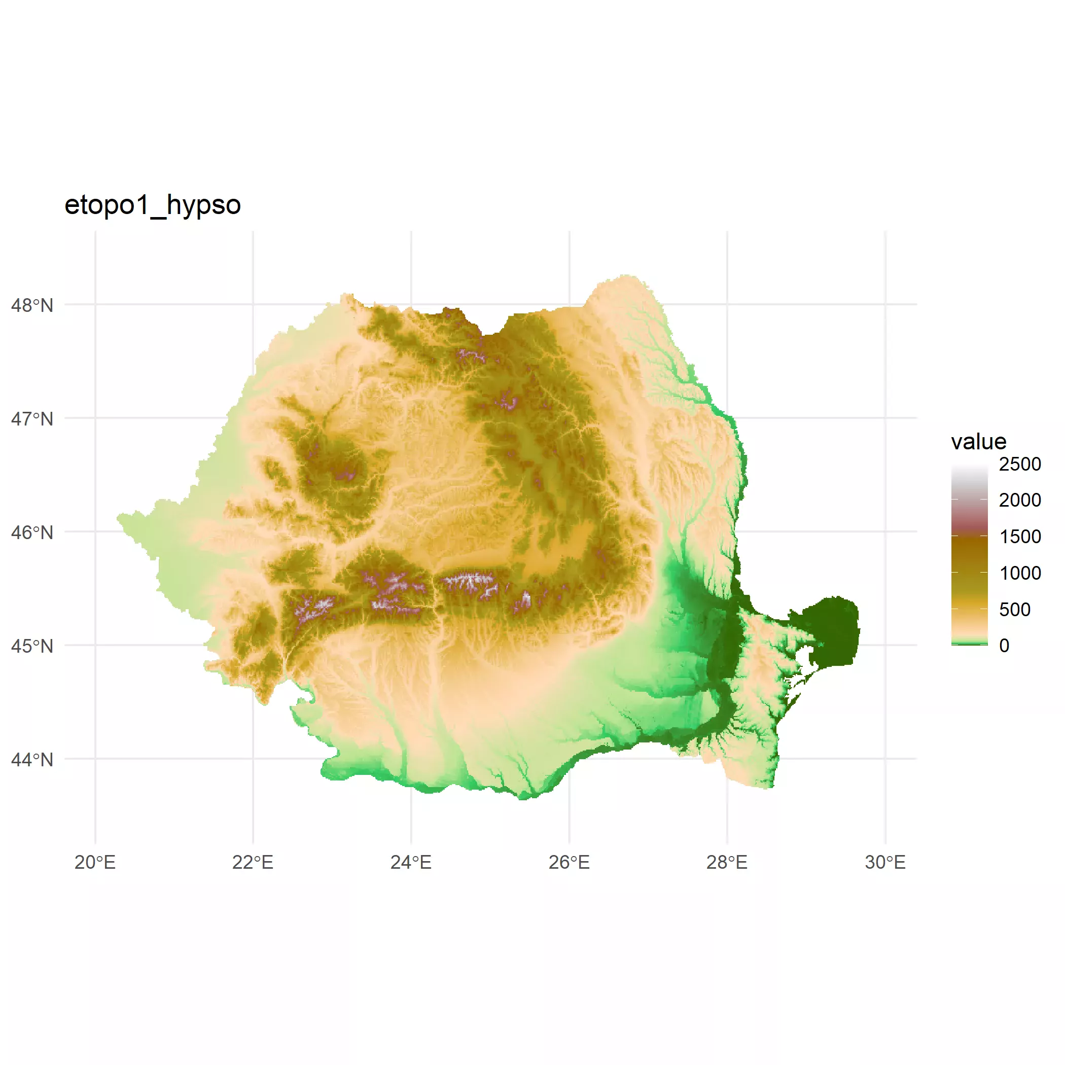
For that reason, tidyterra provides additional gradients whose colors are placed unevenly with the goal of providing a better understanding of the maps:
# Hypso gradient
grad_hypso <- hypso.colors2(10, "dem_poster")


autoplot(r) +
  scale_fill_gradientn(colours = grad_hypso, na.value = NA)
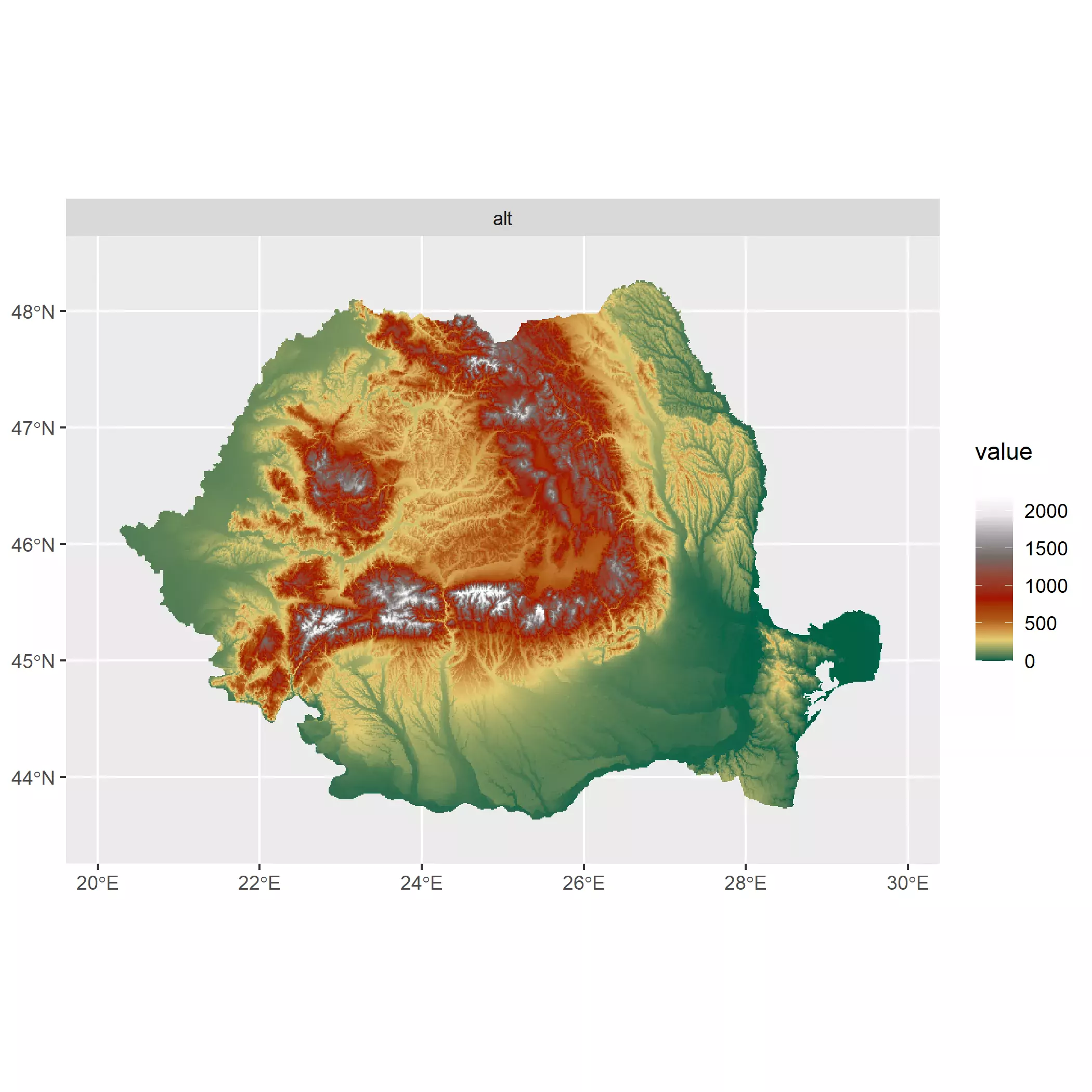
Can you notice the difference? In the first map greens are the dominant color. However greens are representing a wide range of elevations (0-750 meters) that correspond with most of the territory. In terms of perception, we won’t be clearly spotting elevation differences in the center of the country, while with the uneven gradient greens only correspond to the range (0 - 250 meters) and the overall perception of elevation improves. Note that the only difference between plots is exclusively the color palette.
For producing our map we are going to assess visually the result of a selection
of palettes provided by tidyterra. We use here the version
tidyterra::scale_fill_hypso_tint_c() instead of
tidyterra::scale_fill_hypso_c() for taking advantage of the uneven color
gradients.
A downside of using this scales is that we need also to adjust the limits
argument of the functions to make ggplot2 aware of the limits of the value of
the raster. This is easily achieved with terra::minmax() but I added an extra
touch rounding up and down the range of values to the nearest 500.
# Try some options, but we need to be aware of the values of our raster
r_limits <- minmax(r) %>% as.vector()
# Rounded to lower and upper 500
r_limits <- c(floor(r_limits[1] / 500), ceiling(r_limits[2] / 500)) * 500
# And making min value to 0.
r_limits <- pmax(r_limits, 0)
# Compare
minmax(r) %>% as.vector()
#> [1] 0 2481
r_limits
#> [1] 0 2500
# Now lets have some fun with scales from tidyterra
elevt_test <- ggplot() +
geom_spatraster(data = r)
# Create a helper function
plot_pal_test <- function(pal) {
elevt_test +
scale_fill_hypso_tint_c(
limits = r_limits,
palette = pal
) +
ggtitle(pal) +
theme_minimal()
}
plot_pal_test("etopo1_hypso")
plot_pal_test("dem_poster")
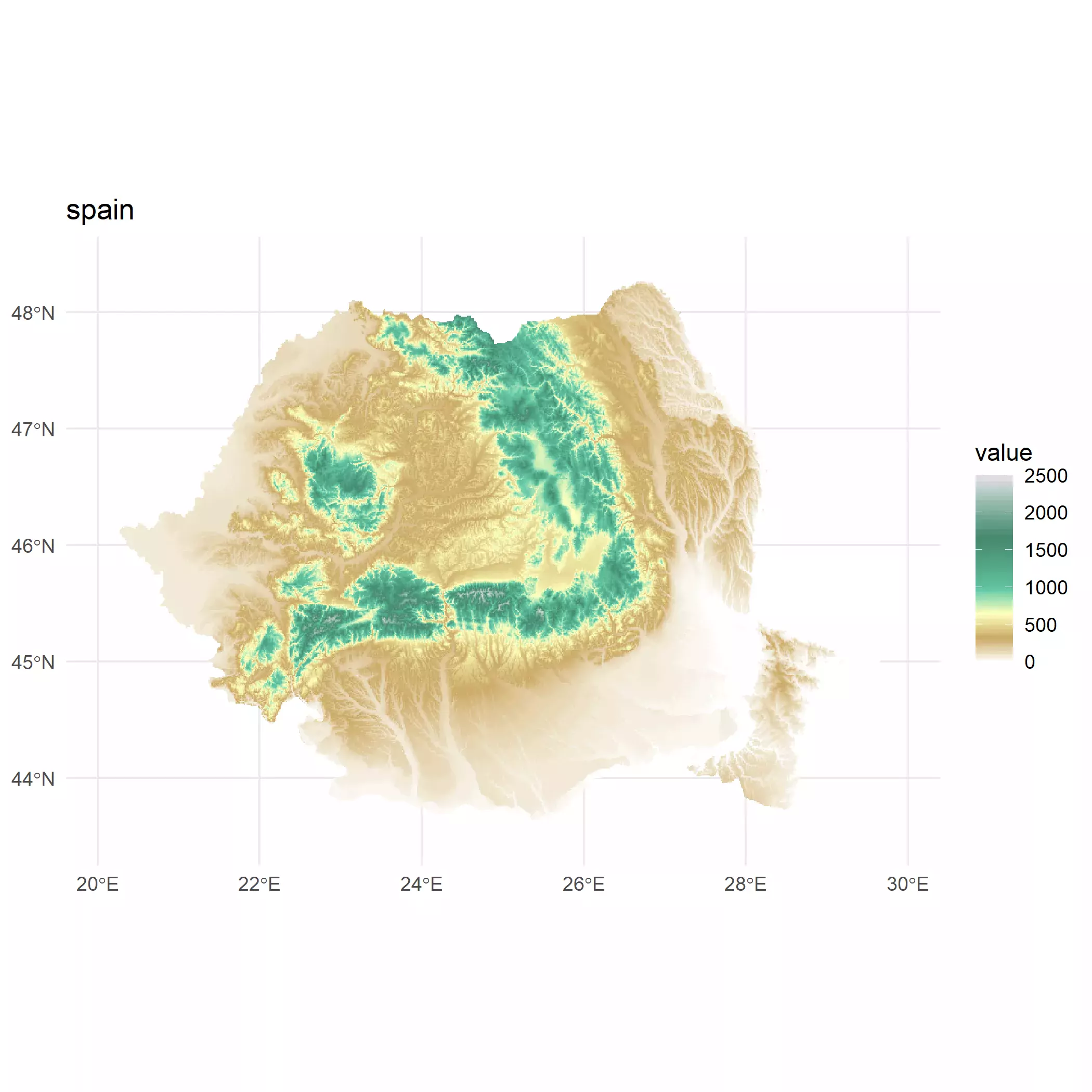
plot_pal_test("spain")
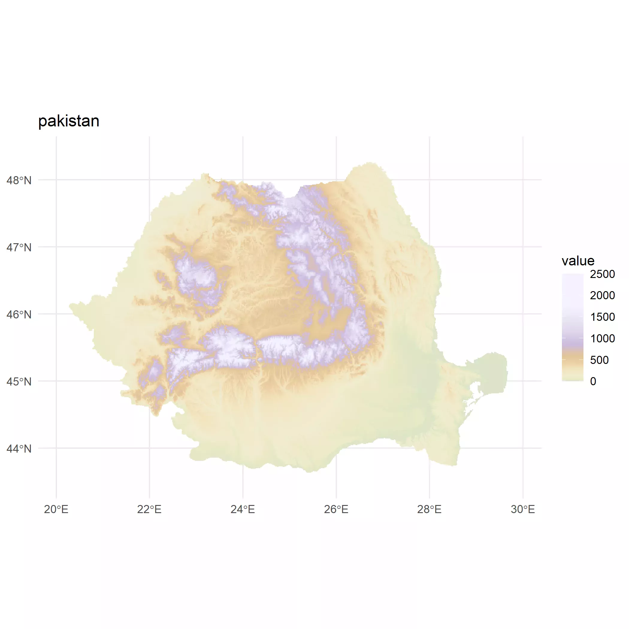
plot_pal_test("pakistan")
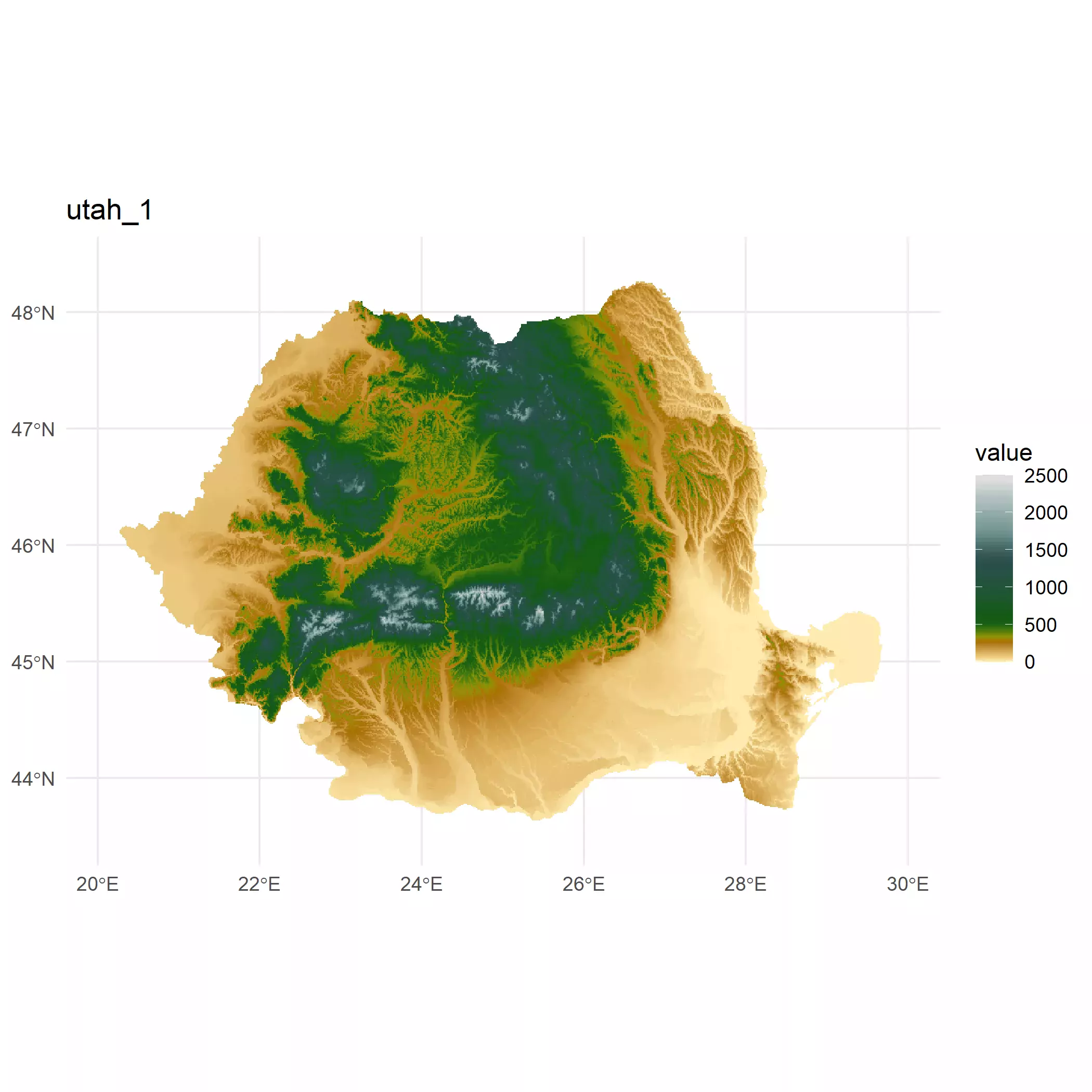
plot_pal_test("utah_1")
plot_pal_test("wiki-2.0_hypso")
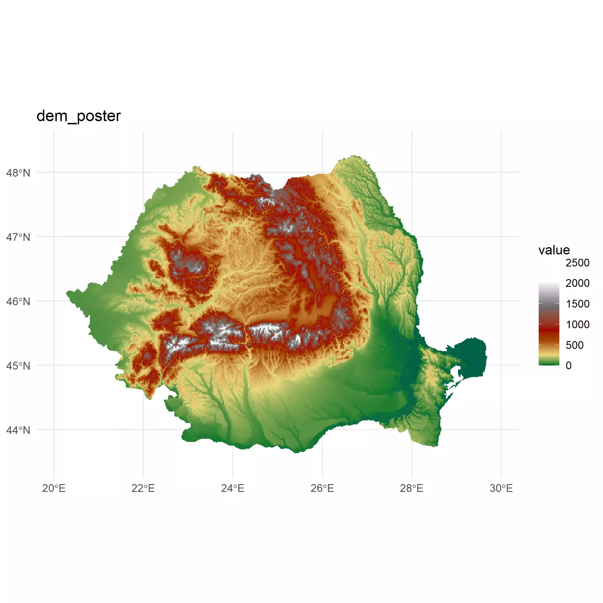
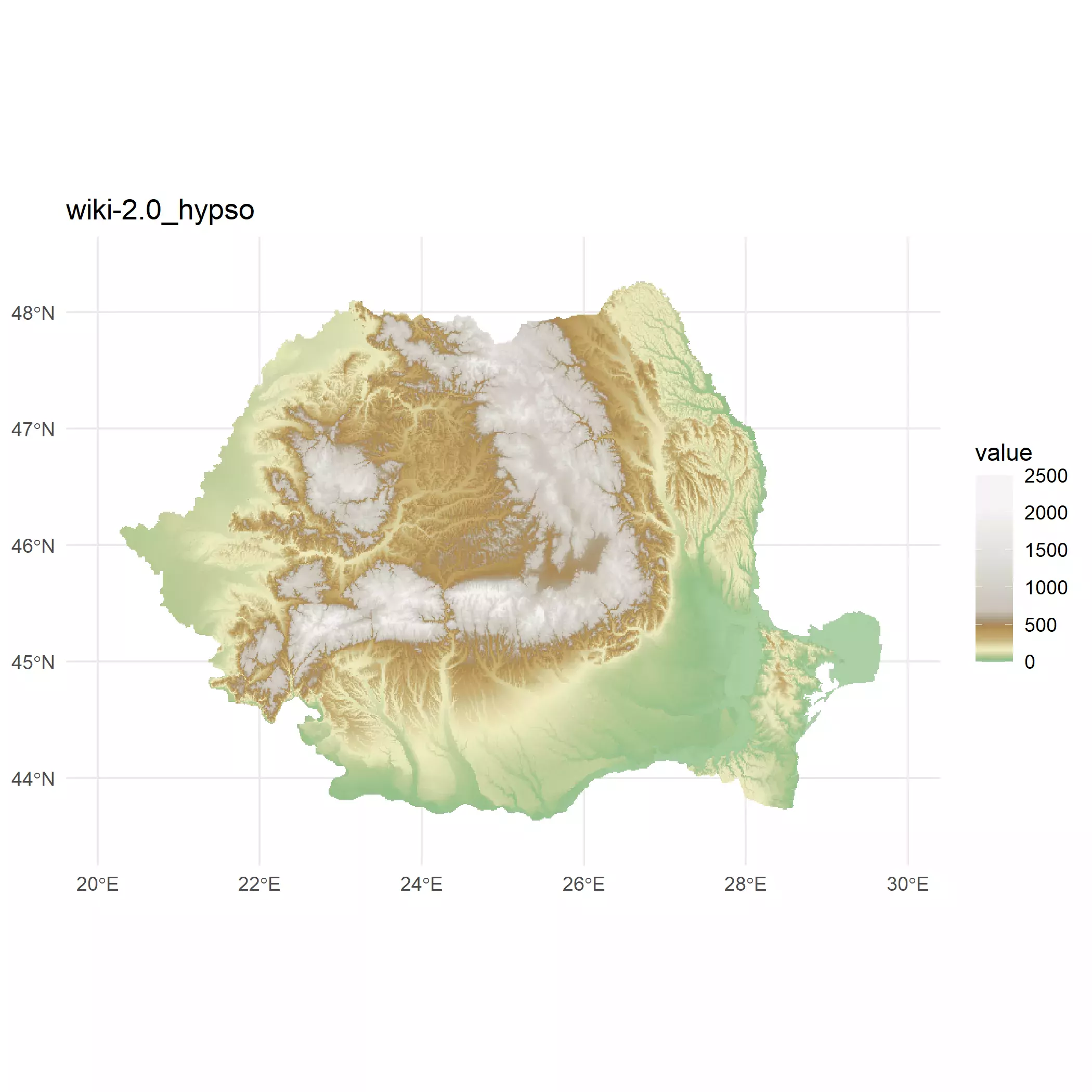
I finally selected for my plot the "dem_poster" palette, but this is
completely a personal choice. You should select the palette you feel more
comfortable with. See the full range of color palettes provided by tidyterra
here.
Final plot
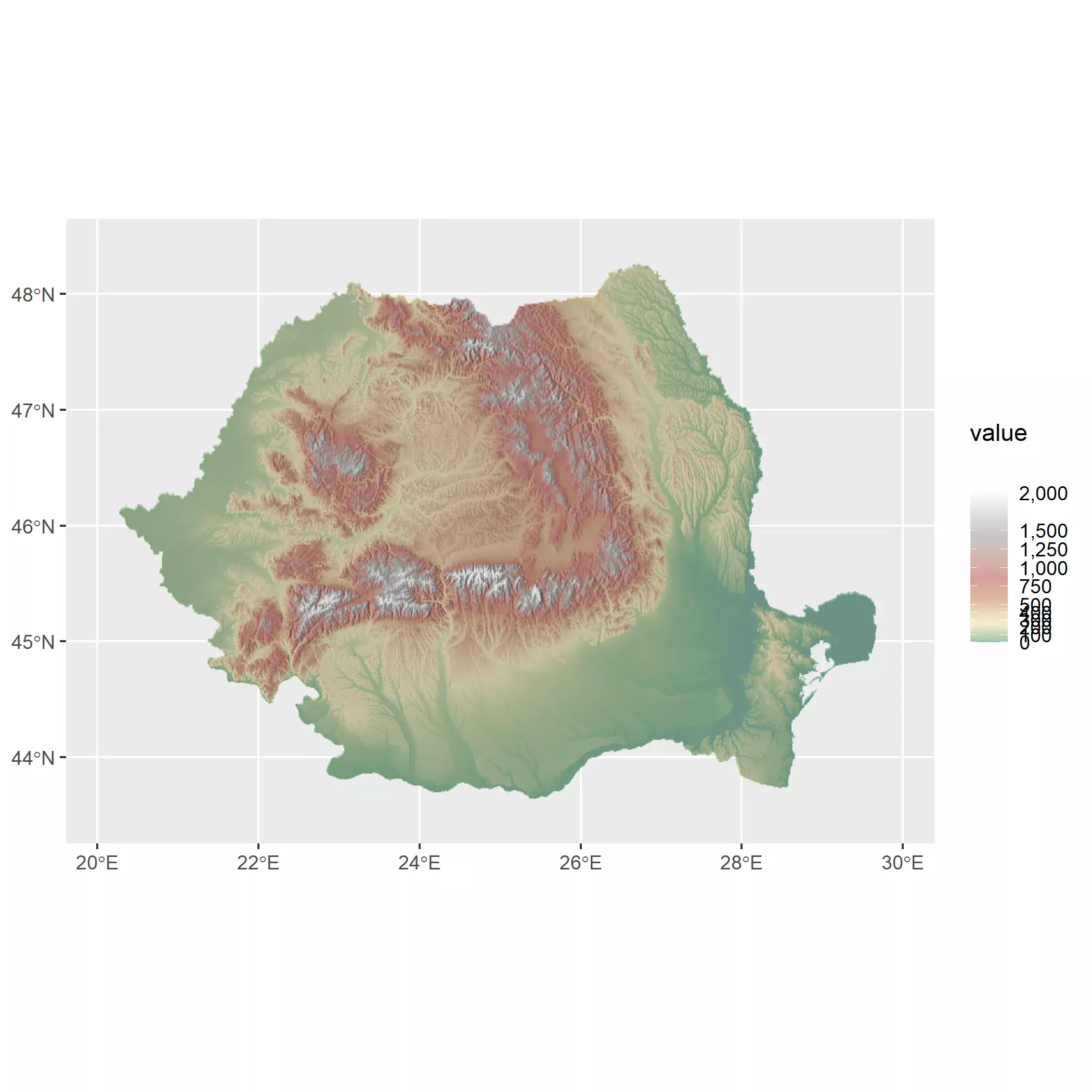
So now it is time to blend both the hillshade layer and the altitude layer using
some level of alpha on the upper layer.
base_plot <- hill_plot +
  # Avoid resampling with maxcell
  geom_spatraster(data = r, maxcell = Inf) +
  scale_fill_hypso_tint_c(
    limits = r_limits,
    palette = "dem_poster",
    alpha = 0.4,
    labels = label_comma(),
    # For the legend I use custom breaks
    breaks = c(
      seq(0, 500, 100),
      seq(750, 1500, 250),
      2000
    )
  )

base_plot
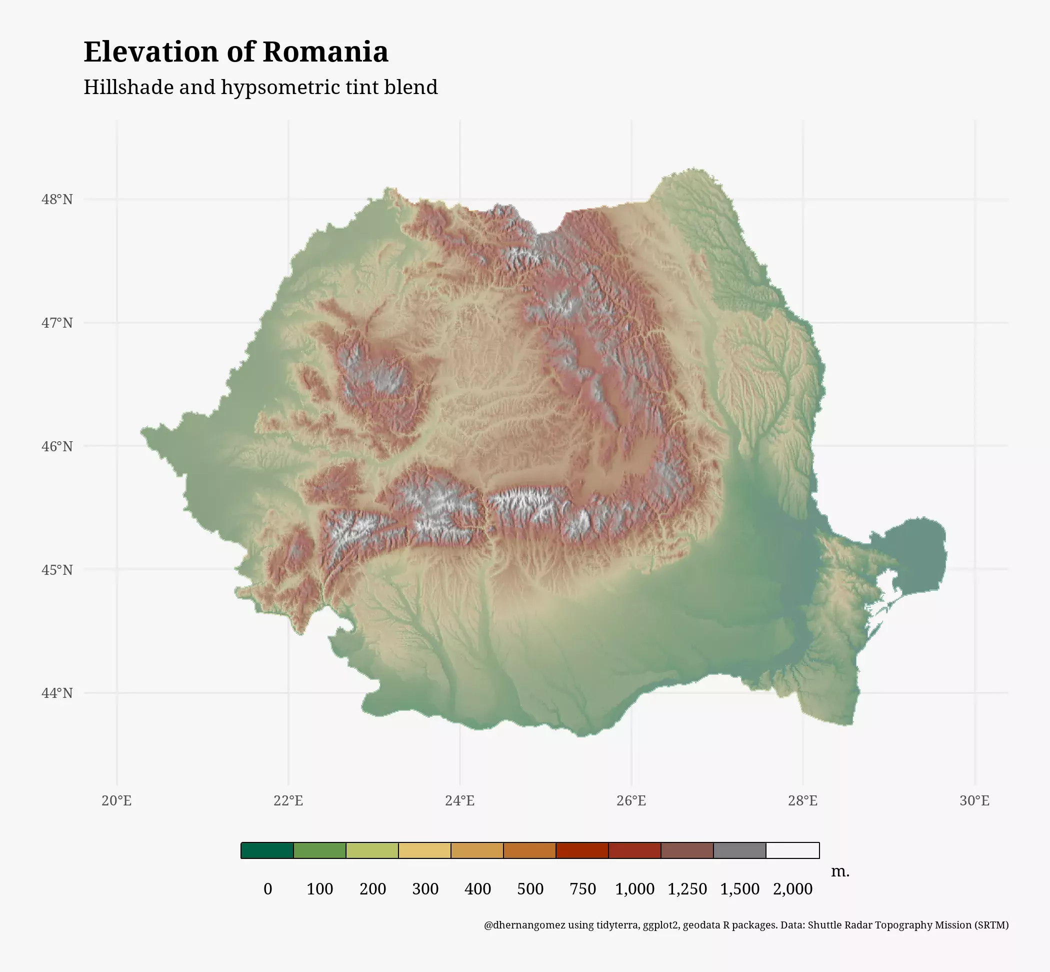
And with a bit of trickery and theming we can have our final map. First we load a font from Google with a custom function:
myload_fonts <- function(fontname, family,
                         fontdir = tempdir()) {
  fontname_url <- utils::URLencode(fontname)
  fontzip <- tempfile(fileext = ".zip")
  download.file(paste0("https://fonts.google.com/download?family=", fontname_url),
    fontzip,
    quiet = TRUE,
    mode = "wb"
  )
  unzip(fontzip,
    exdir = fontdir,
    junkpaths = TRUE
  )

  # Load fonts
  paths <- list(
    regular = "Regular.ttf",
    bold = "Bold.ttf",
    italic = "Italic.ttf",
    bolditalic = "BoldItalic.ttf"
  )


  namefile <- gsub(" ", "", fontname)
  paths_end <- file.path(
    fontdir,
    paste(namefile, paths, sep = "-")
  )


  names(paths_end) <- names(paths)

  sysfonts::font_add(family,
    regular = paths_end["regular"],
    bold = paths_end["bold"],
    italic = paths_end["italic"],
    bolditalic = paths_end["bolditalic"]
  )

  return(invisible())
}
And now we theme it:
# Theming
myload_fonts("Noto Serif", "notoserif", "~/R/googlefonts")
showtext::showtext_auto()

# Adjust text size
base_text_size <- 30

base_plot +
  # Change guide
  guides(fill = guide_legend(
    title = "   m.",
    direction = "horizontal",
    nrow = 1,
    keywidth = 1.75,
    keyheight = 0.5,
    label.position = "bottom",
    title.position = "right",
    override.aes = list(alpha = 1)
  )) +
  labs(
    title = "Elevation of Romania",
    subtitle = "Hillshade and hypsometric tint blend",
    caption = paste0(
      "@dhernangomez using tidyterra, ggplot2, geodata R packages.",
      " Data: Shuttle Radar Topography Mission (SRTM)"
    )
  ) +
  theme_minimal(base_family = "notoserif") +
  theme(
    plot.background = element_rect("grey97", colour = NA),
    plot.margin = margin(20, 20, 20, 20),
    plot.caption = element_text(size = base_text_size * 0.5),
    plot.title = element_text(face = "bold", size = base_text_size * 1.4),
    plot.subtitle = element_text(
      margin = margin(b = 10),
      size = base_text_size
    ),
    axis.text = element_text(size = base_text_size * 0.7),
    legend.position = "bottom",
    legend.title = element_text(size = base_text_size * 0.8),
    legend.text = element_text(size = base_text_size * 0.8),
    legend.key = element_rect("grey50"),
    legend.spacing.x = unit(0, "pt")
  )
References
Patterson T, Jenny B (2011). “The Development and Rationale of Cross-blended Hypsometric Tints.” Cartographic Perspectives, 31–46. https://doi.org/10.14714/CP69.20
Grossenbacher T (2016). “Beautiful thematic maps with ggplot2 (only).” https://timogrossenbacher.ch/bivariate-maps-with-ggplot2-and-sf/.
Royé D (2022). “Hillshade effects.” https://dominicroye.github.io/en/2022/hillshade-effects/.
Hernangómez D (2022). tidyterra: tidyverse Methods and ggplot2 Helpers for terra Objects. <doi:10.5281/zenodo.6572471> https://doi.org/10.5281/zenodo.6572471.