On 1970, Harold D. Craft Jr. published his Ph.D thesis “Radio observations of the pulse profiles and dispersion measures of twelve pulsars”. The thesis (337 pages) includes on pages 214 to 216 the following depictions of successive pulses of some pulsars:
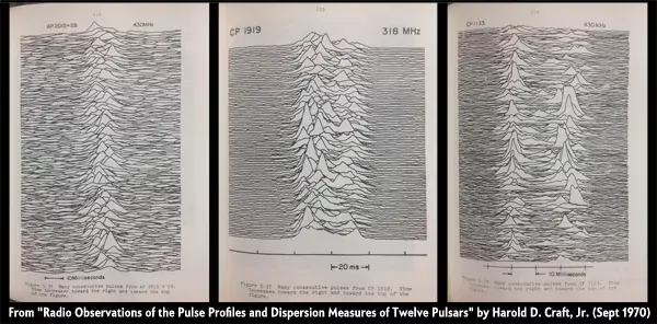
From “Radio Observations of the Pulse Profiles and Dispersion Measures of Twelve Pulsars” by Harold D. Craft, Jr. (September 1970). Original source: https://blogs.scientificamerican.com/sa-visual/pop-culture-pulsar-origin-story-of-joy-division-s-unknown-pleasures-album-cover-video/
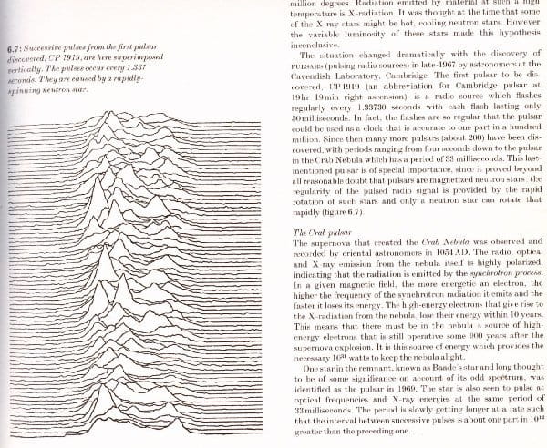
Nine years later, a young graphic designer named Peter Saville had a new project. He had to design the cover of the debut album of a young British rock band, named Joy Division. At some point of the process Bernand Summer (lead guitar of Joy Division)1, found the following image on The Cambridge Encyclopaedia of Astronomy (1977 edition):
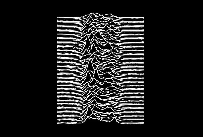
Saville presented a black and white version, producing a cover that reaches an iconic status in the ’80s. This cover has been reproduced in the form of tattoos, fashion clothes, merchandising, video games and even 3-D sculptures:
If you are interested on knowing more about this fascinating history of science and design you can find it on Pop Culture Pulsar: Origin Story of Joy Division’s Unknown Pleasures Album Cover by Jen Christiansen.
Since then, this kind of plots have become very popular, being known as ridge plots or joyplots, in honor of Joy Division. On this post, I would produce “joyplots” with R for specific regions of the world using the elevation data for creating the ridges.
Creating joyplot maps with R
This topic has already been covered by other authors, as Daniel Redondo (Spanish) and Travis M. White. However, they both use QGIS, while on this post I would work completely on R.
Some initial considerations we may need to bear in mind:
-
On this post I will use
geom_ridgline()instead ofgeom_density_ridges(). This would provide us with more control on the final plot, but it has a point of attention: both the coordinates and the elevation should be in the same unit (See why ). Therefore we should project both the raster and the basesfobject on a suitable CRS defined in meters (in this case). -
Joyplots are much cooler when only a few lines are displayed. This is directly related with the number of rows of our raster. A very detailed raster (e.g. lots of rows) would produce a much detailed plot but it may not suit our needs.
Now, let’s start with the required libraries:
# Libraries

# Spatial
library(sf)
library(terra)
library(giscoR) # Shapes
library(elevatr)

# Data viz and wrangling
library(ggplot2)
library(dplyr)
library(ggridges)
The first step consists on selecting our region of interest (sf object) and
extracting the elevation data. We can achieve that with giscoR and elevatr.
In this post I would create a joyplot of
Andalusia. Note that, given we are
creating just a visualization, the resolution of the sf object is not very
relevant.
# Select a Spanish Region: Andalucia
region <- gisco_get_nuts(nuts_id = "ES61") %>%
  # And project data
  st_transform(25830)
Now we need to extract the elevation using elevatr. We can also adjust the
zoom level as needed. You can find a good guidance on the zoom levels on the
OpenStreetMaps wiki.
dem <- get_elev_raster(region, z = 7, clip = "bbox", expand = 10000) %>%
  # And convert to terra
  rast() %>%
  # Mask to the shape
  mask(vect(region))

# Rename layer for further manipulation
names(dem) <- "elev"

nrow(dem)
#> [1] 698

terra::plot(dem)

We already have our elevation raster. Now the next step is to adjust the number of rows of our raster to a lower number. We can then aggregate the raster (i.e. reduce the number of cells or increasing the size of the cells) using a scaling factor that would reduce the number of rows to our desired target (in this case 90 rows):
# Approx
factor <- round(nrow(dem) / 90)

dem_agg <- aggregate(dem, factor)

nrow(dem_agg)
#> [1] 88

terra::plot(dem_agg)

We can check how the number of rows have decreased. Also, the plot shows that we have now less cells.
Now, we may need to perform additional manipulations on the values of the raster:
-
We need to ensure that all the valid values are equal or greater than zero.
-
We would replace the
NAsproduced when masking the raster to zero. We would use this later to decide whether to remove or not some parts of the plot.
After that, we would create a data frame with the information needed for creating the joyplot.
dem_agg[dem_agg < 0] <- 0
dem_agg[is.na(dem_agg)] <- 0

dem_df <- as.data.frame(dem_agg, xy = TRUE, na.rm = FALSE)

as_tibble(dem_df)
#> # A tibble: 12,848 x 3
#>          x        y  elev
#>      <dbl>    <dbl> <dbl>
#>  1  77184. 4306315.     0
#>  2  81049. 4306315.     0
#>  3  84914. 4306315.     0
#>  4  88779. 4306315.     0
#>  5  92644. 4306315.     0
#>  6  96510. 4306315.     0
#>  7 100375. 4306315.     0
#>  8 104240. 4306315.     0
#>  9 108105. 4306315.     0
#> 10 111970. 4306315.     0
#> # ... with 12,838 more rows
Now is a good moment to adjust the units of the coordinates and the elevation if
needed. In this case both are in meters, but I would show you how to perform
those adjustment with the units package:
library(units)

# Units of DEM projection
units_crs <- st_crs(dem_agg)$units

units_crs
#> [1] "m"

# Example, convert to miles
# Adjust as needed

dem_miles <- dem_df %>%
  mutate(
    x = set_units(x, "m"),
    x_mile = set_units(x, "mi"),
    y = set_units(y, "m"),
    y_mile = set_units(y, "mi"),
    elev = set_units(elev, "m"),
    elev_mile = set_units(elev, "mi")
  )

as_tibble(dem_miles)
#> # A tibble: 12,848 x 6
#>          x        y elev x_mile y_mile elev_mile
#>        [m]      [m]  [m]   [mi]   [mi]      [mi]
#>  1  77184. 4306315.    0   48.0  2676.         0
#>  2  81049. 4306315.    0   50.4  2676.         0
#>  3  84914. 4306315.    0   52.8  2676.         0
#>  4  88779. 4306315.    0   55.2  2676.         0
#>  5  92644. 4306315.    0   57.6  2676.         0
#>  6  96510. 4306315.    0   60.0  2676.         0
#>  7 100375. 4306315.    0   62.4  2676.         0
#>  8 104240. 4306315.    0   64.8  2676.         0
#>  9 108105. 4306315.    0   67.2  2676.         0
#> 10 111970. 4306315.    0   69.6  2676.         0
#> # ... with 12,838 more rows
Finally, we can create our joyplot. Note that we can “train” the scales of our
ggplot to an spatial object automatically if we pass our region object into
the plot. The relative height of the ridges is controlled via the scale
parameter:
ggplot() +
  # Just for the scales, pass with NA arguments so it is not shown
  geom_sf(data = region, color = NA, fill = NA) +
  geom_ridgeline(
    data = dem_df, aes(
      x = x, y = y,
      group = y,
      height = elev
    ),
    scale = 25
  ) +
  theme_ridges()

The last step is to provide a black theme, resembling the cover of the album:
ggplot() +
  geom_sf(data = region, color = NA, fill = NA) +
  geom_ridgeline(
    data = dem_df, aes(
      x = x, y = y,
      group = y,
      height = elev
    ),
    scale = 25,
    fill = "black",
    color = "white",
    size = .25
  ) +
  theme_void() +
  theme(plot.background = element_rect(fill = "black"))

Variations
We can produce some variations of the same map using several parameters and other artifacts.
Using geom_density_ridges()
We can use geom_density_ridges() with stat="identity" instead of
geom_ridgeline() for creating a similar map:
ggplot() +
  geom_sf(data = region, color = NA, fill = NA) +
  geom_density_ridges(
    data = dem_df, aes(
      x = x, y = y,
      group = y,
      height = elev
    ),
    stat = "identity",
    scale = 25,
    fill = "black",
    color = "white",
    size = .25
  ) +
  theme_void() +
  theme(plot.background = element_rect(fill = "black"))

Land only
If we use geom_ridgeline() it is quite easy to remove some parts of the lines,
as the parameter min_height allow us to control the minimum height to be
plotted. I found this much more difficult when using geom_density_ridges(),
where the equivalent parameter rel_min_height is relative to the overall
maximum height.
This is the main reason why we replaced the NA values with zeros, so those
parts of the string can be easily removed.
ggplot() +
  geom_sf(data = region, color = NA, fill = NA) +
  geom_ridgeline(
    data = dem_df, aes(
      x = x, y = y,
      group = y,
      height = elev
    ),
    scale = 25,
    fill = "black",
    color = "white",
    size = .25,
    min_height = 0.1
  ) +
  theme_void() +
  theme(plot.background = element_rect(fill = "black"))

With colors
We can apply different colors to the plot. Note that ggridges only accepts
different aes by row, and not by column:
# Classify on three different bands

dem_df <- dem_df %>%
  mutate(class = cut_number(y, n = 3))

ggplot() +
  geom_sf(data = region, color = NA, fill = NA) +
  geom_ridgeline(
    data = dem_df, aes(
      x = x, y = y,
      group = y,
      height = elev,
      color = class
    ),
    scale = 25,
    fill = "black",
    size = .5,
    show.legend = FALSE
  ) +
  theme_void() +
  theme(plot.background = element_rect(fill = "black")) +
  scale_color_manual(values = alpha(
    c(
      "#007A33",
      "white",
      "#007A33"
    ),
    .95
  ))

Combine with another objects
Like using a sf object:
highres <- gisco_get_nuts(
  nuts_id = "ES61",
  resolution = 1
) %>%
  # And project data
  st_transform(25830) %>%
  st_buffer(-5000)

ggplot() +
  geom_sf(data = highres, color = NA, fill = "#007A33", alpha = 0.95) +
  geom_ridgeline(
    data = dem_df, aes(
      x = x, y = y,
      group = y,
      height = elev
    ),
    scale = 25,
    fill = "black",
    color = "white",
    size = .25,
    min_height = 0.1
  ) +
  theme_void() +
  theme(plot.background = element_rect(fill = "black"))

Or maybe adding a frame to the plot
frame <- as.polygons(dem_agg, extent = TRUE) %>%
  st_as_sf()

ggplot() +
  geom_sf(data = frame, color = "lightblue", fill = NA, size = 2) +
  geom_ridgeline(
    data = dem_df, aes(
      x = x, y = y,
      group = y,
      height = elev
    ),
    scale = 25,
    fill = "black",
    color = "white",
    size = .25
  ) +
  theme_void() +
  theme(plot.background = element_rect(fill = "black"))

References
Craft Jr, H. D. (1970). Radio observations of the pulse profiles and dispersion measures of twelve pulsars. Cornell University.
Mitton, Simon (1977). The Cambridge encyclopaedia of astronomy. Prentice-Hall of Canada.
Lipez, Zachary (2019, June 14). “How Joy Division’s ‘Unknown Pleasures`’ image went from underground album cover to a piece of cultural ubiquity” The Washington Post. https://wapo.st/3K6Chsc
White, T. M. (2019). Cartographic Pleasures: Maps Inspired by Joy Division’s Unknown Pleasures Album Art. Cartographic Perspectives, (92), 65–78. https://doi.org/10.14714/CP92.1536
Redondo, Daniel (2020, January 25). “Mapas estilo Joy Division con QGIS y R.” https://danielredondo.com/blog/2020-01-25-joy_division/
-
Other versions of the story credit drummer Stephen Morris for finding it. ↑