This article collects frequently asked questions about using tidyterra, with a focus on the integration of terra and ggplot2. You can ask for help or search previous questions using the following links.
This is the default behavior of ggplot2. tidyterra color scales, such as scale_fill_whitebox_c(), have na.value = "transparent" by default, which prevents NA values from being filled2.
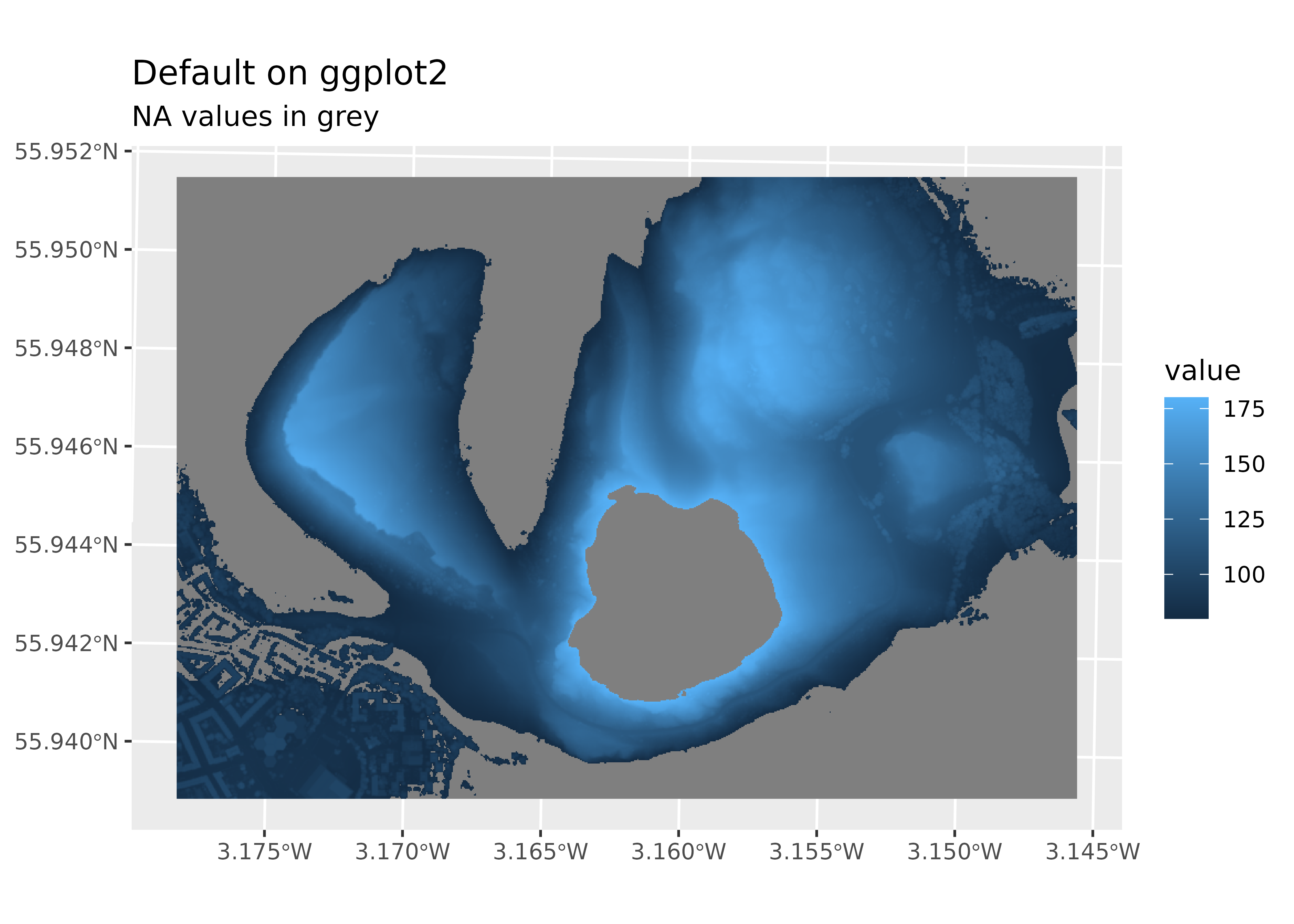
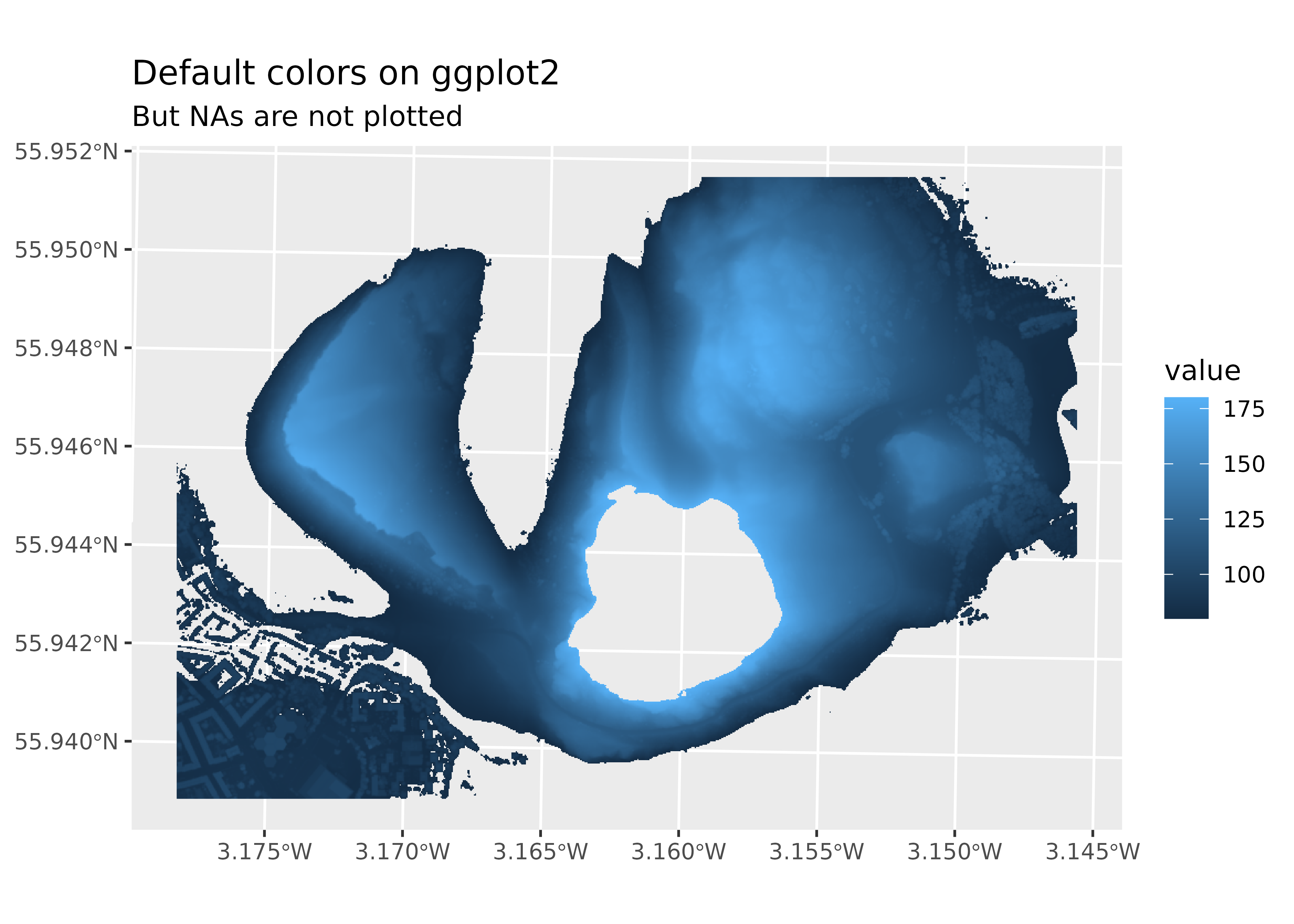
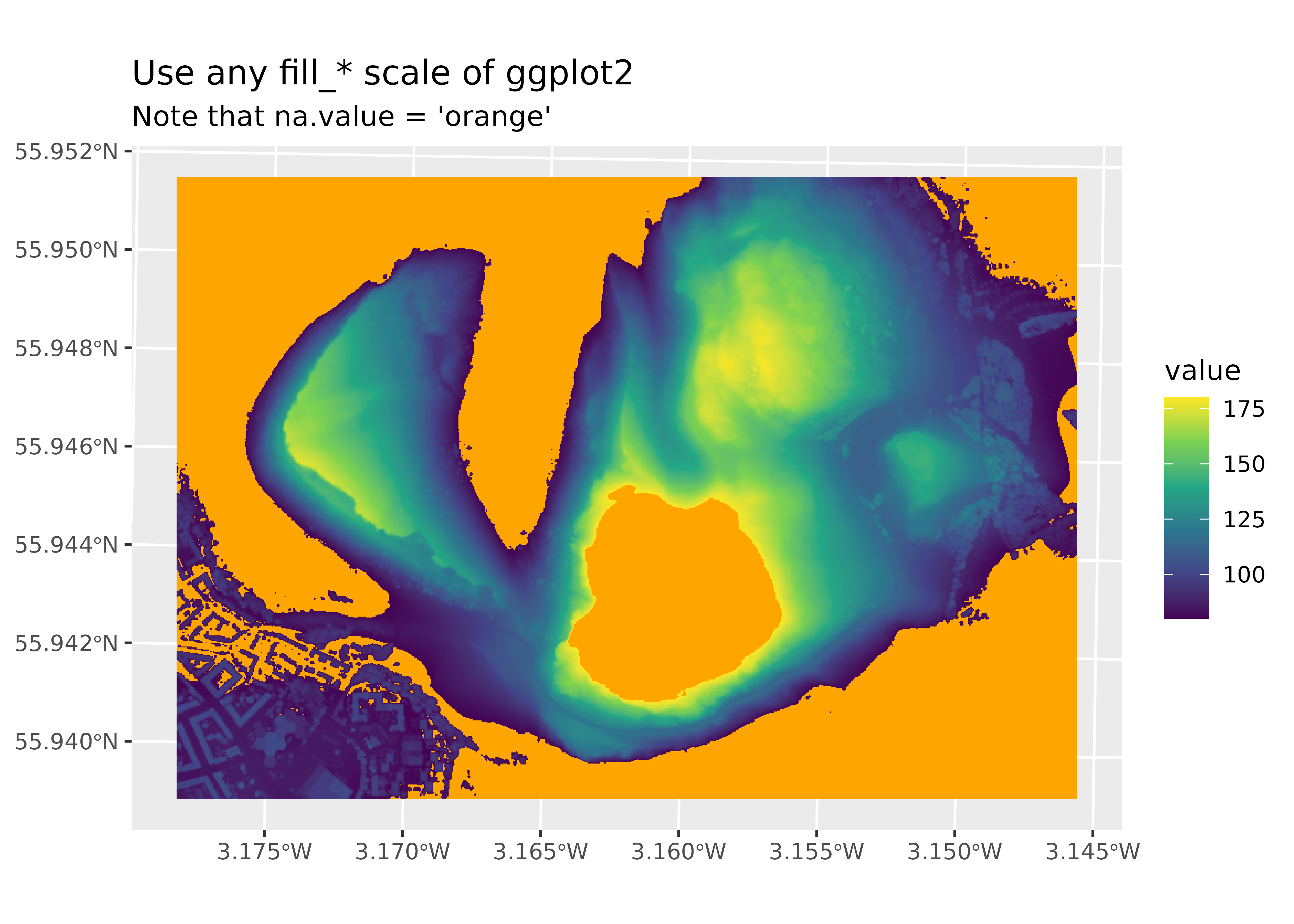
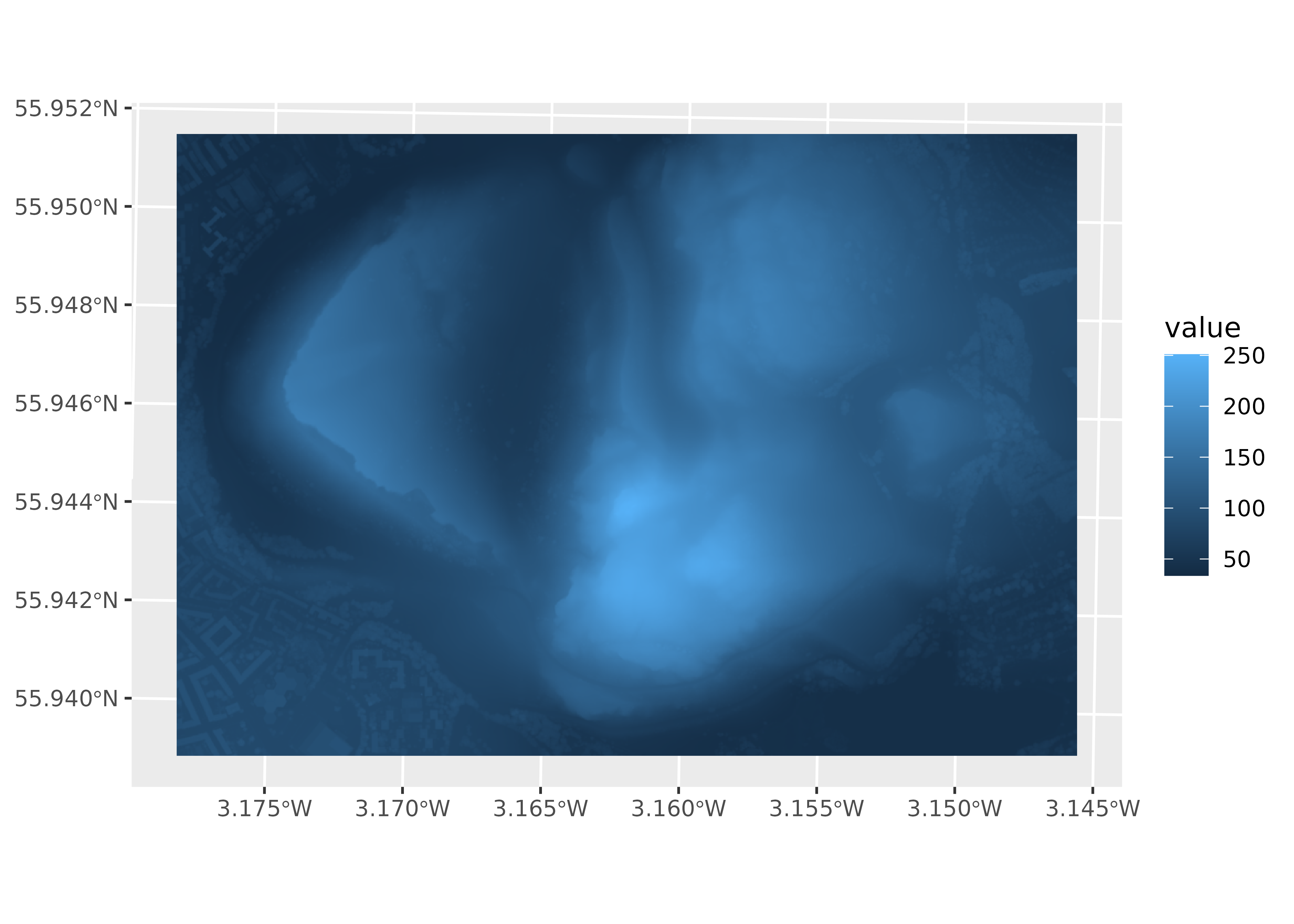
library(terra)library(tidyterra)library(ggplot2)# Get raster data from Holyrood Park, Edinburgh.holyrood<-"holyroodpark.tif"r<-holyrood|>rast()|>filter(elevation>80&elevation<180)# Default behavior.def<-ggplot()+geom_spatraster(data =r)def+labs( title ="Default in ggplot2", subtitle ="NA values in gray")# Modify with scales.def+scale_fill_continuous(na.value ="transparent")+labs( title ="Default colors in ggplot2", subtitle ="But NA values are not plotted")# Use a different scale provided by ggplot2.def+scale_fill_viridis_c(na.value ="orange")+labs( title ="Use any ggplot2 fill scale", subtitle ="na.value = 'orange'")
Figure 5: Changing default ggplot2 color palettes.
My map tiles are blurry
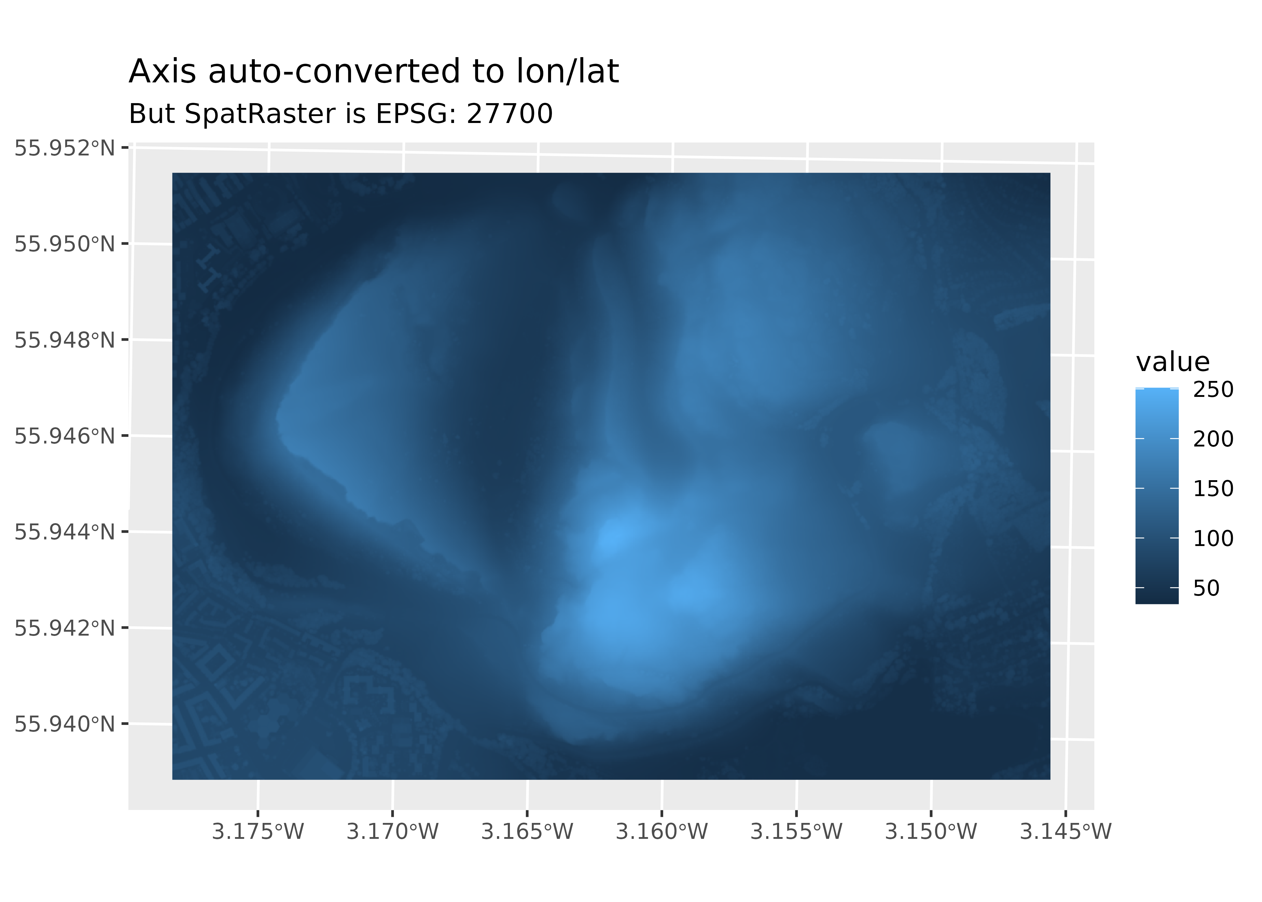
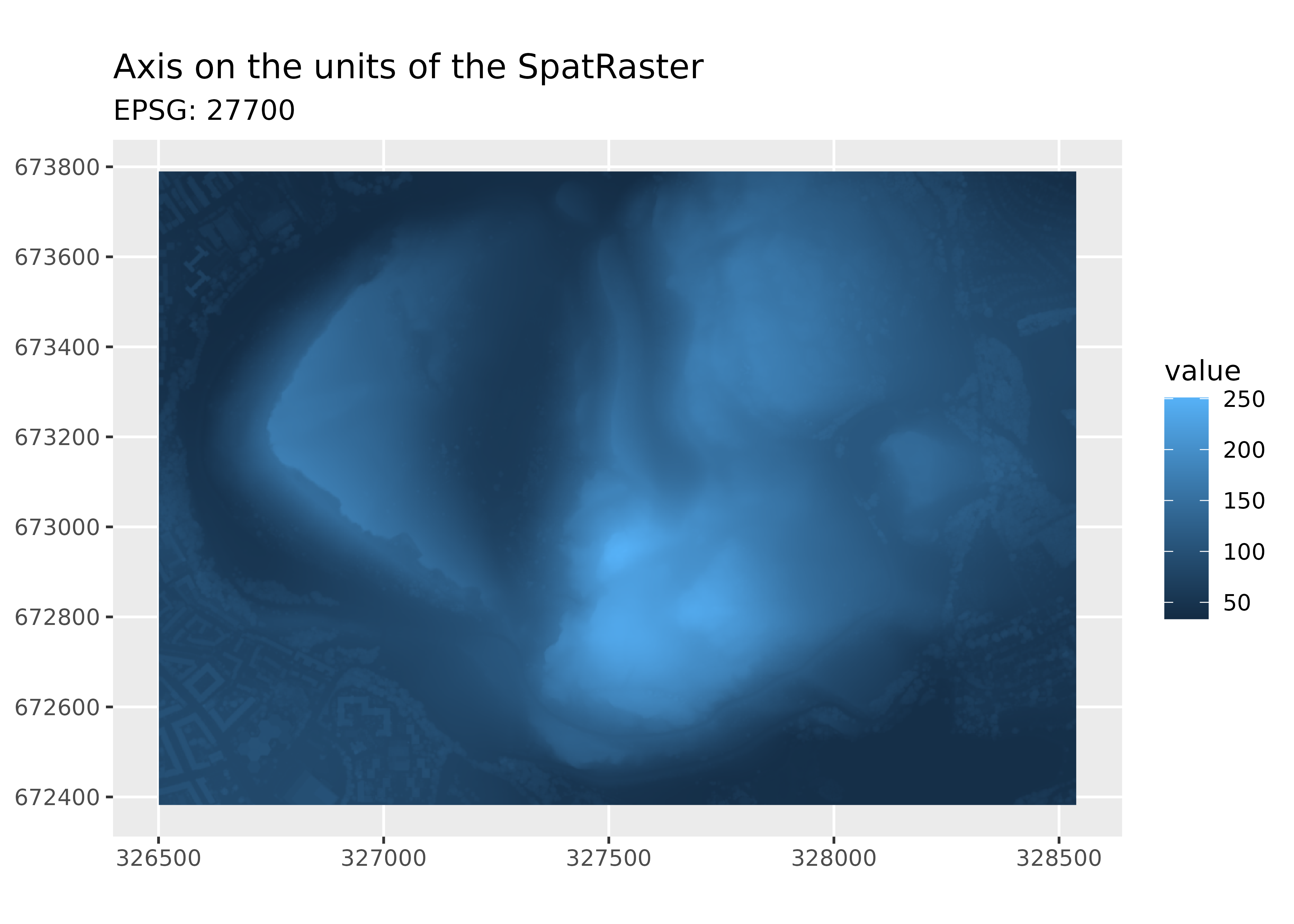
Blurriness is typically related to the tile source rather than the package. Most base tiles are provided in EPSG:3857, so verify that your tile uses this CRS rather than a different one. If your tile is not in EPSG:3857, it has likely been reprojected, which involves resampling and causes blurriness. To avoid extra resampling, increase the maxcell argument and ensure the ggplot2 map uses EPSG:3857 with ggplot2::coord_sf(crs = 3857):
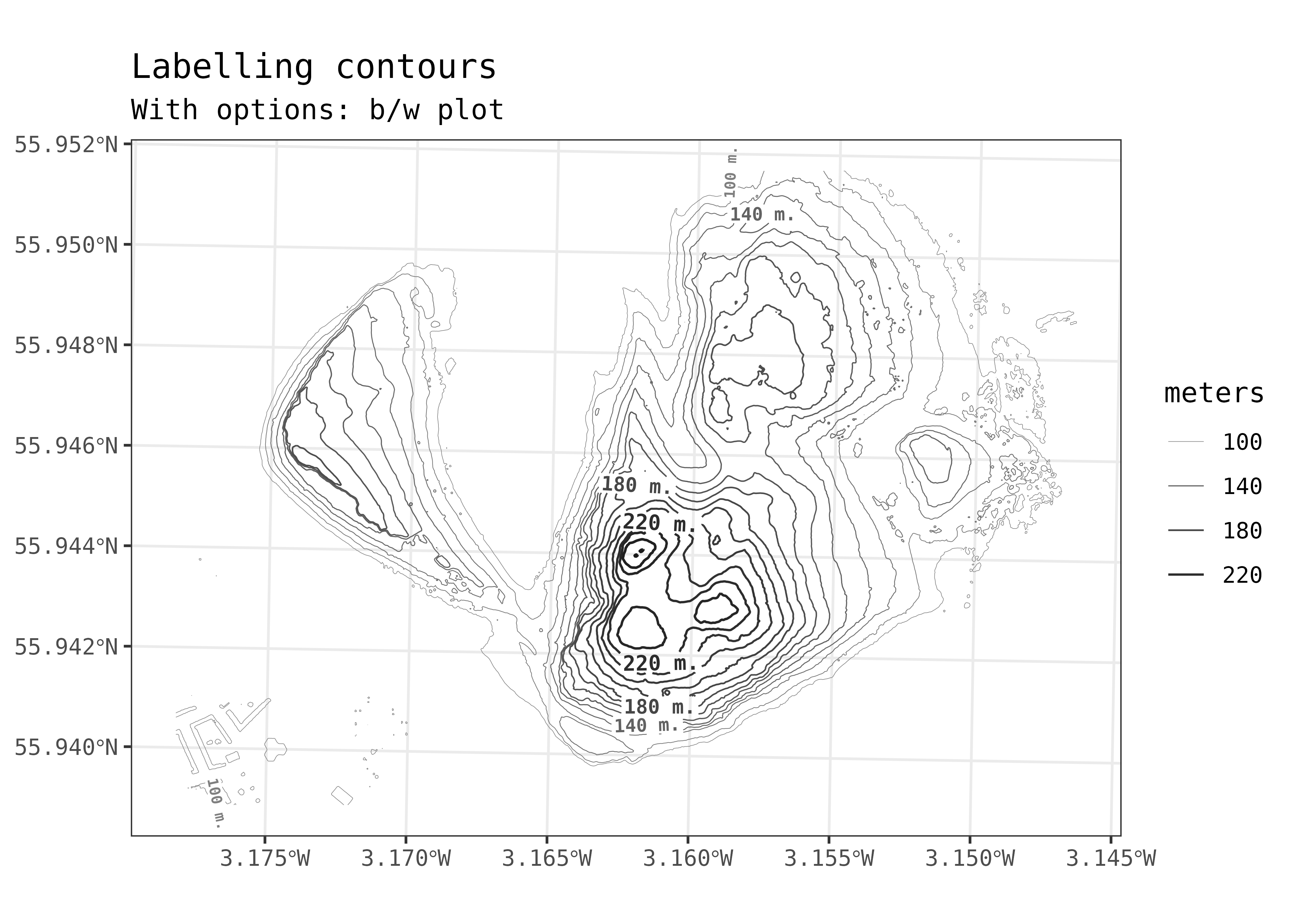
We omitted the legends in this section’s figures to improve readability.
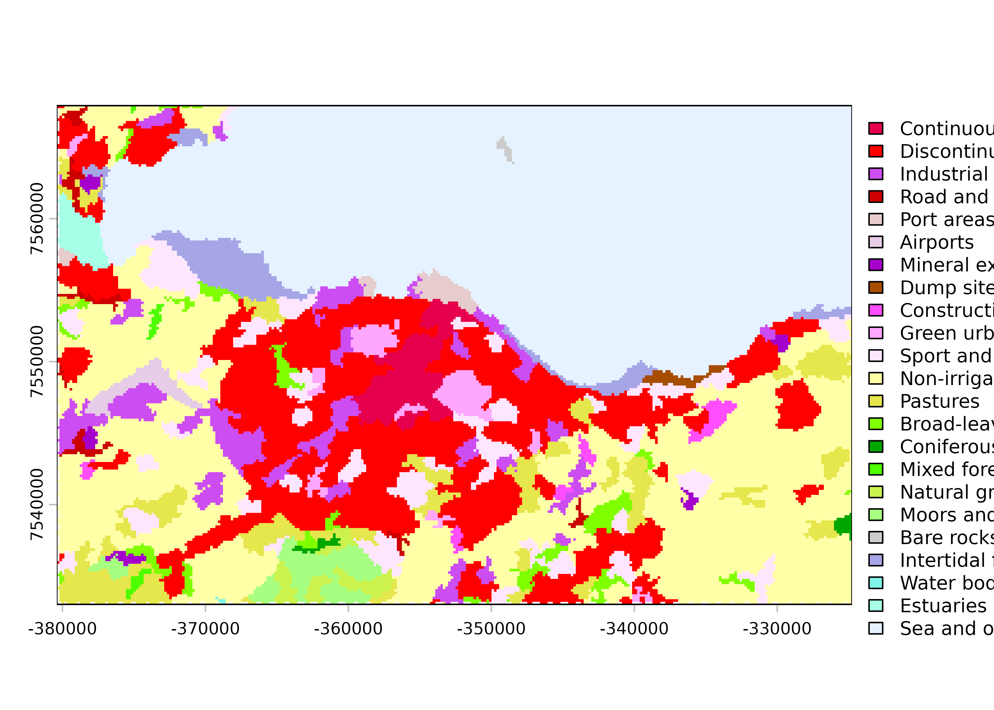
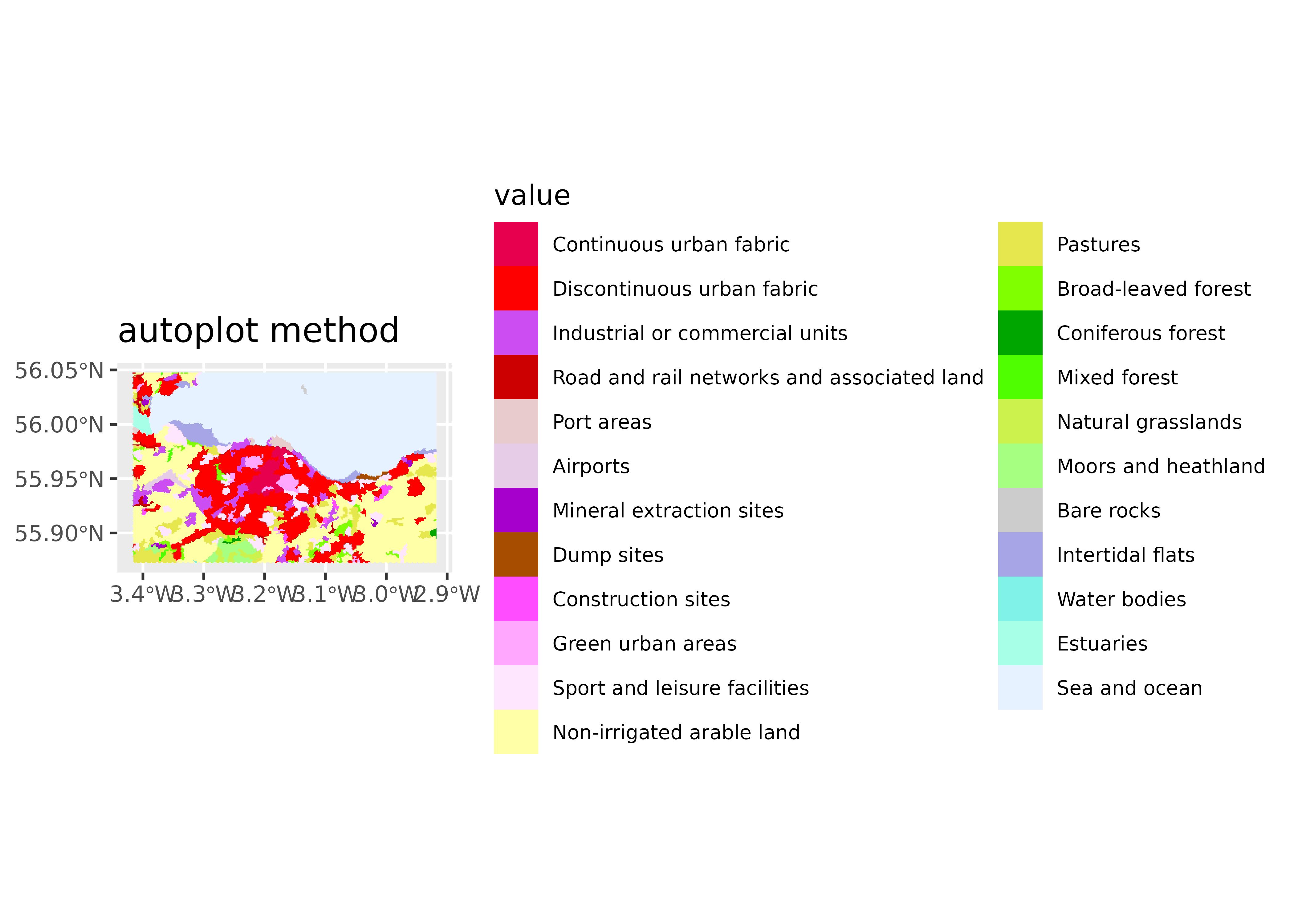
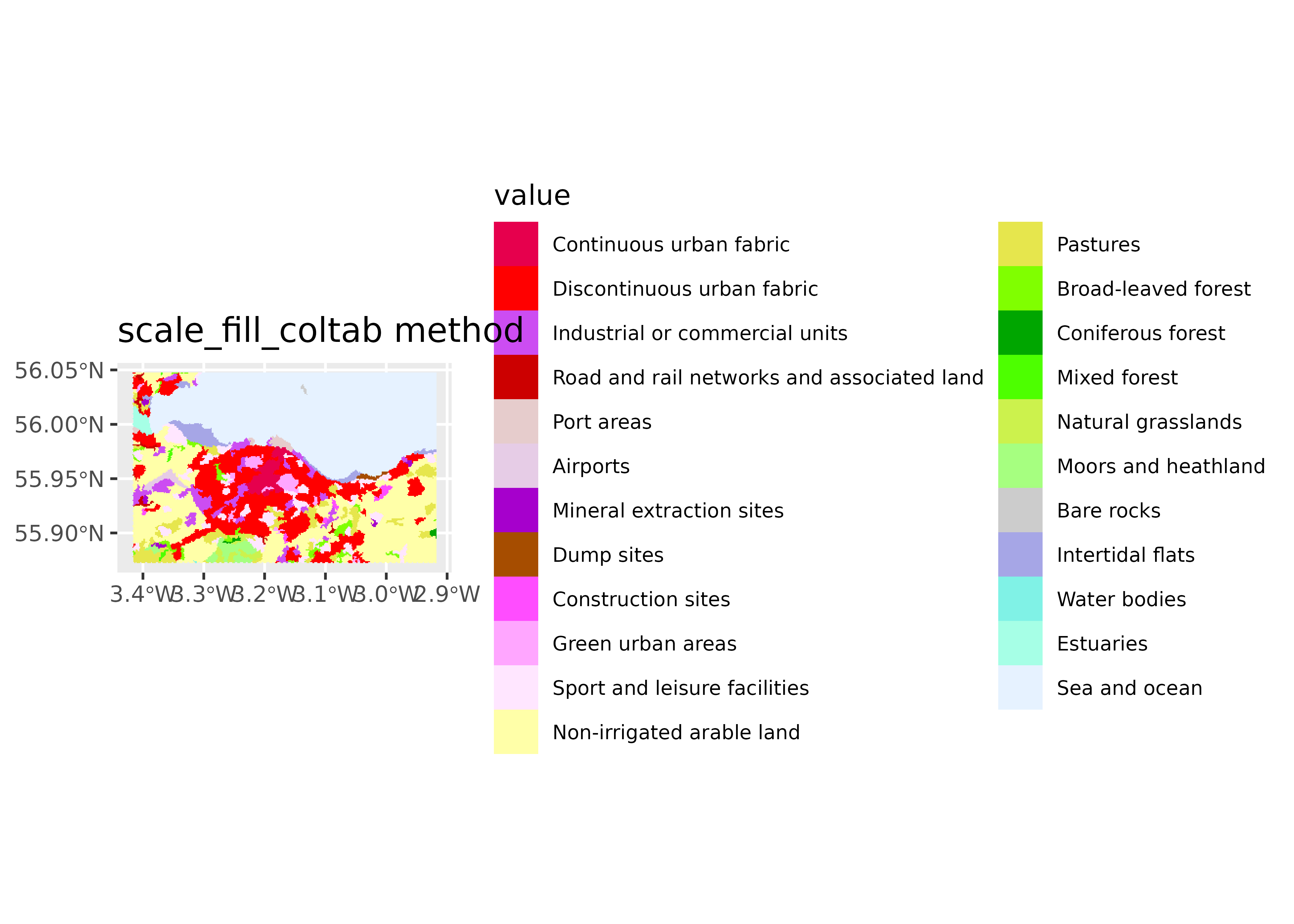
tidyterra provides several methods for handling SpatRaster objects with color tables. This example uses clc_edinburgh.tif, available online in the data-raw folder. It contains data from the CORINE Land Cover dataset (2018) for Edinburgh3.
library(terra)library(tidyterra)library(ggplot2)# Get a SpatRaster with a color table.r_coltab<-rast("clc_edinburgh.tif")has.colors(r_coltab)#> [1] TRUEr_coltab#> class : SpatRaster#> size : 196, 311, 1 (nrow, ncol, nlyr)#> resolution : 178.8719, 177.9949 (x, y)#> extent : -380397.3, -324768.1, 7533021, 7567908 (xmin, xmax, ymin, ymax)#> coord. ref. : WGS 84 / Pseudo-Mercator (EPSG:3857)#> source : clc_edinburgh.tif#> color table : 1#> categories : label#> name : label#> min value : Continuous urban fabric#> max value : Sea and ocean# Native handling by terra.plot(r_coltab, legend =FALSE)
Figure 9: Color tables: native plot with the terra package.
# `autoplot()` method.autoplot(r_coltab, maxcell =Inf, show.legend =FALSE)+labs(title ="autoplot() method")# `geom_spatraster()` method.ggplot()+geom_spatraster(data =r_coltab, maxcell =Inf, show.legend =FALSE)+labs(title ="geom_spatraster() method")# `scale_fill_coltab()` method.ggplot()+geom_spatraster( data =r_coltab, use_coltab =FALSE, maxcell =Inf, show.legend =FALSE)+scale_fill_coltab(data =r_coltab)+labs(title ="scale_fill_coltab() method")# Extract named colors and use `scale_fill_manual()`.cols<-get_coltab_pal(r_coltab)cols|>head()#> Continuous urban fabric #> "#E6004D" #> Discontinuous urban fabric #> "#FF0000" #> Industrial or commercial units #> "#CC4DF2" #> Road and rail networks and associated land #> "#CC0000" #> Port areas #> "#E6CCCC" #> Airports #> "#E6CCE6"# Use the extracted colors.ggplot()+geom_spatraster( data =r_coltab, use_coltab =FALSE, maxcell =Inf, show.legend =FALSE)+scale_fill_manual( values =cols, na.value ="transparent", na.translate =FALSE)+labs(title ="scale_fill_manual() method")
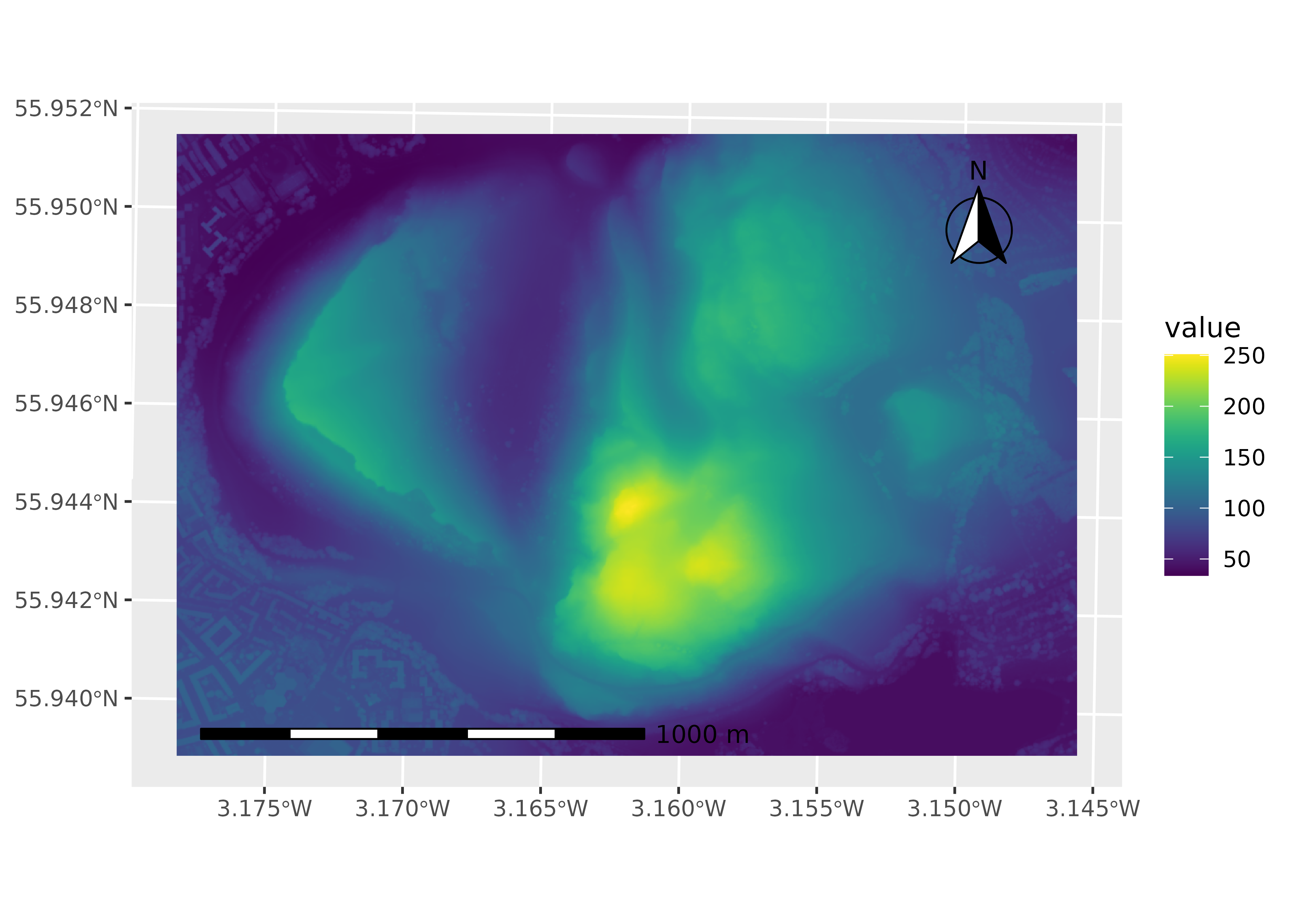
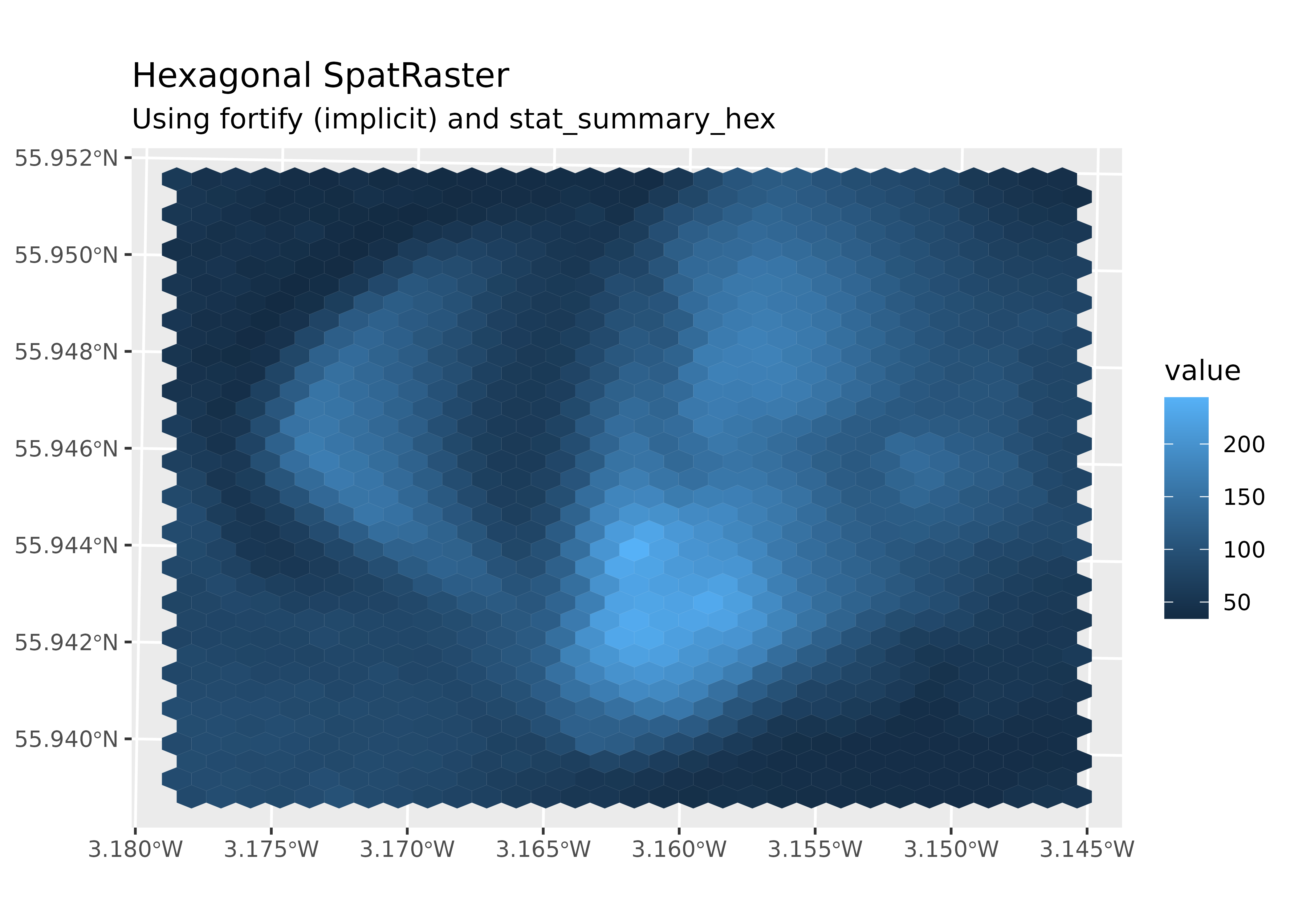
While SpatRaster cells are inherently rectangular, you can create plots with hexagonal cells using fortify.SpatRaster() and stat_summary_hex(). The final plot requires coordinate adjustment with coord_sf():
library(terra)library(tidyterra)library(ggplot2)holyrood<-"holyroodpark.tif"r<-rast(holyrood)# With a hexagonal grid.ggplot(r, aes(x, y, z =elevation))+stat_summary_hex( fun =mean, color =NA, linewidth =0,# Bin size determines the number of cells displayed. bins =30)+coord_sf(crs =pull_crs(r))+labs( title ="Hexagonal SpatRaster", subtitle ="Using implicit fortify() and stat_summary_hex()", x =NULL, y =NULL)
Figure 15: Elevation data aggregated and visualized as hexagonal grid cells.
You do not need to call fortify.SpatRaster() directly because ggplot2 invokes it implicitly when you use ggplot(data = a_spatraster).
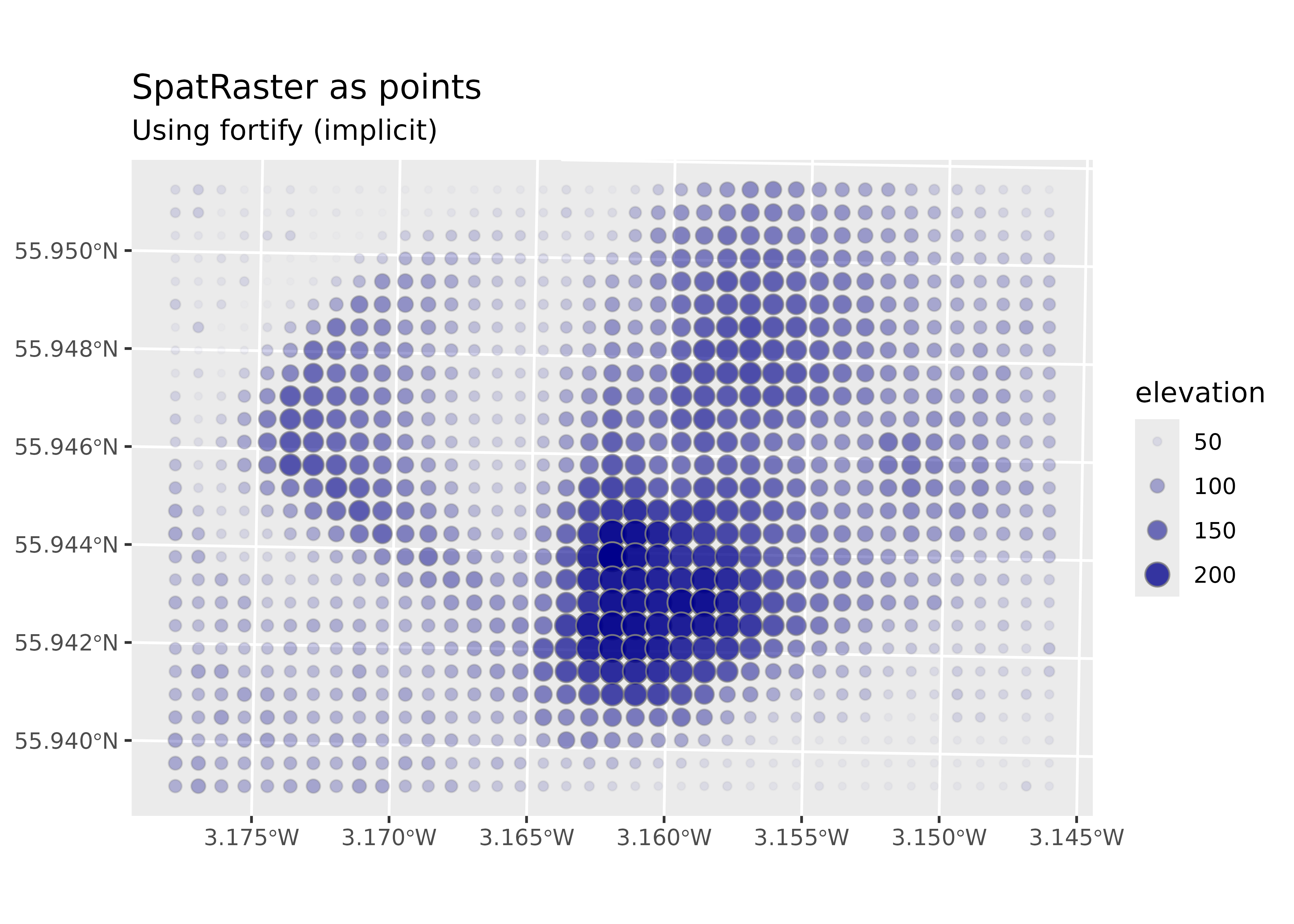
Thanks to this extension mechanism, you can use additional geoms and stats from ggplot2:
# Point plot.ggplot(r, aes(x, y, z =elevation), maxcell =1000)+geom_point(aes(size =elevation, alpha =elevation), fill ="darkblue", color ="grey50", shape =21)+coord_sf(crs =pull_crs(r))+scale_radius(range =c(1, 5))+scale_alpha(range =c(0.01, 1))+labs( title ="SpatRaster as points", subtitle ="Using implicit fortify()", x =NULL, y =NULL)
Figure 16: Elevation data represented as points with size and transparency scaled by elevation values.
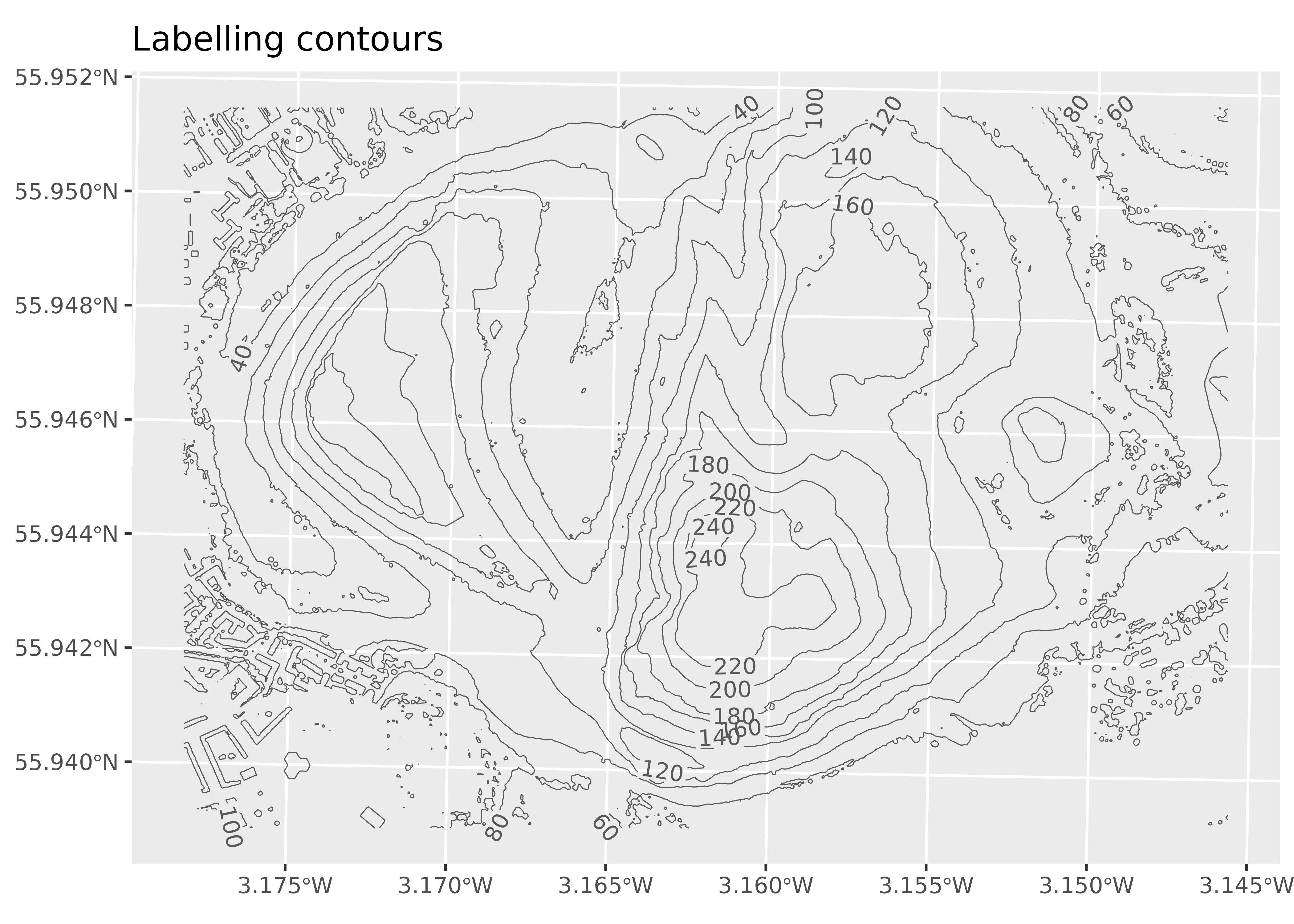
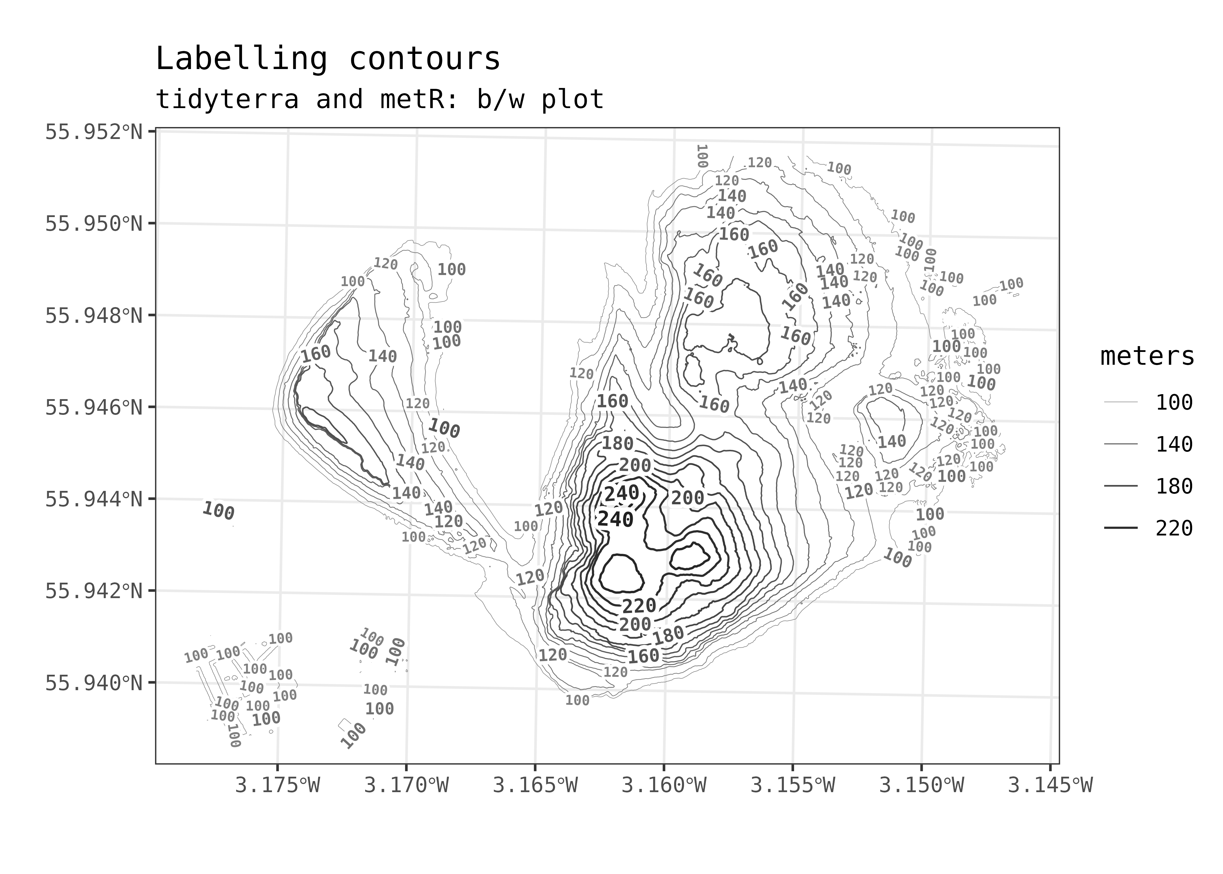
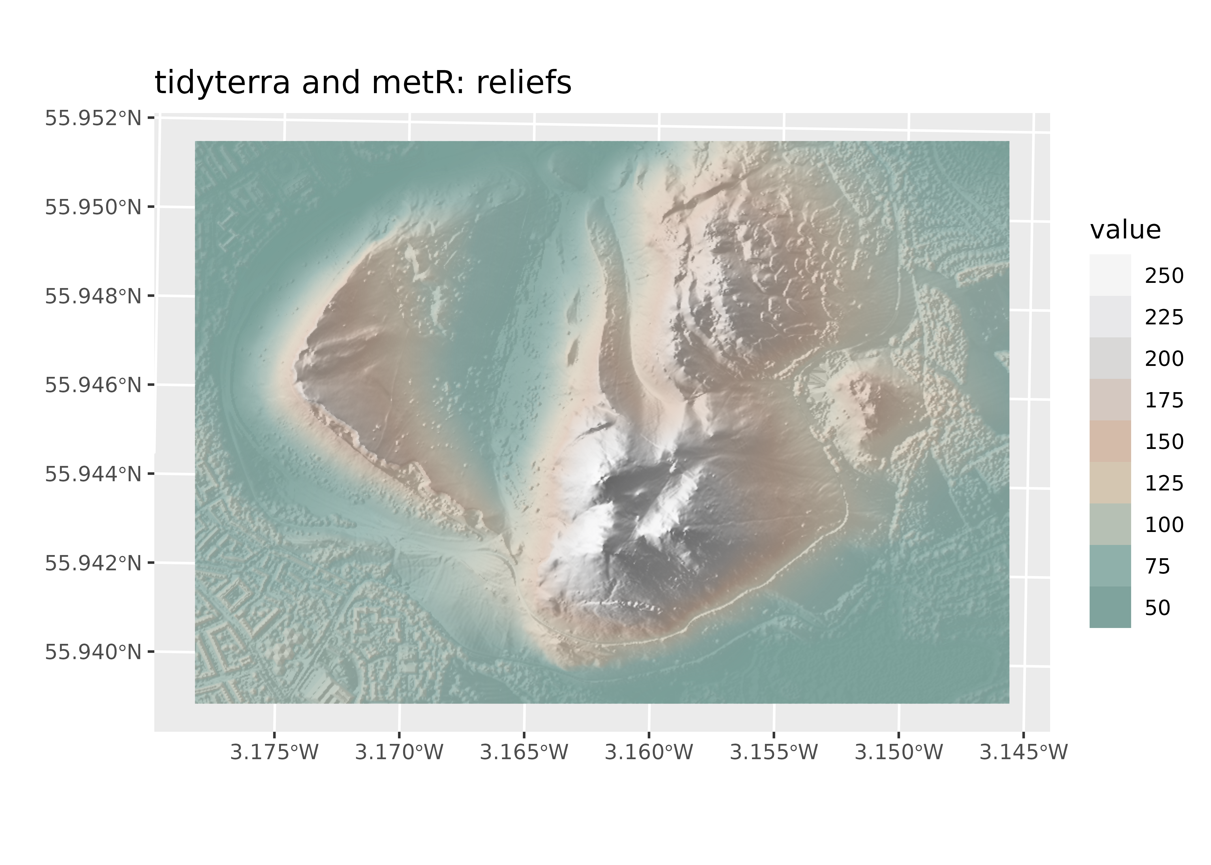
tidyterra and metR
metR provides ggplot2 extensions, primarily for meteorological data visualization. As shown previously (see Labeling contours), you can combine both packages to create rich, complex plots.